GRIZZLY PEAR

written snapshots

Category: Drawings

  • Swiss 1JJ, Page of Wands

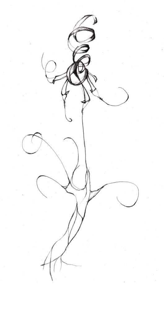
    I copied the drawing while waiting for files to upload to the server

    I used the classic upside down technique…but ran out of room at the bottom of the notepad for the top of the head.

    A blue ink outline drawing of a mail figure standing with a long baton, wearing a skirt.
  • Separate Heaven and Earth

    Monday was crazy so first thing Tuesday is to catch up on yesterday’s figure. Maybe I’ll get a second round in this afternoon.

    (I threw in some architectural scalies for fun.)

    I’m reusing my notepad with sketches for the 6 of Swords….and this is now my desk pad so the rest of the white space will eventually get filled in (and green highlighted when completed).

    A messy page including black in outlines of swords, messy red architecural scalies, and a red ink outline of a man exercising.
  • Bad Figures

    At the Museum of Contemporary Art, San Diego I contemplated my recent decision to draw more (than nothing everyday). One gallery had paintings with several highly stylized figures. I committed the classic response to modern art.

    I could do that!

    Spoiler alert: I can’t.

    This idea pushed me to finally attack the white whale of drawing figures. I’m so bad, even my architectural scalies look awful. This is way out of my comfort zone but it’s time to attack the issue in a concentrated fashion.

    I’m calling this Figure 8’s . The series is to draw a human figure for +/- 8 minutes, for x8 days.

    At least for 08 days to go with the 8 brocades, maybe up to 78 (tarot deck) or 18, 28, 68, or 88 (for good luck).

    Yesterday, I started with image of a guy stretching upward. I didn’t use a reference and …. umm yeah … this makes my scalies look like palatable.

    Red outline drawing of a dude raising his arms over his head.  No model, just out of the noggin.

    The drawing today was from the cover of my exercise book, the second callisthenic shooting an arrow. I’ll do exercises 3-8 from the book before I venture back out into my imagination.

    Red outline drawing of a man pointing his fingers out towards the left, shown with the photograph.

    The girl got a good laugh when she saw these drawings, she even got her brother upstairs to join in the fun. It may be good for them to see dad fail miserably…and hopefully get better by the end. Given how quickly she picks things up in school, I worry she has developed a fear of failure. So hopefully this will encourage her to take some risks and fail graciously a few times before the stakes get too high in life.

  • Coat, Desk, Chair

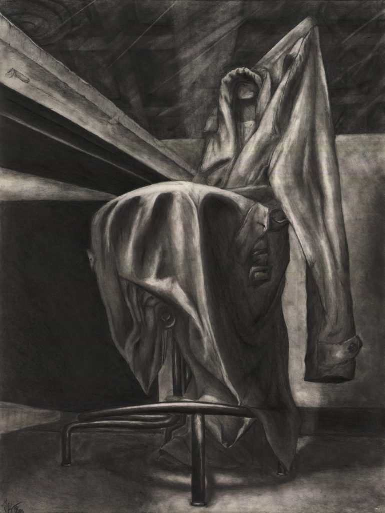
    I took my first studio in the spring of 1998. More than architecture, ED11A was about drawing and seeing.

    This was the big midterm assignment.

    It also coincided with the clock change, and we bemoaned the loss of an hour to complete this drawing.

    It turned out that I didn’t need that extra hour. I finally got an “A” on this drawing. It was a brutal studio (architecture studios are half hazing), but something clicked on this drawing.

    I expended an intense amount of effort on this piece, but one must also credit Fortuna, since nothing is guaranteed with art.

    It’s been a quarter century since that long week in concrete caverns of Wurster Hall. Things that seemed cataclysmic are mere whispers in our memory.

    Maybe I’ll return to this level artistry one day. More importantly, I hope my kids will push themselves to discover their art — my daughter is less than a decade away from her freshman year in college.

    18″x24″ Pencil Drawing of a Coat, Desk, and Chair. I spent the week on my stomach drawing the green army trench coat at my studio chair and desk. A classmate drew this same scene from a different perspective. Everyone else took this opportunity draw in the comfort of their dormitories.

    The graduate assistant for our section was Noga Wizansky who still makes great art. During my time at Berkeley, I developed close relationships with the professors Chip Sullivan and Joe Slusky in future studios. I loved their omnivorous approach to everything. It’s a shame that the Architecture program has become focused on architecture. There’s plenty of time for that silliness after college.

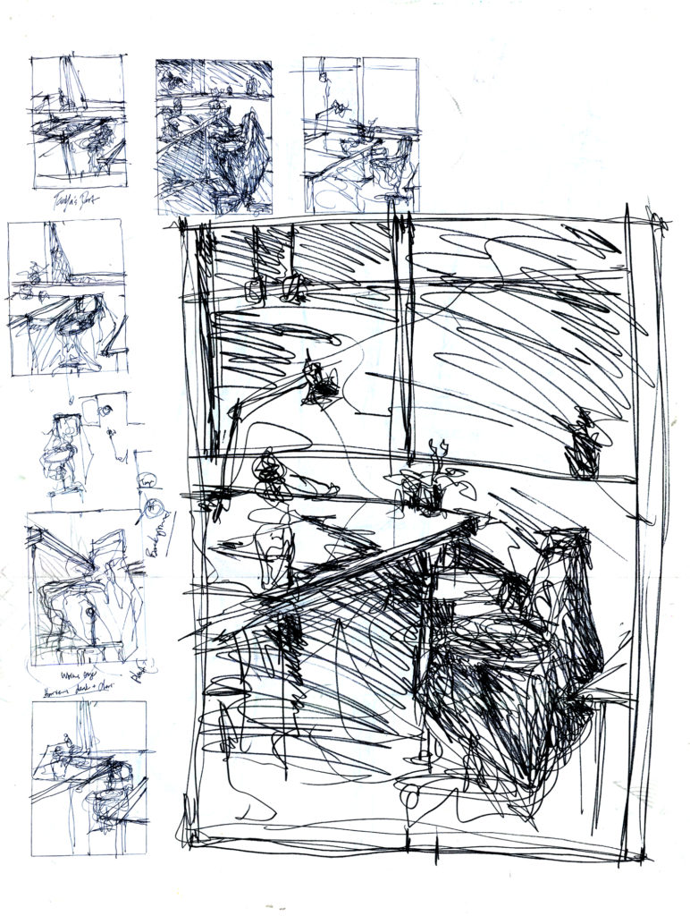
    Ink for determining the perspective
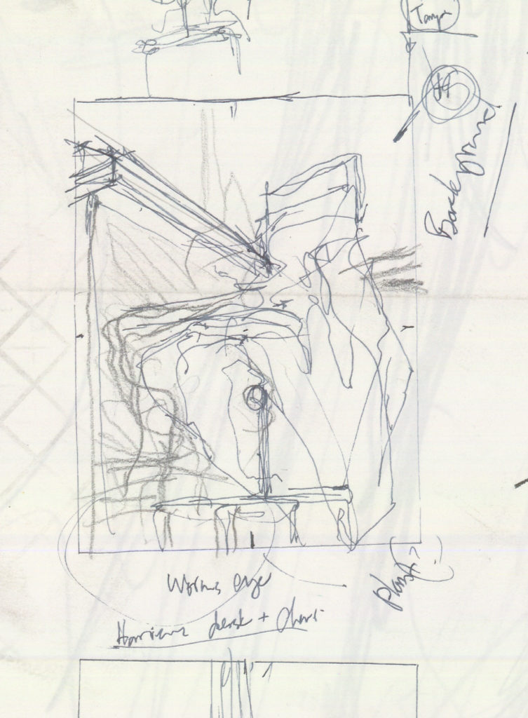
    Detail of the selected view
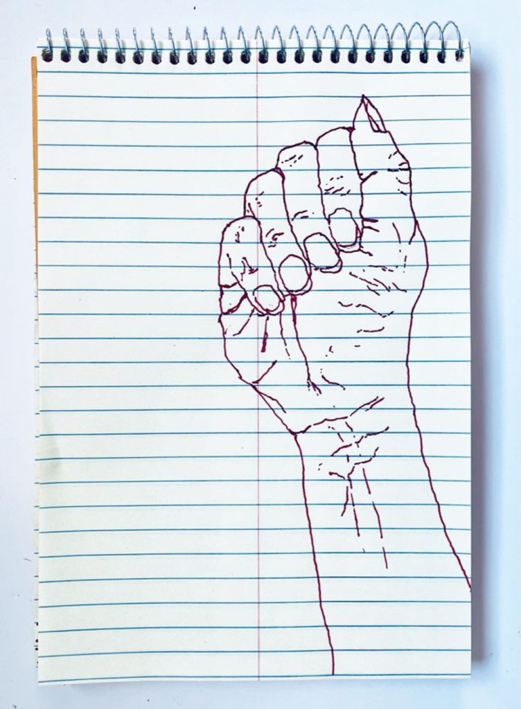
  • Drawing Hands

    Late last year, I started drawing a little. I had joined Post.news and wanted to see more art in my feed. I decided that I had to make some of my own in order to manifest this desire into reality.

    The drawings are nothing special, but it was good to start moving my hand again.

    Hands are a rich subject. They are very hard to perfectly, but they are quite forgiving to make decent. It’s just a matter of breathing slowly and taking your time.

    This exercise is highly recommended for anyone that wants to get out of the digital vortex of the 21st century.

    Index Finger pointing towards the Right.
    An open palm with my Pelikan Fountain Pen cap resting on my fingers.
  • Another encouragement to make your website.

    I’m part of a small group on Post.news who posts old work under the hashtag #SundayShare. This was going to be my suggestion for a “lunar new years resolution”…until the tragedy at Monterey park. I still think it’s worth sharing, so I posted it today.

    ~

    In 2008, I planted a flag on the interwebs with www.grizzlypear.com. (We came up with the name as a twist on our bunnies Badger and Peppercorn.)

    I quickly lost interest in the webcomic, but now I had a domain to build upon. It morphed into the repository of my random contributions scattered across various forums.

    Even though #PostCreative / #CreativeCollective is going strong right now, who knows how things will go?

    Let this new-new year will be the one when you start your own site. Build a library that stands apart from these social media bazaars that come and go.

    Your place might have few visitors, but you’re the only one that counts. Maybe you be digging into for next week’s #SundayShare in 2033.

    If you don’t know where to start, I recommend getting the domain name on Hover.com which I’ve really enjoyed using. I don’t know which web-host is best, but I’ve been using the cheapest plan on Hostgator for a decade with WordPress for my blog engine.

    Alt Text: A black and white ink drawing of two rabbits in a rectangular vaguely urban landscape with two rabbits hopping down the street towards the vanishing point. The dot pattern for the sunset was added on the computer and I still can’t decide which is better.

    This is what I shared last week in the face of that tragedy.

    A simple #SundayShare diptych of Badger and Peppercorn ferociously consuming Bok Choy in our old apartment in Houston.

    Alt text: two photos, showing a pair of rabbits eating veggies on the floor. The black and white harlequin steps away after she yanked a luscious green leaf out of her albino partner’s mouth.

    Taken with a Nikon D40 with the 18-35mm kit lens. Fifteen years later, the gear doesn’t matter all that much. Glass and metal tubes sit in the a box while the heart is warmed by the glow of bygone days, occasionally rekindled by pixels on a screen.

    Here’s to the New Year!

    Let’s make many great memories and maybe some photos too.

  • Happy Year of the Rabbit!

  • 9 Coins

    an ignoramus tips the Tarot

    Black ink (Flair Pen) drawing on a yellow steno pad. Colored in Pixlr. Collaboration with the kids. She did some of the coloring this time.

    A black ink sketch on lined paper with a pile of nine gold coins with square holes. The coins are marked with a yellow house, an invisible face, a strange oval thing, green icing, and a peachy "DADDY BAD!" warning. Around the stash float two grey locks, two pink hearts, two smiling faces, two purple something-randoms, a blue-red spike ball, three purple hats, four windows, and a tomato-tomato head. This time, coloring didn't last beyond the weekend...then again we didn't go up to Mount Charleston to play in the snow this week.
    A black ink sketch on lined paper with a pile of nine gold coins with square holes. The coins are marked with a yellow house, an invisible face, a strange oval thing, green icing, and a peachy “DADDY BAD!” warning. Around the stash float two grey locks, two pink hearts, two smiling faces, two purple something-randoms, a blue-red spike ball, three purple hats, four windows, and a tomato-tomato head. This time, coloring didn’t last beyond the weekend…then again we didn’t go up to Mount Charleston to play in the snow this week.
  • Parking Garage Apartment Parks

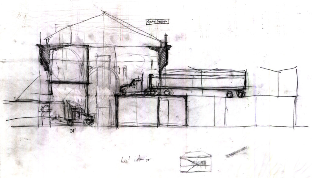
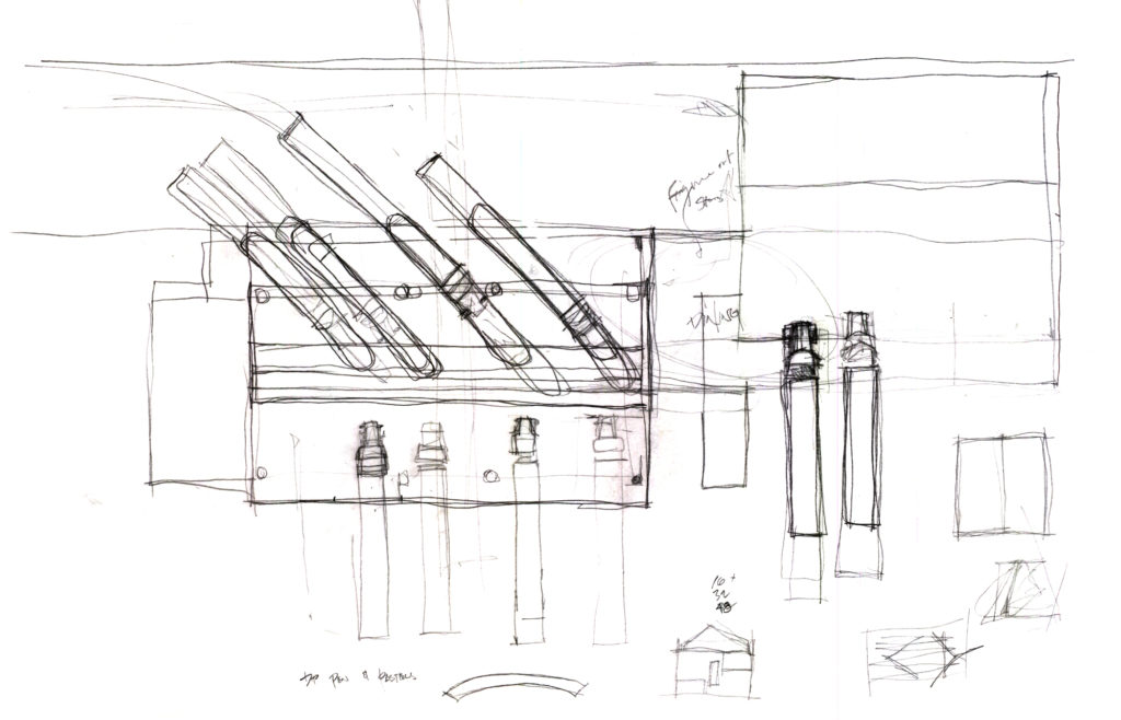
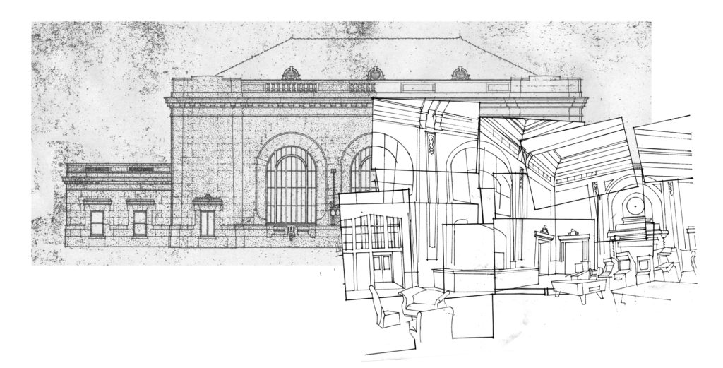
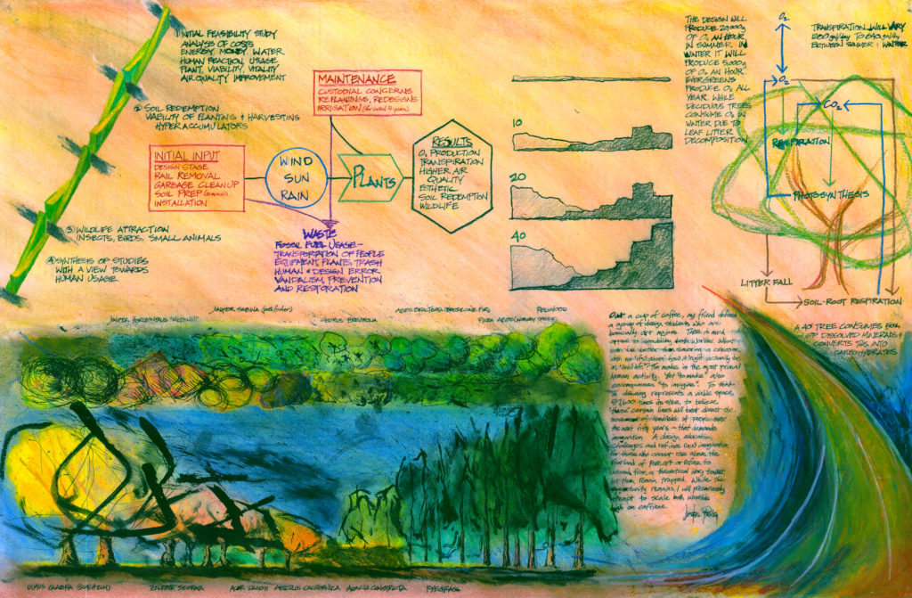
    15 years ago, I presented my thesis project, so let’s relive the past!

    It started in the Spring of 2007 when I was studying abroad in Rice’s Paris exchange program. For thesis prep, I explored the idea of increasing density in Southern California which suffers a simultaneous lack of housing and paucity of public parks. Looking back, I suspect my brain was a mix of wonder at living in a real metropolis and a nostalgia for home.

    I focused on the suburban city of Alhambra when I visited my grandfather that summer. I sited the project on a parking lot in front of Ralph’s Supermarket, proposing a big new structure along the street. I added new shops at grade level, moved all retail parking below-ground, and built a multi-story suburban landscape of apartments on the upper floors of the parking garage (the gimmick is that you get to park next to your apartment!). The remainder of the old asphalt parking lot was converted into a large public park, daylighting the buried storm culvert and connecting the adjacent school and church.

    I’ve always been a luddite as an architect, so I finally learned Rhino and rendering for this project, only to never use these skills again. This was also the last time I made a physical model in my career. And as with most other architecture students, this thesis got me a degree and hasn’t seen the light of day outside of the occasional job interview.

    There are more images and the thesis book for download on my online portfolio.

    A series of diagrams showing the relationship of the project to the site. In the 00's Rem Koolhaas was king and Rice was more of a diagram factory than a design school.
    A series of diagrams showing the relationship of the project to the site. In the 00’s Rem Koolhaas was king and Rice was more of a diagram factory than a design school.

    PS. After writing this, I texted some old classmates who I haven’t contacted in years, it was fun catching up!

  • 10 Cups

    an ignoramus tickles the Tarot

    Black ink (Flair Pen) drawing in a yellow steno pad. Collaboration with with the kids. Colored in Pixlr.

    A black ink sketch on lined paper with a rainbow of ten goblets with a green girl square monster, cyan space star, pink donut, and a blue red spike ball. Blue clouds float above with a red warning “Daddy Bad” with a mushroom house and random shapes from the future. Under the rainbow is a vase with space flowers, a square daisy, two gold clouds, and an alien puppy with five legs, two tails, and a pair of antennae.