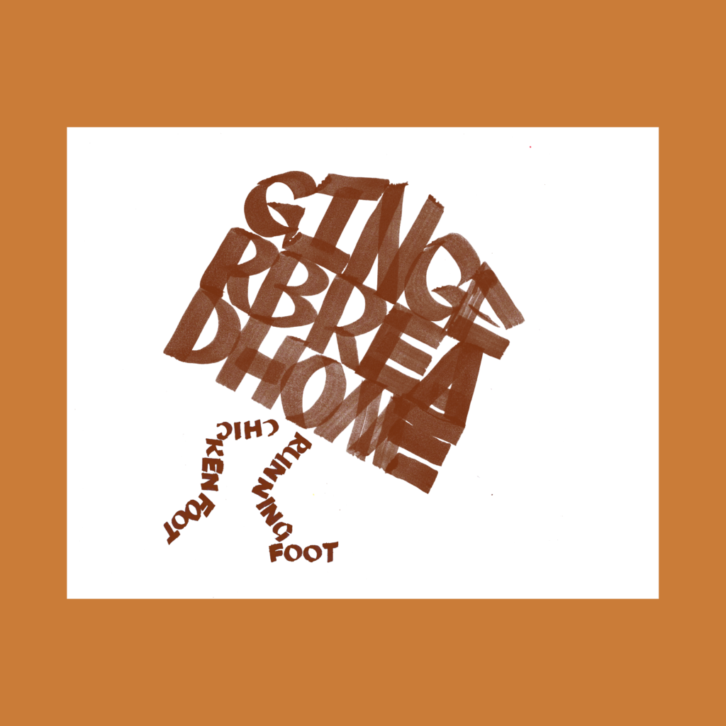
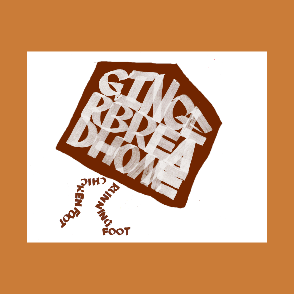
After the initial post, I thought it might be better with the gingerbread home inverted. But it just looks like a piece of toast.
In the past few months, I’ve gone native with GIMP. Its UI is not as intuitive as what I remember from Photoshop, but I’m able to produce quickly on the program, at least for the limited work that I do with it. I presume going back to Adobe would now involve an uncomfortable learning curve.
And yes, this piece is a reference to Baba Yega’s lovely home.
,
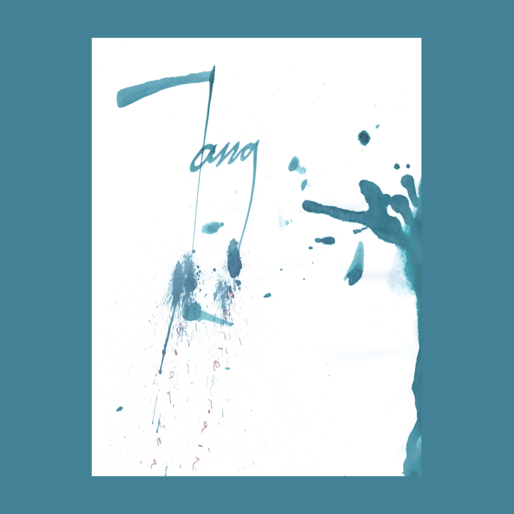
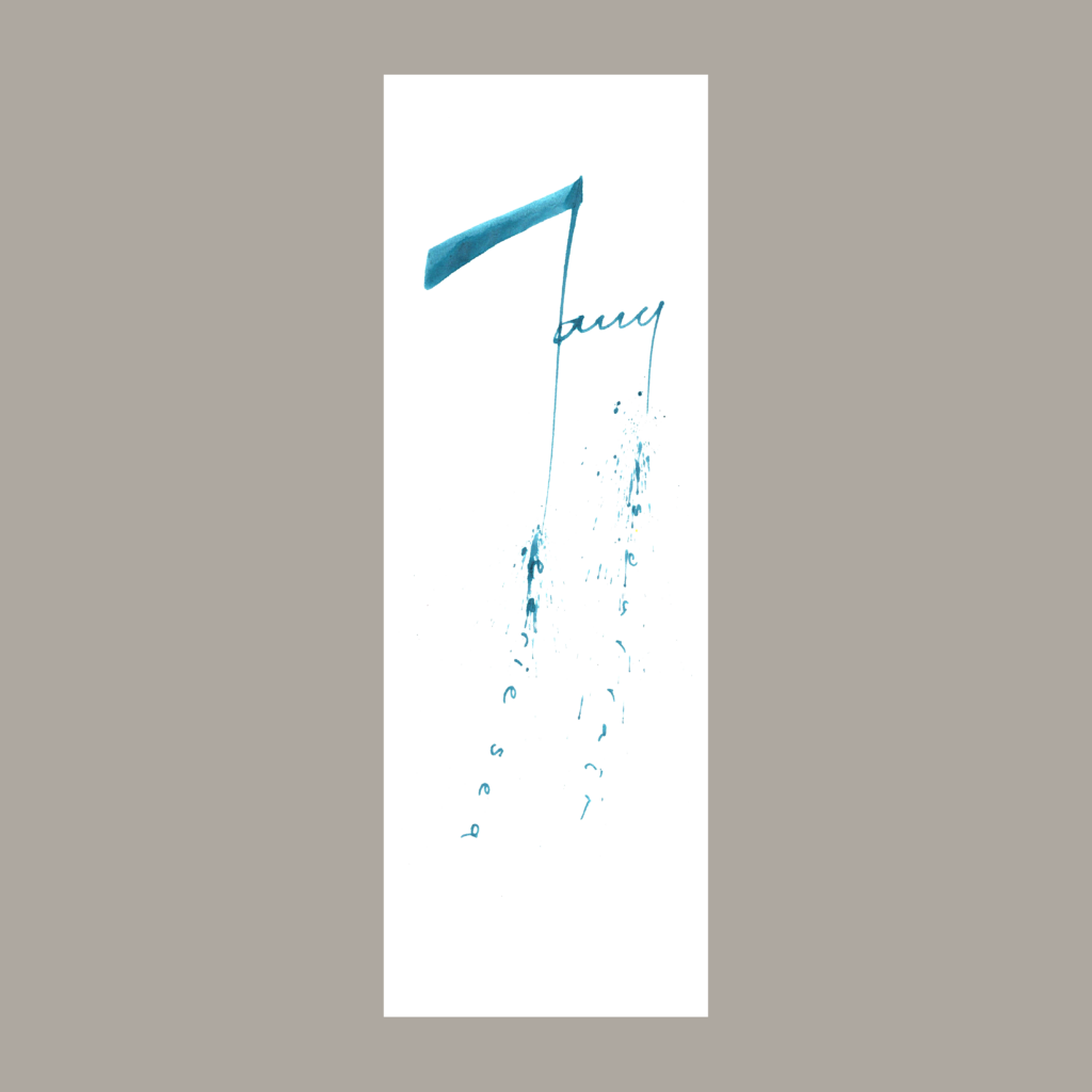
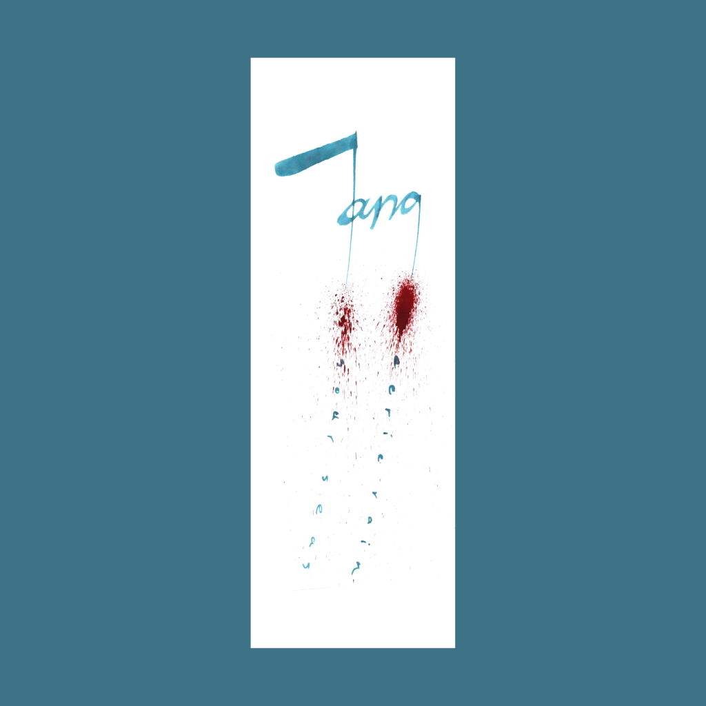
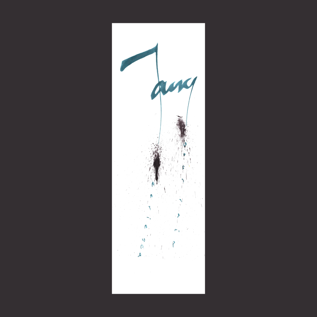
12/18 Inktober 52, week 32
fang sour rain eerie sea
This was partly inspired by the Fender logo, but it took a bit of finagling to get something that felt properly fangy. Even then, I had to add a bit of splatter to lock in the effect.
,
12/20 Inktober 52, week 30
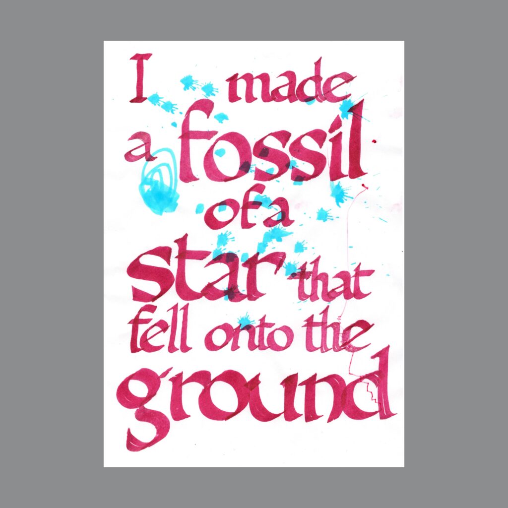
O blessed and cursed mutation
There is a slight color shift in the four words because I was playing with the gradient effect by touching two Pilot Pens. Maybe I’ll spend a month really playing with that effect. Or maybe I just use watercolors.
,
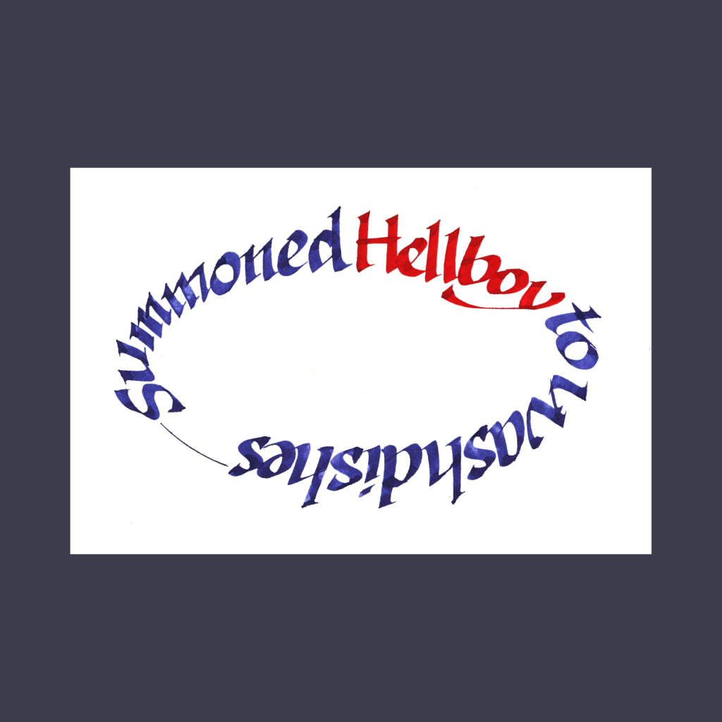
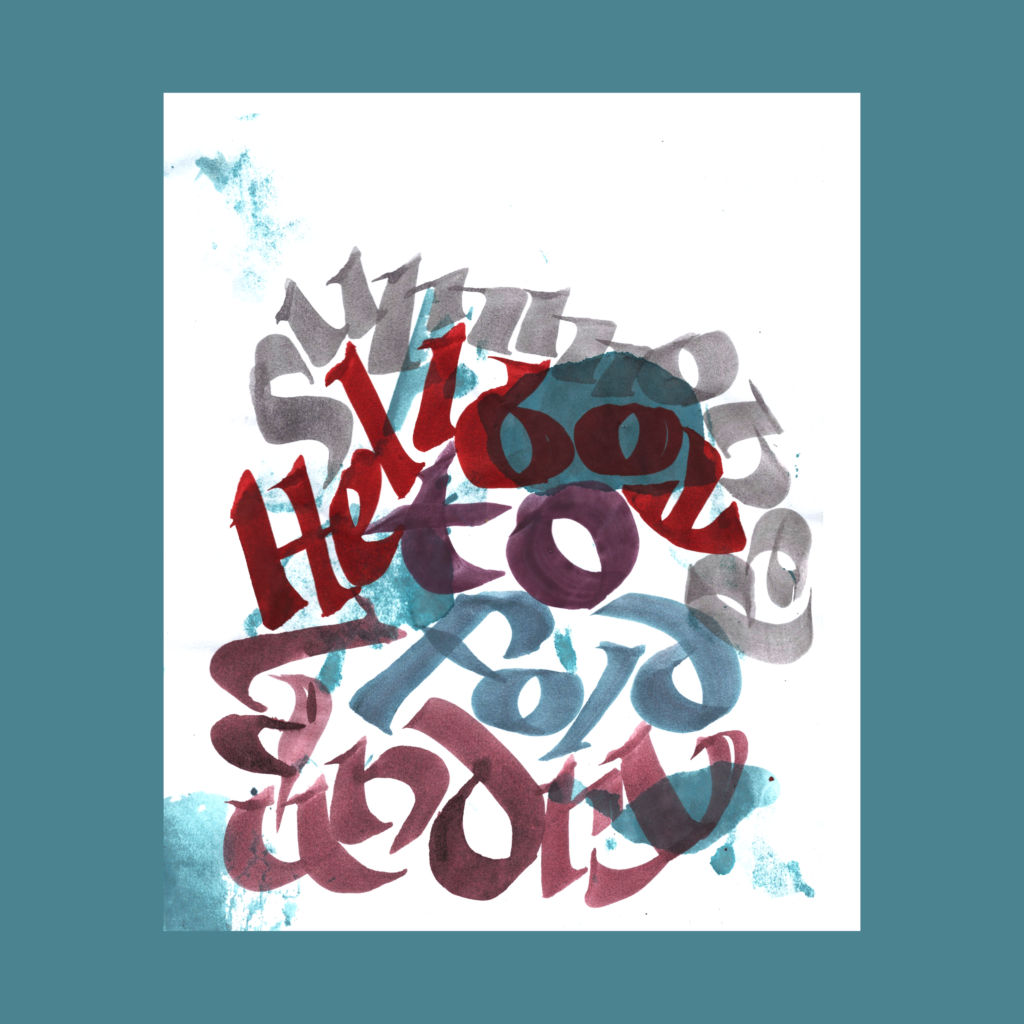
12/21 Inktober 52, week 29
summoned Hellboy to wash dishes
Tried a couple versions of this poem but went with the mental image of Hellboy carefully soaping porcelain teacups. It was fun to learn how to draw an ellipse!
,
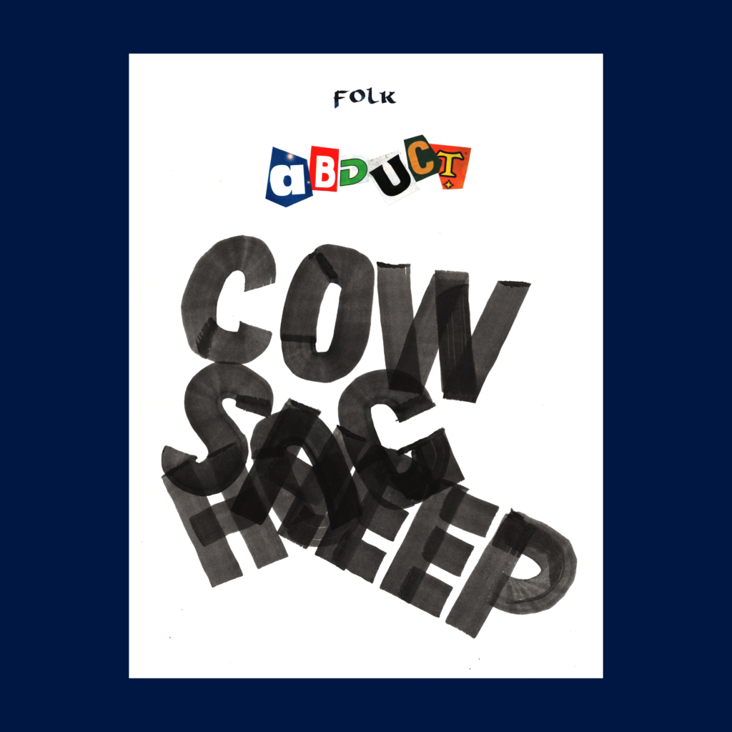
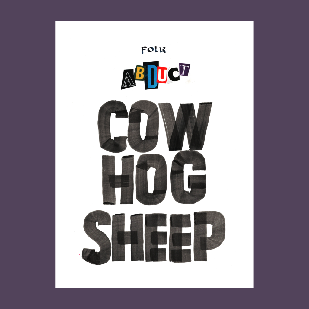
12/22 Inktober 52, week 25
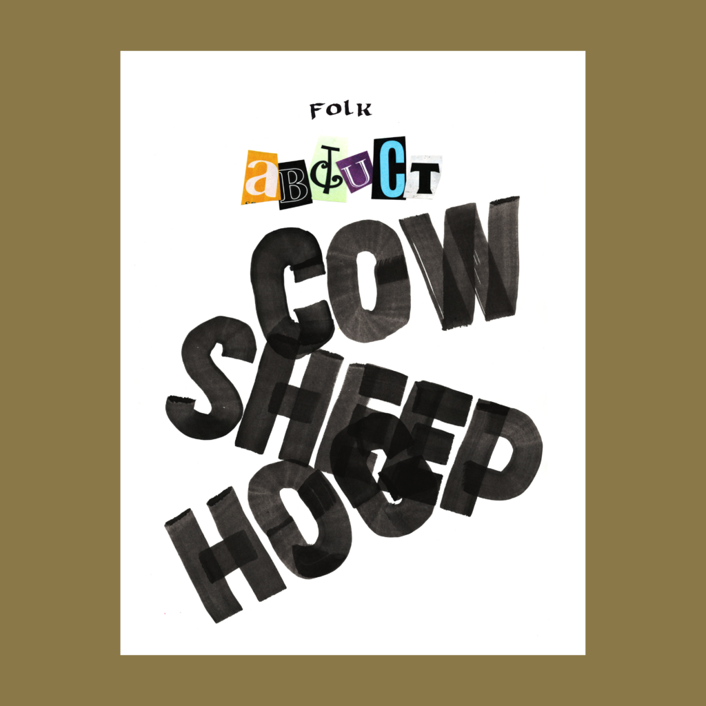
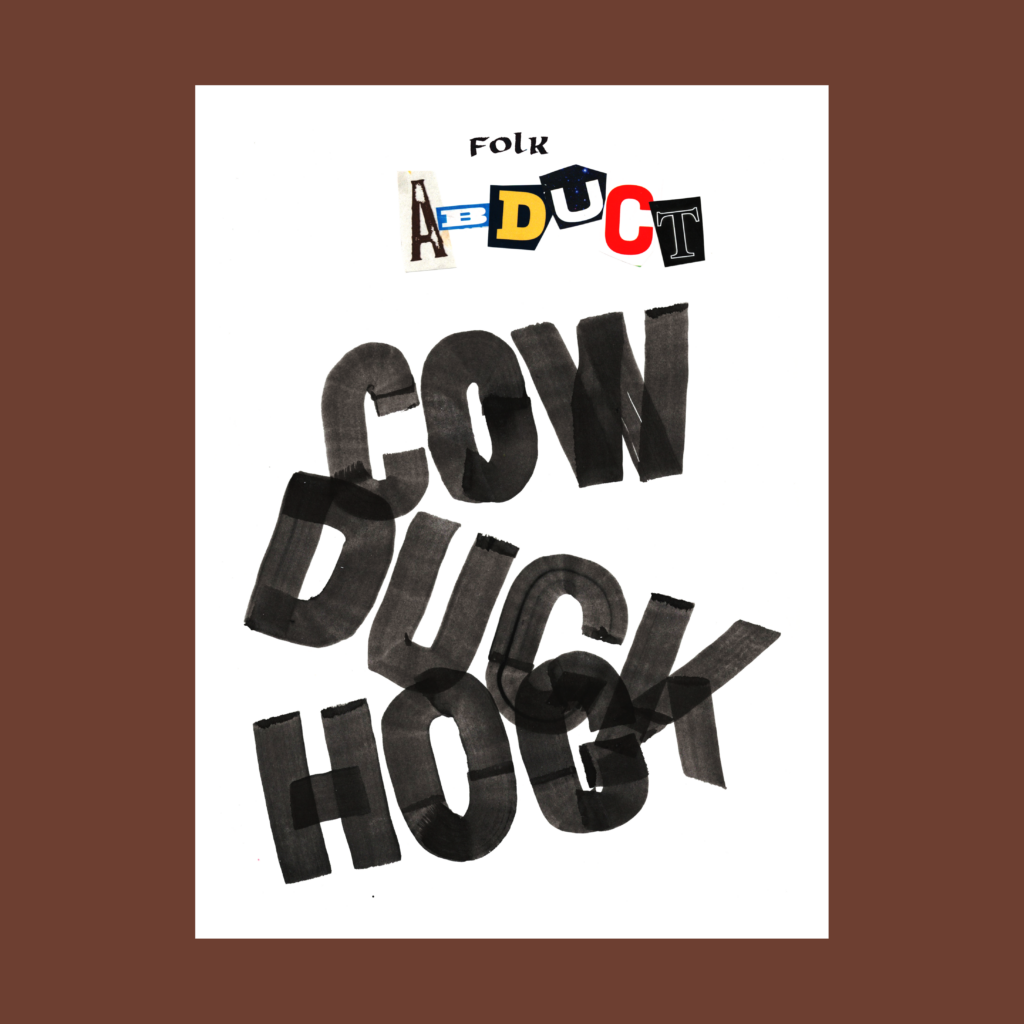
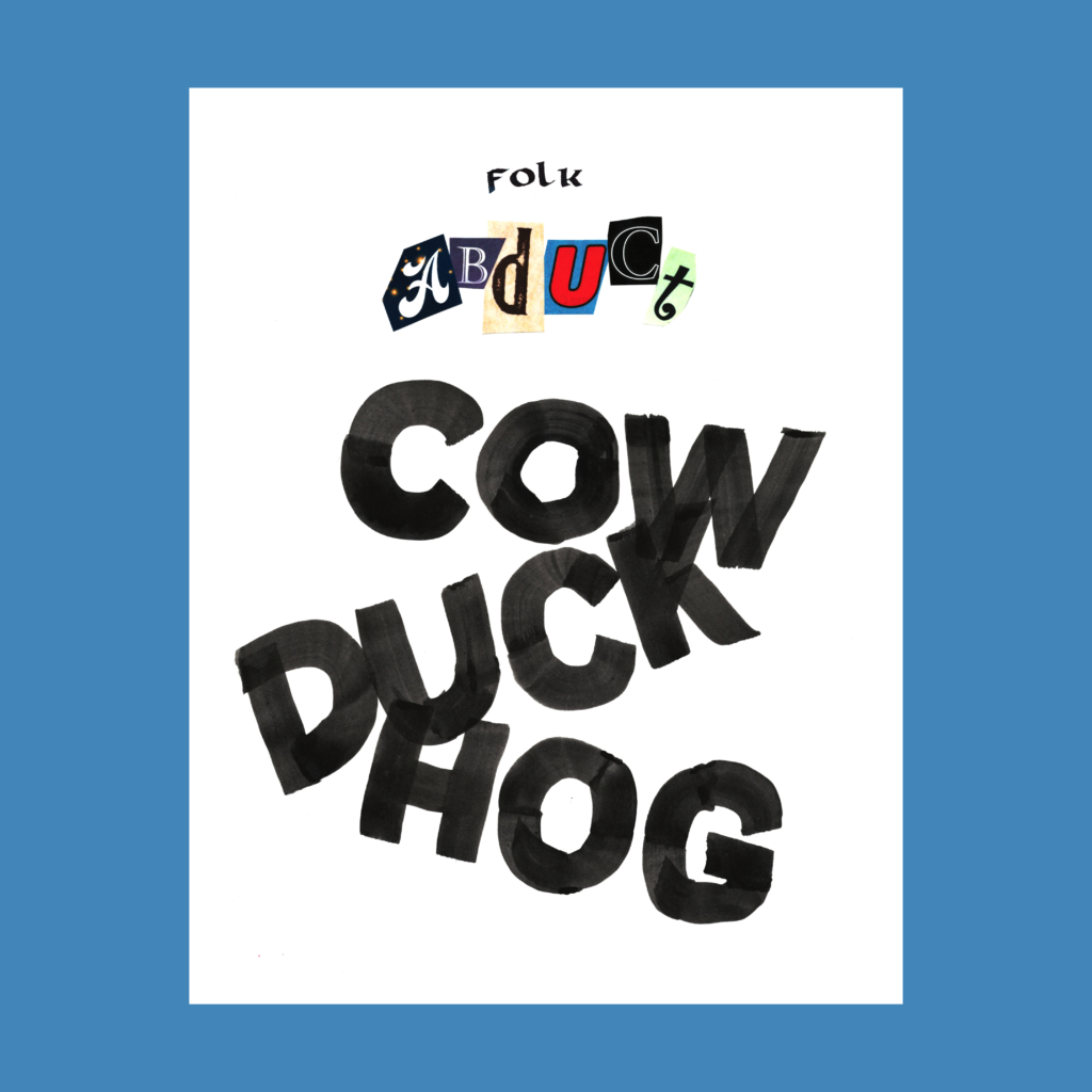
little folk abduct farm animals
After the time cutting out a pile of A B U D C and T’s from mailers and brochures, I had to show off all five attempts.
,
I’m trying to write these in advance, but it’s hard to keep up with the calendar. Time marches inexorably forward.
And commitments invariably multiply.
The doc just prescribed a half hour of aerobics, 5 days a week. It’s going to take every self-help hack I’ve collected over forty-five years to develop a positive mindset about this new 150 minute weekly time suck.
But I’ve been warned that heart drugs mean no more eating grapefruits.
So I must run and jump.
Cya next time!
,
PS—Analects of Confucius, translated by Robert Eno, 2015
The internet is a wonderful place.
When the pandemic hit, I finally started reading eastern philosophy. I can’t remember why I started with the Analects, but Robert Eno of the University of Indiana made it easy by freely sharing his translation of Confucius.
The Analects are a mix of history and proverbs, and Eno greatly aids the reader with a two column format that runs the commentary directly adjacent to the text It’s a brilliant layout to insert to add historical context and explain pithy sayings without interrupting the flow of the original.
I also enjoyed that Eno chose not to translate key words, such as ren, junzi, li, and dao. The transliteration allows these words to accrete their own meaning, separate from imperfect English analogues. Over time, these sounds become “real words” as you internalize this technical vocabulary.
In terms of thought, I’m temperamentally conservative so I naturally get along with this book even if the philosophy eventually calcified into an oppressive ideology of empire.
Confucius was merely trying to restore order in a dissolving society. These Analects are a collection of lively sayings, not a systematic philosophy. The flow is accessible, almost haphazard. This was a practical school, exploring the role of ritual, morality, and power in governance. As a bureaucrat, I feel an odd camaraderie with his students, through two and a half millennia from bamboo slats onto a printed PDF.
Even if you’re not a government drone, it’s worth a read. Daoism is more popular in the West, but one’s appreciation of Lao Tzu and Chuang Tzu will be enriched by better having a conversation with their stuffier sibling, Master Kong.
,
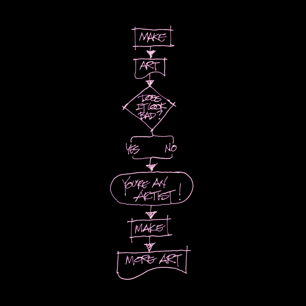
PPS—I doubt Confucius was into flow charts, but I think he’d dig this, courtesy of Miep, who shared a flowchart which I loved. I tweaked my version to utilize the shapes that are used at my government job.
Some 5WP’s from that came from here and out there.
,
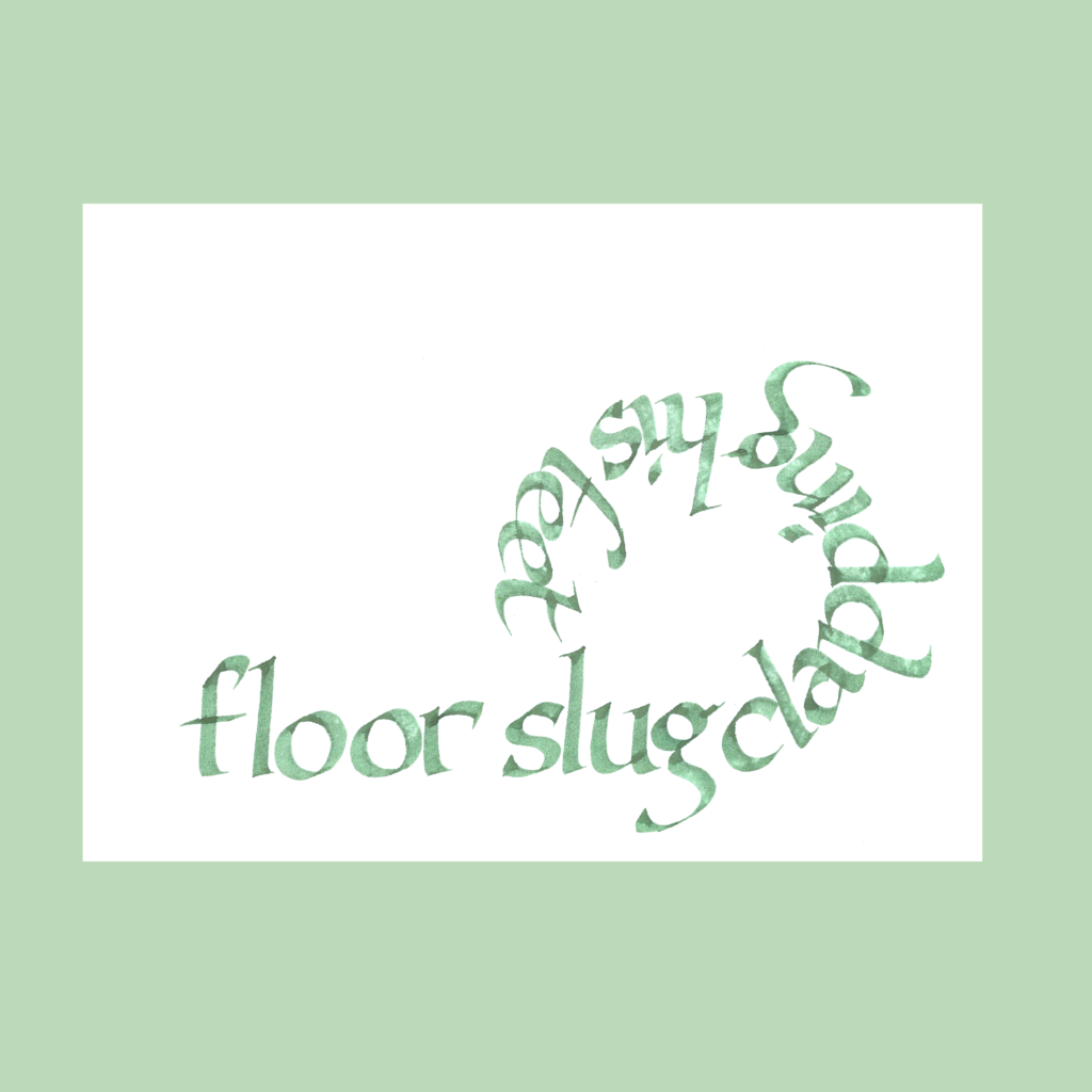
12/15
floor slug clapping his feet
When we eat, the boy wanders around the house. I wrote this after watching him mop the floor with his back and clapping his feet in the middle of dinner. The girl has always been well behaved at meals so I’m gonna chalk it up to genetics.
,
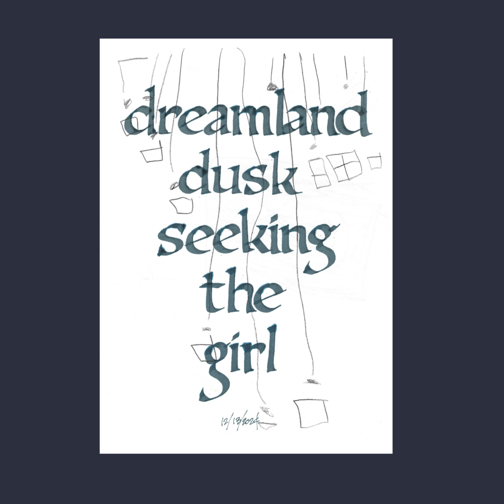
12/13
dreamland dusk seeking the girl
An early morning poem after waking up from a dream.
,
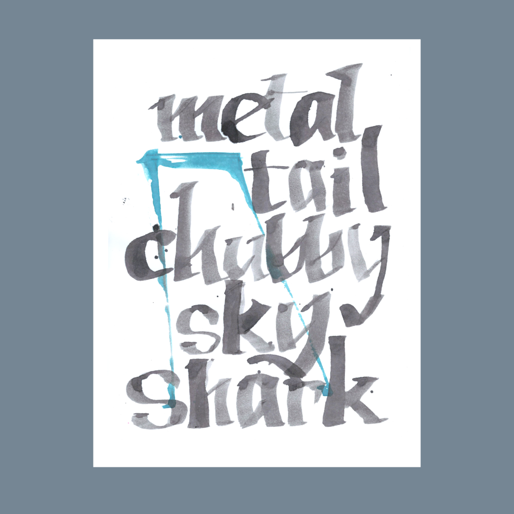
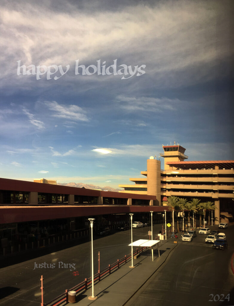
12/16
metal tail chubby sky shark
Next to the airport is a big shopping center. I’m always tickled by the tail fins gliding in the background by as jets prepare for takeoff while I’m parking the car to pick up oranges.
,
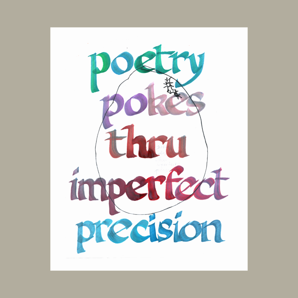
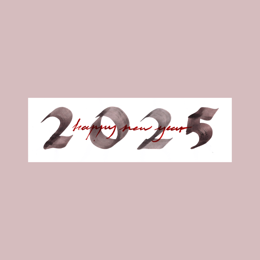
12/31/2024
poetry pokes thru imperfect precision
It started with the phrase “poetry is precision” but it felt too pat and wasn’t five words.
I have no business making pronouncements on the nature of poetry. If I keep this up maybe this will feel prescient. Or just cringe. Tomorrow’s problem!
,
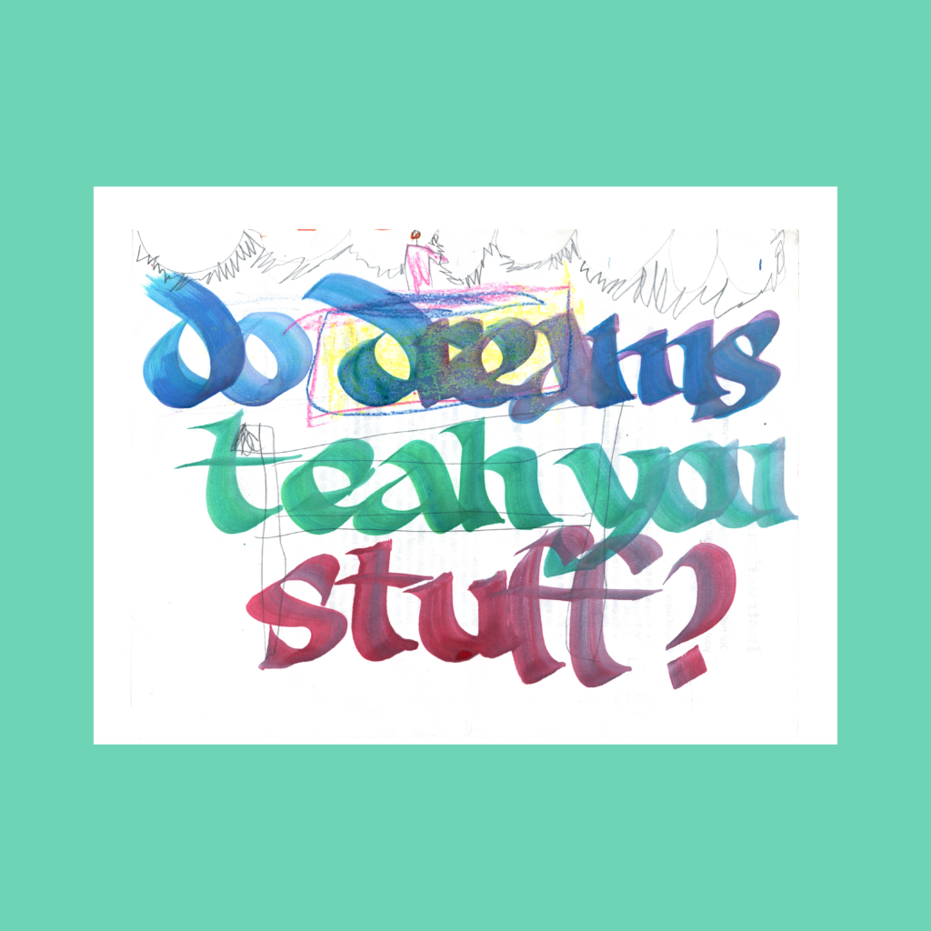
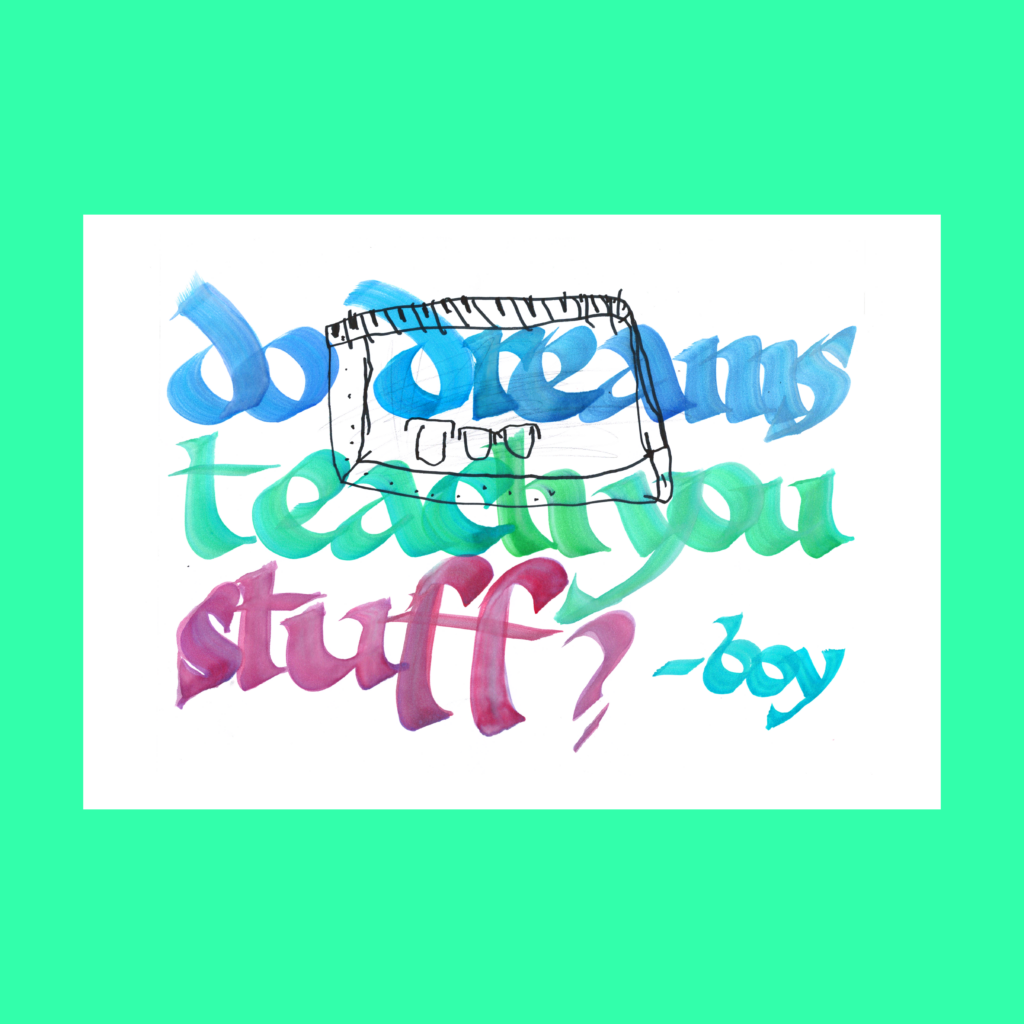
1/2/2025
do dreams teach you stuff?
A couple of weeks ago, the boy walked up as I was typing on the computer and asked an innocent question.
Unfortunately my first attempt had a mistake. But it’s prettier.
,
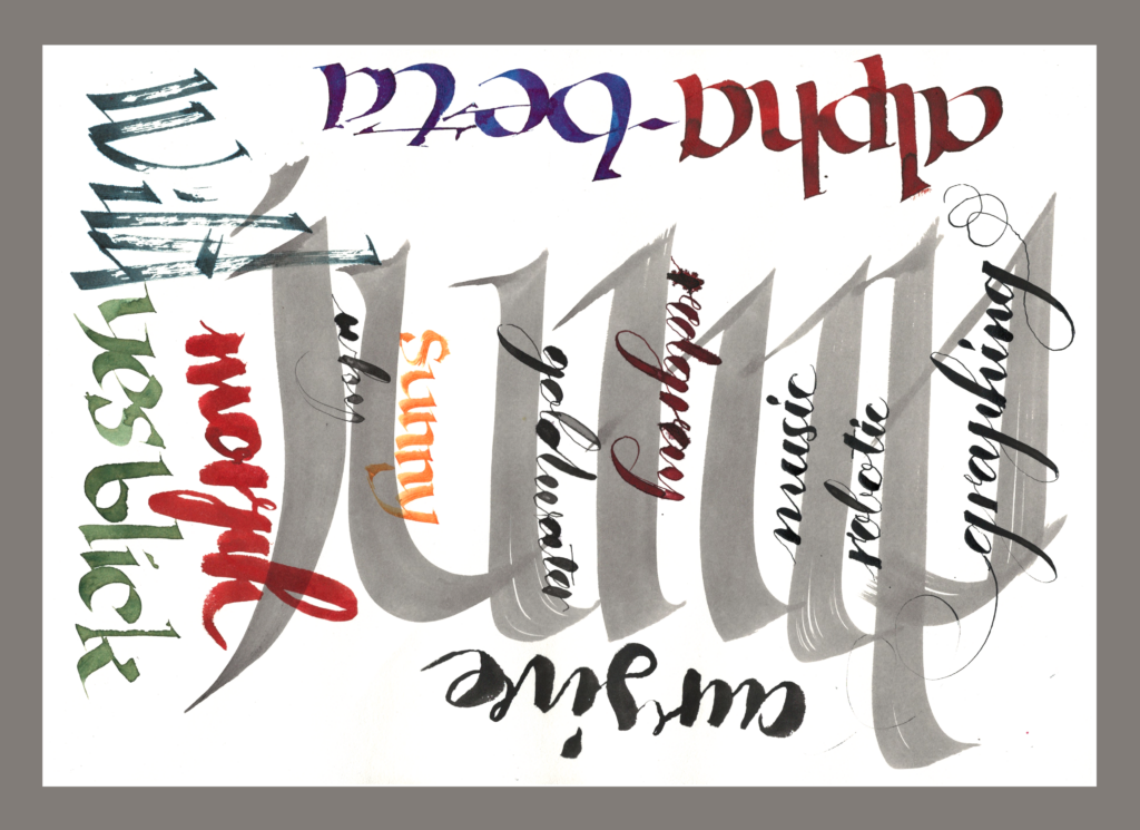
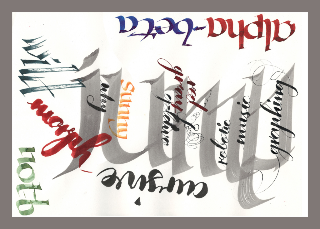
I’ve been focusing on using a straight brush for this month.
I’m not using a “real” standalone brush, but Pentel refillable brush pen. The price fluctuates wildly, but I’ve gotten them at around $8 for a pen (with two black cartridges). I refill the empty cartridges with whatever color I want. I’ve got three at home and one at the office.
We also picked up a straight brush from Blick for Christmas. Maybe I’ll pull it out and have something deep to say about straight brush calligraphy by the end of the month. Ha!
Cya next time!
,
PS–Magic Puzzle Company
In spite of my fatherly brainwashing, my kids just aren’t into boardgames.
But they did go through a jigsaw puzzle phase. A couple of years ago I found a puzzle at Goodwill priced at $12.99, when I’ve never seen a puzzle go for more than $2.99.
That price sparked my curiosity so I looked it up on Amazon. It had good reviews, the box felt sturdy, and the art was undeniably cute. I bought it for the girl’s birthday.
Bingo!
I bought another one for my son’s birthday (this time new).
Bingo, again!
These offerings by Magic Puzzle Company are spectacular. Thick pieces, intricate art, creative cuts, damn near magical. Heads and tails better than Ravensburger puzzles (which are already significantly better than other brands normally found in thrift shops).
So I’m giving it the highest possible recommendation. In a world where I can keep buying used puzzles at the library and thrift stores for two bucks a pop, I’ve purchased the entire Magic Puzzle Company catalog at $23 a piece.
To add a slight literary valence (and to avoid being a complete shill) I’ll also recommend that y’all check out George Perec’s Life a User’s Manual. I often think about the puzzle maker in that novel while playing these puzzles. It’s high time that I revisit that epic.
,
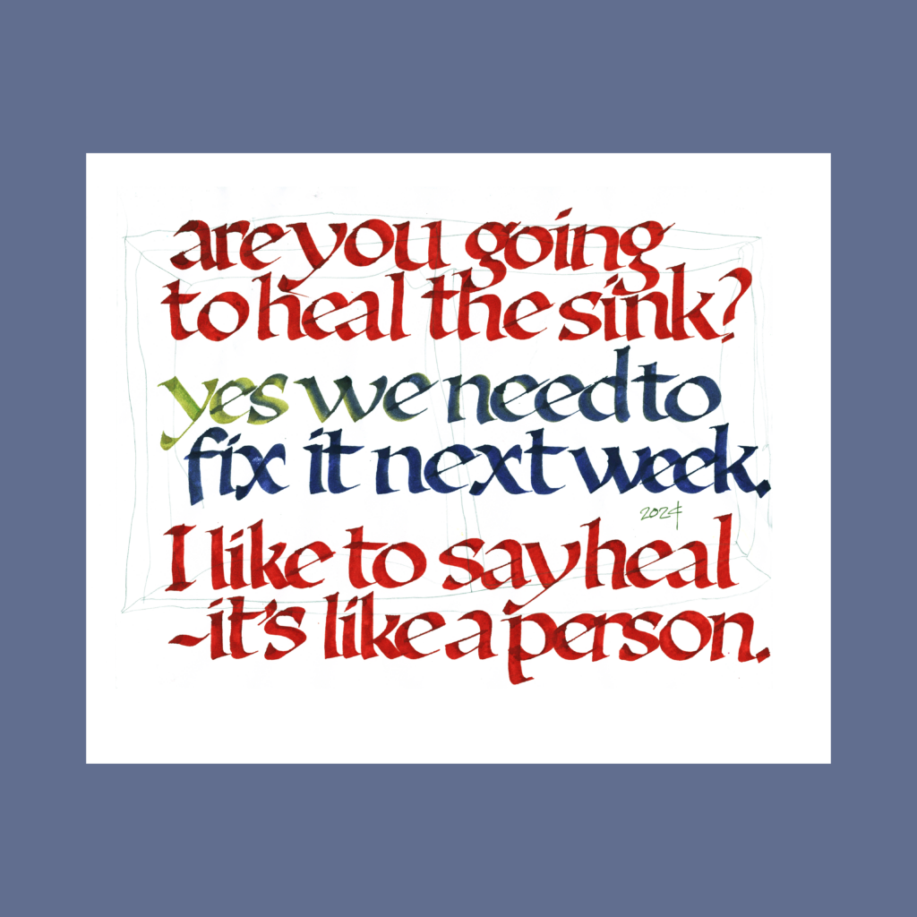
PPS—Heal
1/3
are you going to heal the sink? yes, we need to fix it next week. I like to say heal—it’s like a person.
From a conversation last year with the boy soon after we moved into this house.
With the holidays, I’ve fallen behind on these compilations. We’ll see if I catch up or if life will keep me busy so that production just falls off in this new year. It’s gonna be a busy year at work, without adding any burdens from a self-imposed hobby schedule.
,
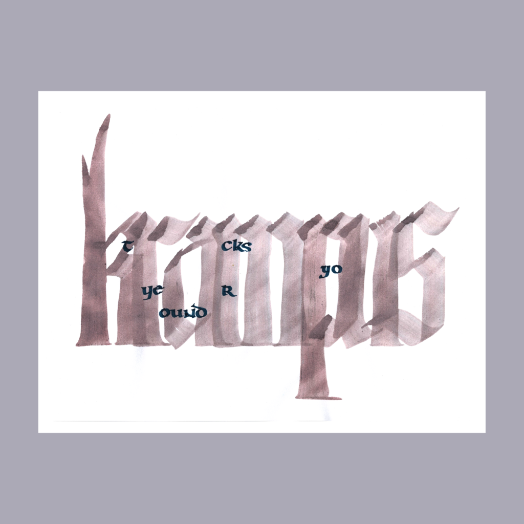
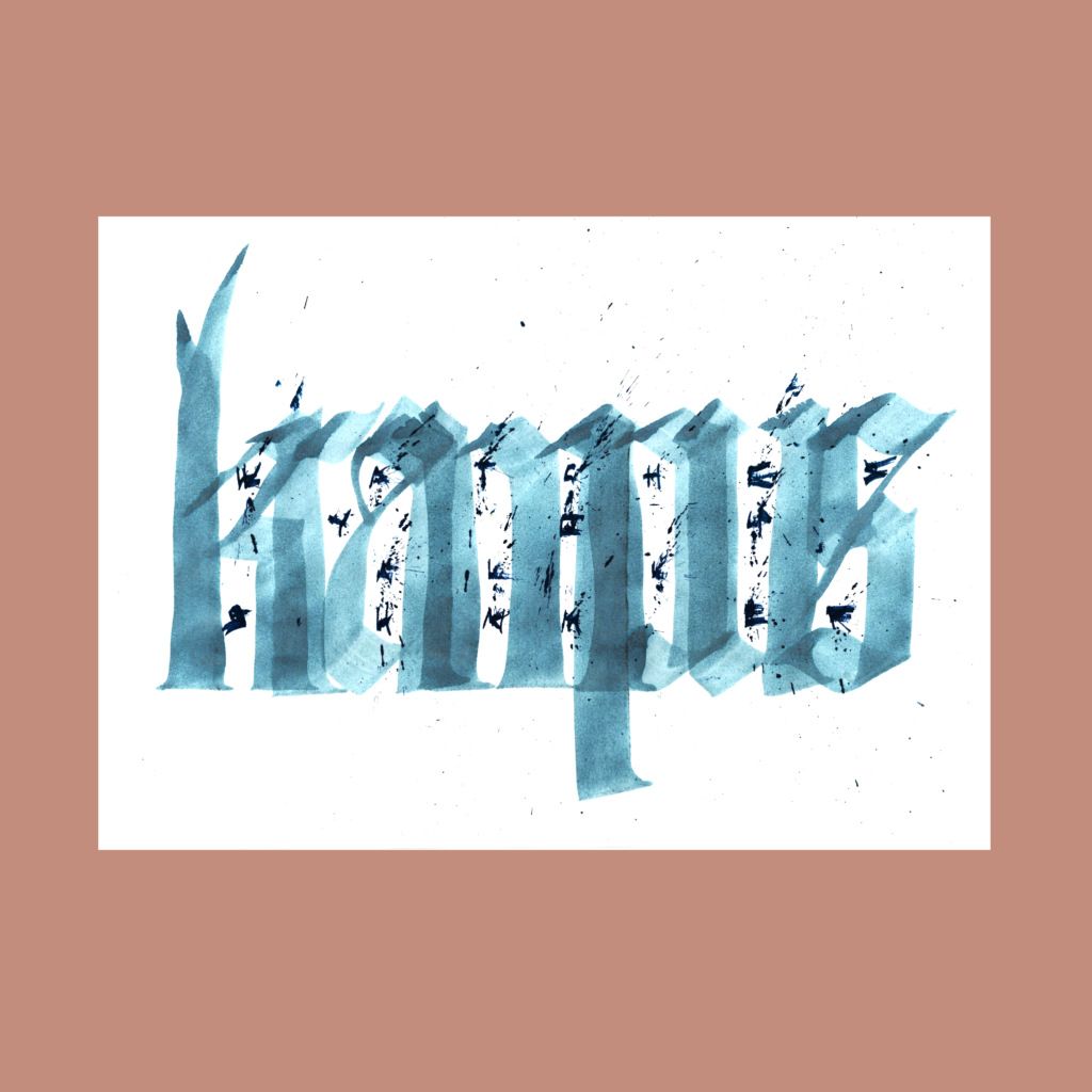
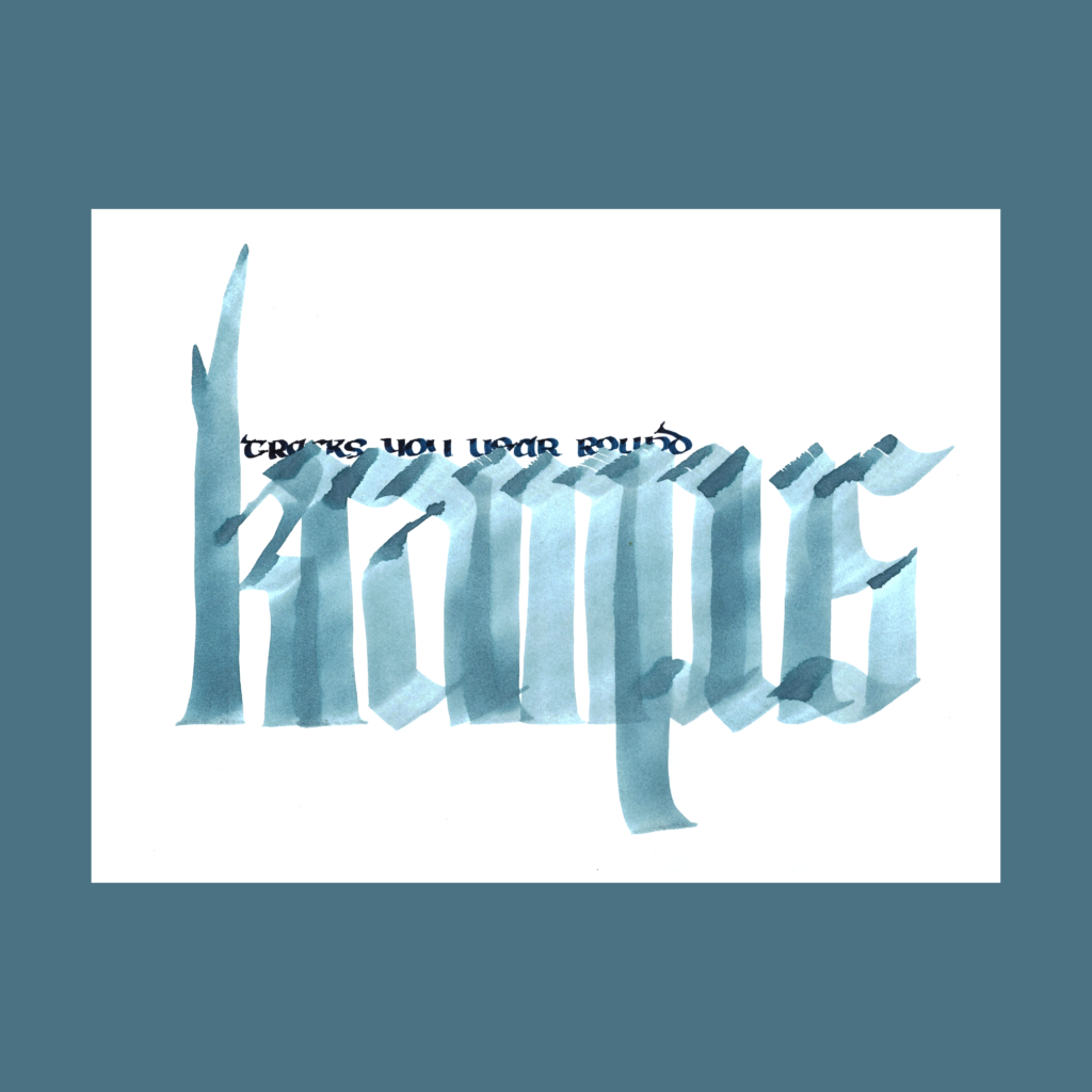
12/7 Inktober 52, week 49
krampus tracks you year round
I tried to create claustrophobia with Krampus spying through the caps in the words. Turns out that half-hiding the four words along the top was more effective.
,
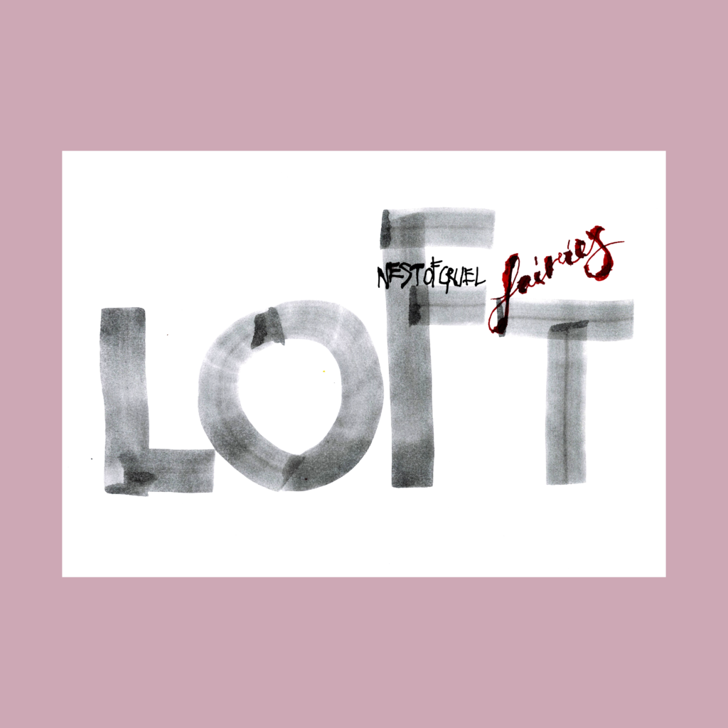
12/11 Inktober 52, week 35
loft nest of cruel fairies
Made a loft out of “loft”. Unfortunately, I’ve totally forgotten how I created that creepy effect with “fairies”, maybe with a ruling pen?
,
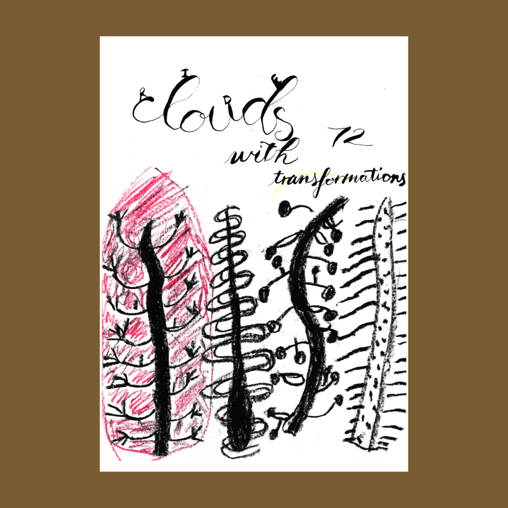
12/12 Inktober 52, week 34
ride clouds with 72 transformations
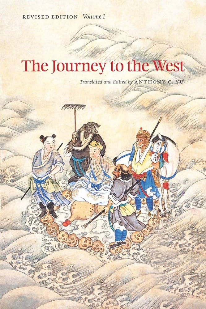
Another homage to the Great Sage Equal to Heaven. I used to believe that I didn’t have a favorite didn’t have a superhero. When the boy was old enough to get into the Sun Wukong cartoons, I realized I did had one all along, decades after my mom read these stories to me as a boy. Soon after, I read the Journey to the West and fell in love with that crazy monkey even more.
,
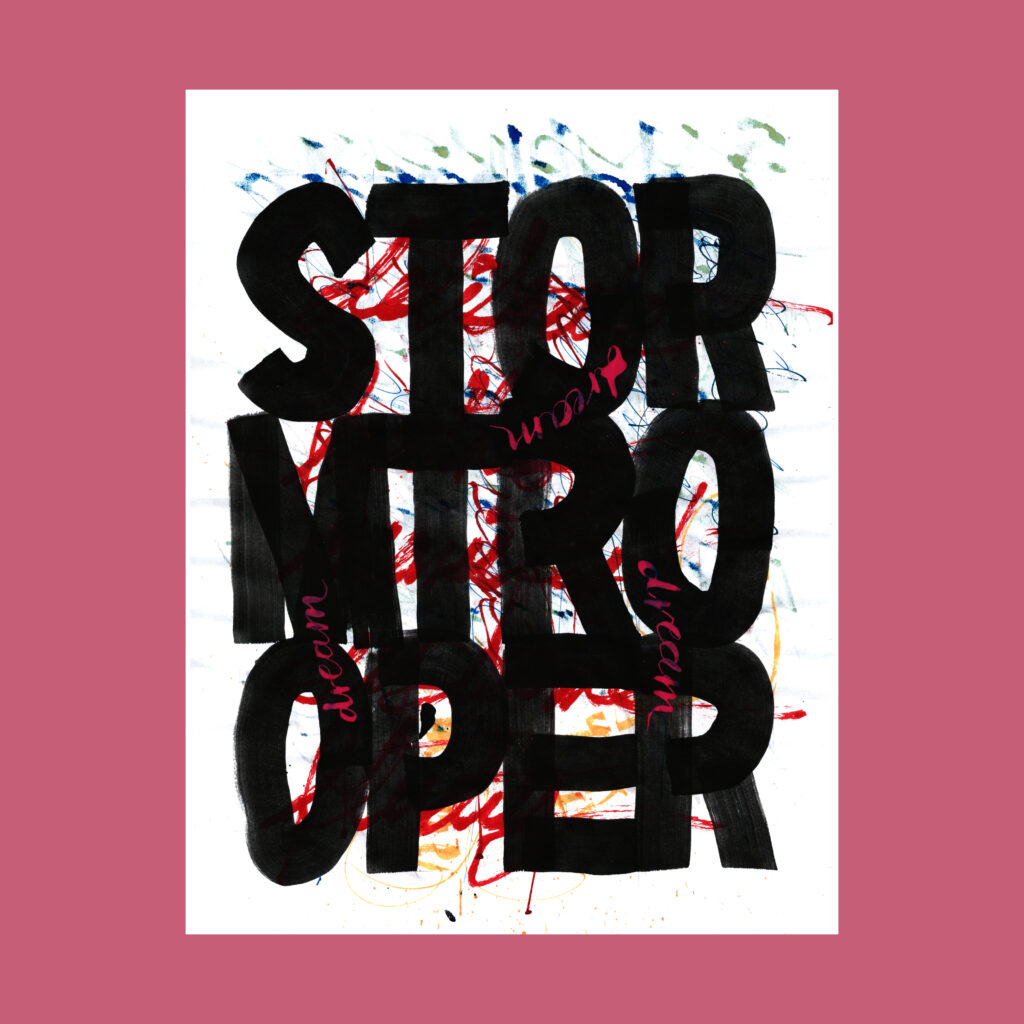
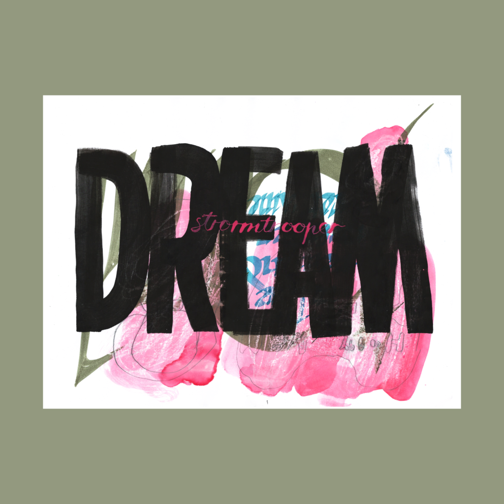
12/14 Inktober 52, week 33
pink dreams in a stormtrooper
pink stormtrooper in a dream
Stormtrooper was the word, but it played out in two different ways.
,
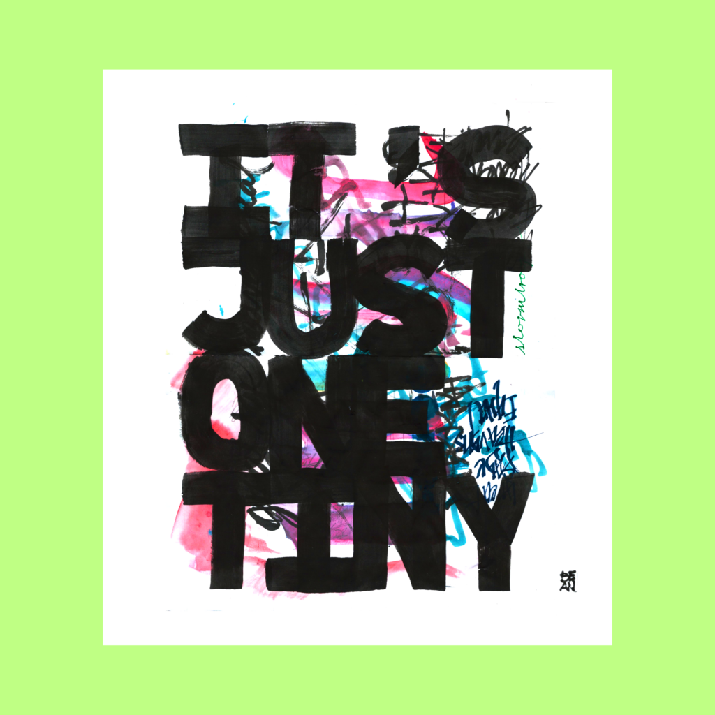
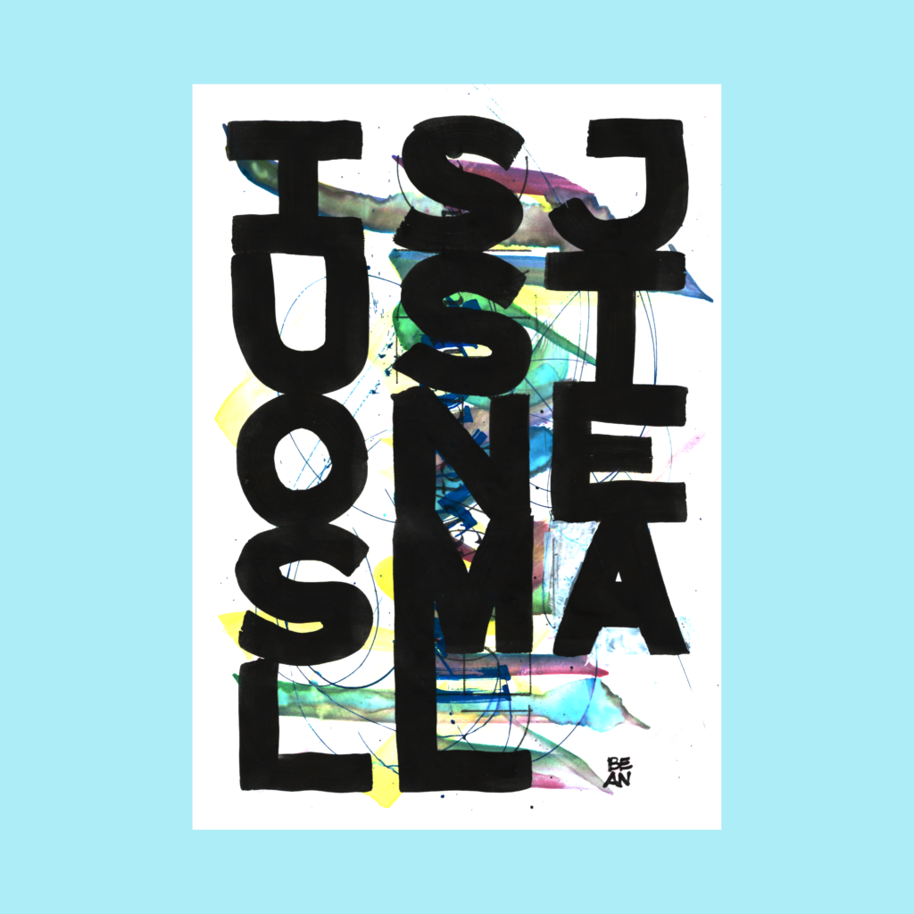
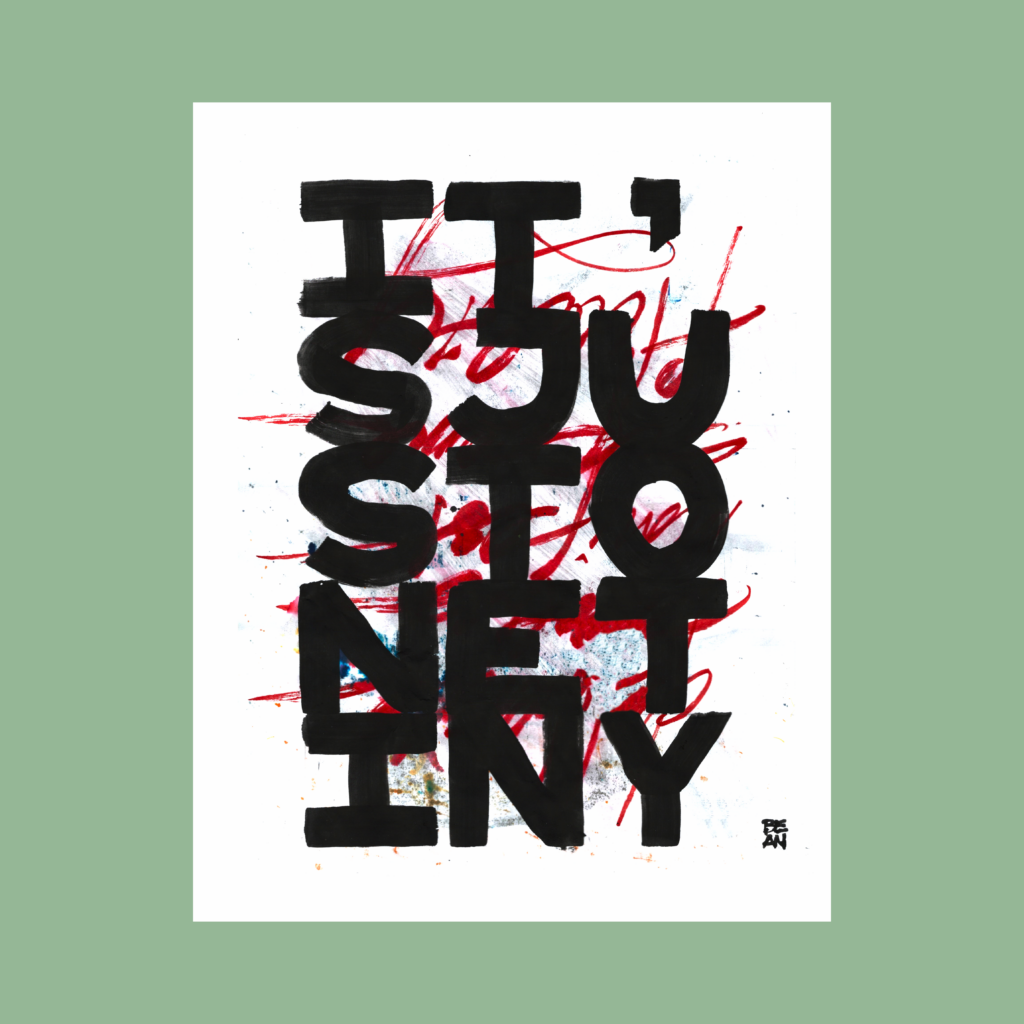
12/19 Inktober 52, week 31
It’s just one tiny bean
“Stormtrooper” and “Bean” are both unapologetically inspired by this essay by Michele Banks about the work of Christopher Wool. It’s is well worth a read.
The variations (among several more that aren’t published) show that there is a whole world of additional decisions that follow the initial concept. Details upon details, all the way down.
,
After all the decisions, there is the final execution. Which is always a thrill and terror.
Every time I get frustrated at a piece, I re-center by reminding myself that it’s a huge privilege to work on these drawings. I should savor these multiple bites at this apple. Is there any better use of time than making art?
Here’s to more 5WP’s in ’25.
Cya next time!
,
PS–Ties
Architects have a weird relationship with ties. We’re artsy professionals.
Look at the photos of any architecture website—we don’t wear ties. I never wore one in private practice. We’ll rock a sports coats for big meetings and some architects make a statement with a bow tie. But no ties.
But things were a bit more formal in the State. As the low guy on the totem pole, it’s best to be overdressed for government meetings. So I kept a coat in a car (with two ties, to match whatever shirt I might be wearing).
How about meetings where I’m not the low guy? In such a case, I like to signal west-coast casualness to keep folks at ease, but I’m still a government official. Last year, I finally solved the conundrum. I can just wear the tie, without the coat! With a tie, I’m taking the meeting seriously, but not I’m not full of myself.
A good example would be consultant selection interviews. I don’t want to outshine the interviewees, but I want to acknowledge that this is a big deal for them.
If I know I’m going to wear a tie that day, I’ll wear a long sleeved shirt, but in a pinch, a short sleeved shirt with a tie has a nice 50’s vibe to it. But wait! There’s more—the badge lanyard. At the State our employee ID card was functionally useless. So I never wore it except for meetings in other State buildings. In such a case I’m signaling that I’m “one of you” (versus the outside consultants or contractors).
,
PPS-Airport Dress Update
With airport security, the badge lanyard went from bonus to required. Even then, which lanyard? These things are all branded! Currently I’ve settled for a LAS lanyard that was passed out at an all-hands meeting. I’d prefer a thinner lighter lanyard, but until I splurge on a UC Berkeley lanyard, it’s best to rep for the employer.
More complicated is how to dress. For most folks that’s not a problem. Almost all of the airport dresses pretty much as we did at the State. But my boss comes from the East Coast. He’s always well dressed. Invariably better dressed than the top directors of this place! It’s a balancing act. As his subordinate, I don’t want to underdress my boss, but it feels weird to be overdressed to his bosses.
Currently my compromise is that while I’m in the office I dress as I’ve always done (button down and slacks). But whenever I hit the terminals I tuck the shirt in and wear a sports coat. If I’m in a big meeting, I’ll wear a tie. Definitely when I’m meeting the public or when elected officials, and I’m still figuring out how to play it out when it comes to our internal leadership.
So to that end, I finally bought a couple ties. First time in decades! I got tired of the old hand-me-downs with bland patterns and got a pair of simple navy blue ties (representing the color the new Harry Reid logo). With a sports coat in the car and another in the cubicle, I’m always ready to look formal.
Of course, I’m is totally overthinking things, nobody else is wasting brain space on such questions. But overthinking is what architects do. So Walmart is $20 richer, and I’m the proud owner of two blue strips of cloth.
,
PPS-Blick Paper Play
For Christmas we bought a ream of sulfite paper from Blick. I took a moment to compare it against an existing ream that we already have. The texture is the same so the only difference is a very subtle beige tint on the Blick paper that might have been washed out in the post processing.
Still, it’s always fun to play with all the tools on one sheet.
Prompted by this marker on the solar cycle—a few thoughts on the past year and looking into this fresh, shiny, new year.
Last year started hectic between moving into our new house and work piling up at my old job. That went from busy to crazy when the Administrator and Deputy Administrator were suddenly demoted adding a gray pall over the whole endeavor.
Soon after, I was contacted by a former consultant engineer about an opening at the Airport. I initially demurred, because I wanted to finish my current projects. On the last day the position was open, she called me back to just apply already!
Fine!
I applied, using an iPad in a San Diego garage apartment before heading out to the Zoo (copy-pasting from my LinkedIn profile!)
At my old job, the Spring during even-numbered years were always insane as we prepared for the upcoming State legislative session. Beyond normal duties, you’d be assigned a slew of projects to scope out and estimate.
Now add going to an interview, negotiating salary, accepting the gig, waiting for background checks to clear, and ultimately giving notice.
That was a long, fast three months.
Over that season, I realized that my old job was no longer recognizable. The place had changed and I was lucky to have been pushed into a new position.
Every new job comes with fresh jitters.
Especially joining a unique place like an airport. It’s a high security mini-city transportation complex that’s carefully regulated by the federal government. Plus learning the different politics of being part of a new agency.
I shouldn’t have worried. Each of my colleagues went through their own shock whenever of joining the airport and were all happy to help.
And it was nice to be spare working crazy hours…and not having to think about work when I wasn’t at the office. This freed me to cement my daily practices.
Before I left the old gig, I had started posting a daily “Vegas Ordinary” photograph to maintain a minimal semblance of creative sanity. With the extra breathing room at the new job, I turned it into a wider tracking exercise—clearing out blog drafts, diet, physical exercise, and music practice . In August, I pivoted from photography towards calligraphy.
This endeavor was supercharged when we bought a printer-scanner and I pulled out an old light box. I was now composing on sheets, not just scribbles in notebook!
This new obsession survived it’s first big interruption—a week in September with COVID. I was still graphing at the end of that lovely time off, which made me confident enough to step into two months of daily insanity.
At first it was “just” Inktober. I planned on just doing a simple 5 Word Piece every morning. Nice and easy, but composition (and yeah a little competition) consumed the month.
Inktober lead into Callivember and sixty-one days had suddenly disappeared. I’d unknowingly signed up for an unpaid part-time internship. At least I progressed quite a bit by pushing my limits every day.
But no time for rest. By the end of November it was time to get into the holiday spirit, make cards, wrap presents, and boom we’re now in tax season!
So what to make of this new year?
I’m not serious about goals but I am fond of noting a yearly theme. The exercise helps me reflect on the past year and nudge my attention for the new trip around the sun.
At first, I toyed with the idea of a mass purge. Refinement. Crucible. Burn the dross. Much too aggressive.
Let’s go with a much gentler vibe of “letting go”. Admittedly I started 2024 hoping to work through this slew of old blog posts and unfinished digital projects. This time I’ll take a chill approach to clearing them out.
I don’t plan on changing jobs this year. So hopefully I’ll make a legit dent this time! Or maybe, I’ll end ’25 with the realization that I need to let go of that urge to clean out this digital house.
We’ll find out in 365 days. Hope you’ll hang around for the fun!
Here are five non-prompted 5WPs that popped up over the past few weeks. It’s a fun challenge to memorialize a moment using only five words and then make it pretty.
,
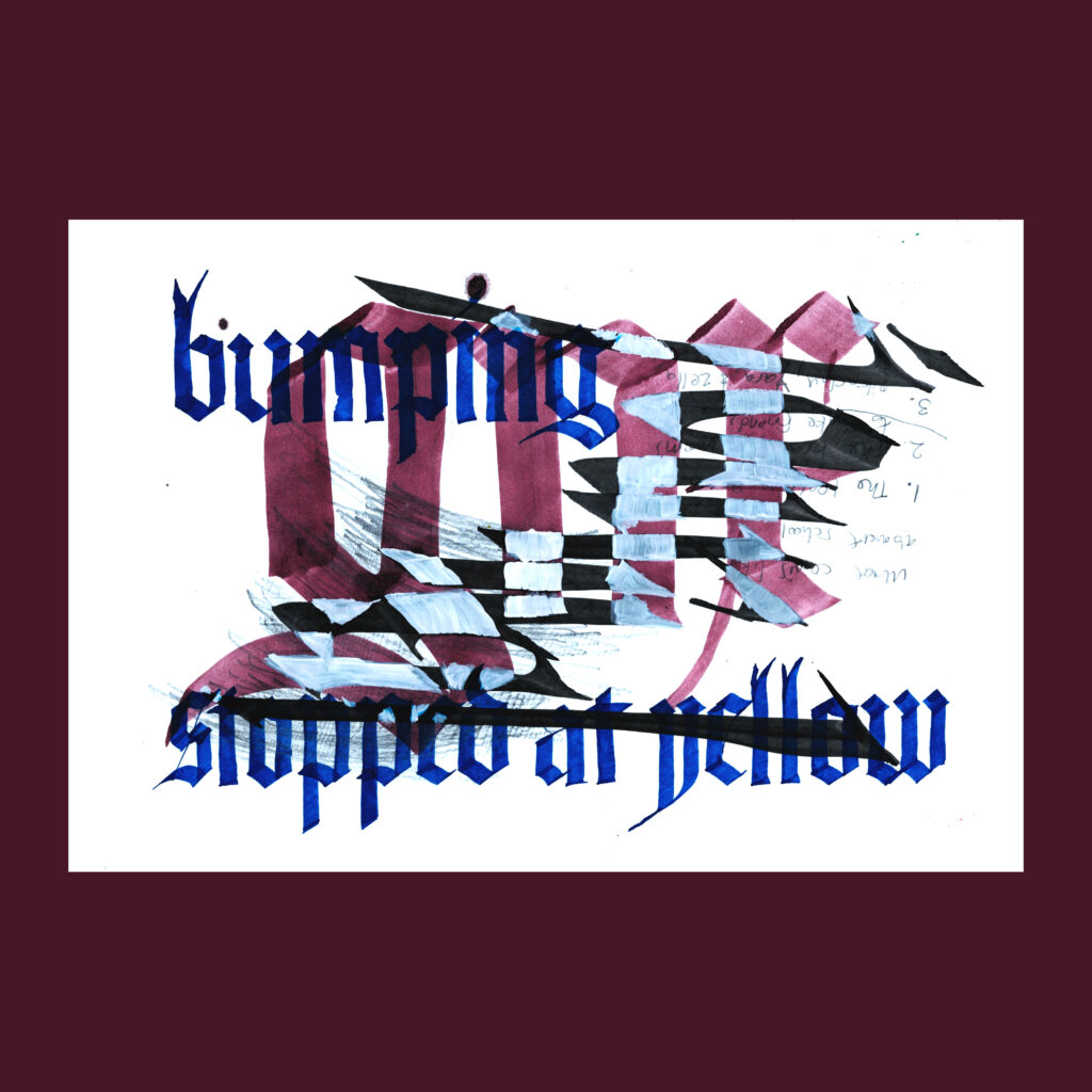
11/26
bumping gnx stopped at yellow
I had just hit 55mph on the highway when the light turned yellow. Even though I was vibing hard to the first track on Kendrick’s new album gnx, I slowed down and stopped.
,
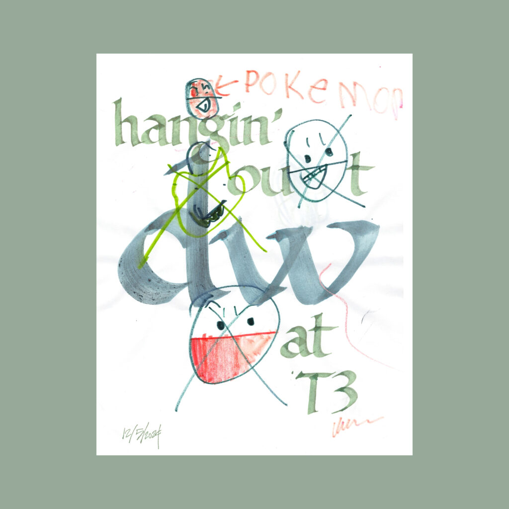
12/5
hangin’ out d. w. at T3
On Thursday, my sister’s flight was delayed a couple of hours so I got a little extra time to hang out with them. That evening, my substack friendd.w. was flying out of town, so I hung out with him at the airport bar. It’s a big perk to join folks for their last few moments in Vegas.
,
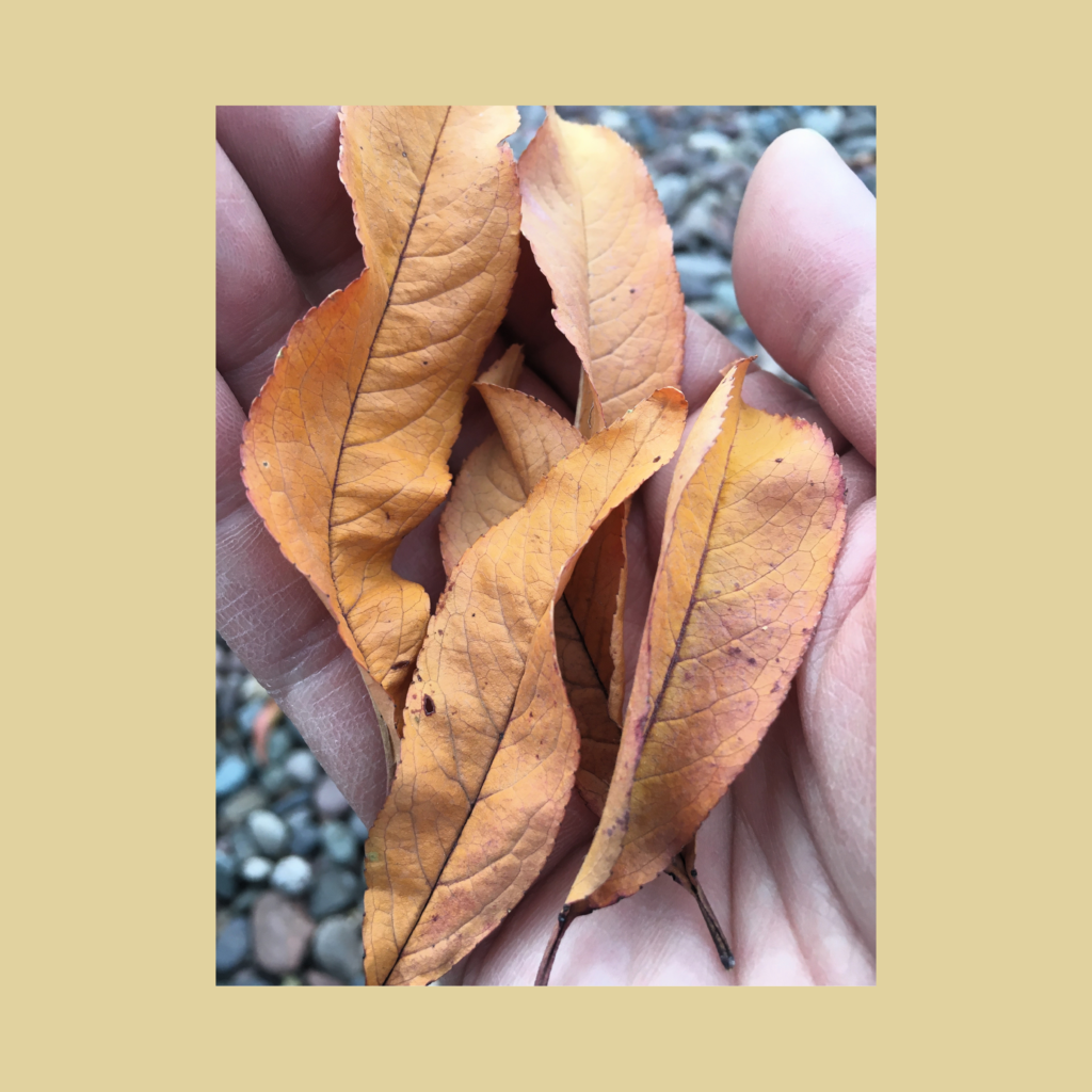
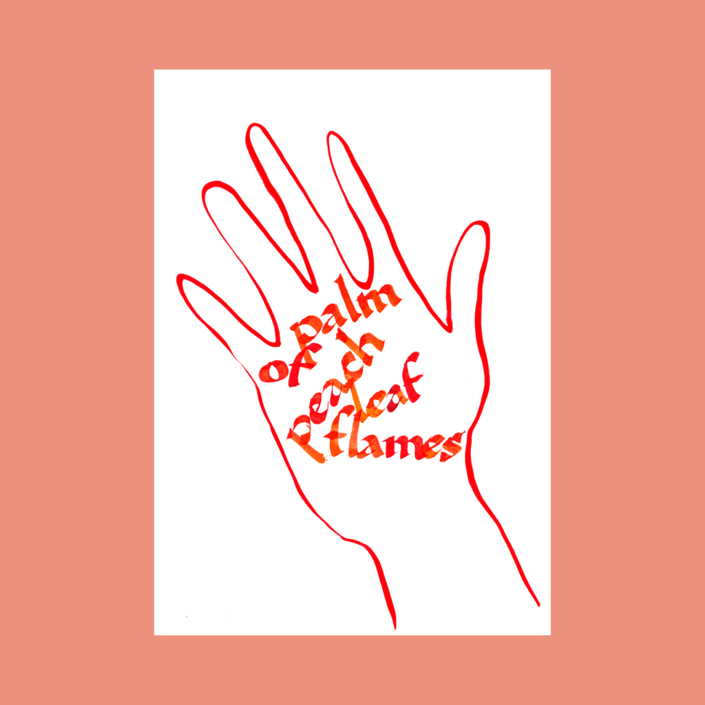
palm of peach leaf flames
We visited the grandparents after Thanksgiving. This popped up while helping the kids collect leaves and twigs to make a nest on the patio.
12/6
,
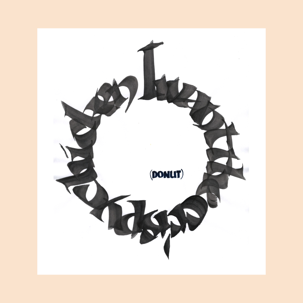
12/9
I want the crispy chicken
(donut)
We had fried chicken for Thanksgiving. A week later I bought four donuts from Randy’s Donuts (a chain entering the Vegas market). This was his choice for the first day.
,
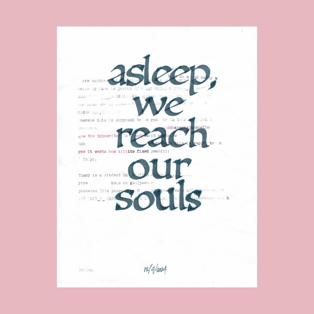
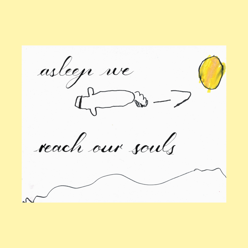
12/10
asleep we reach our souls
I have no idea how this line popped into my head, but it was a perfect 5WP.
On the first version, the boy typed the background text while testing a new ribbon for my typewriter. It doesn’t scan dark, but it’s a huge improvement over the twenty year-old ribbon.In undergrad, I didn’t use the computer for art or architecture work. When applying to grad school I bought a Remington Quiet-Riter so I scan in real typewritten text to emphasize my hand work. I got into almost all of the schools, so I guess they appreciated my devotion to this illusion.
,
A few weeks ago, I deleted all social media apps from my phone to detox from those random dopamine hits keep us constantly distracted. The only exception was YouTube, because it has become a second podcast player. In the void, YouTube started creeping up.
I found a solution in ZenScreen, a simple free app that delays how long it takes before YouTube opens. If it’s important, I can wait 60 seconds. If not, I’ll lose patience and slip over to the podcast or music app.
I don’t care about their tracking features, but the core delay feature works perfectly….though I’m not sure how long it will last. I find that most life-hacks are only effective for about six weeks before my monkey brain finds a workaround back to the juice.
Cya next time! Justus
,
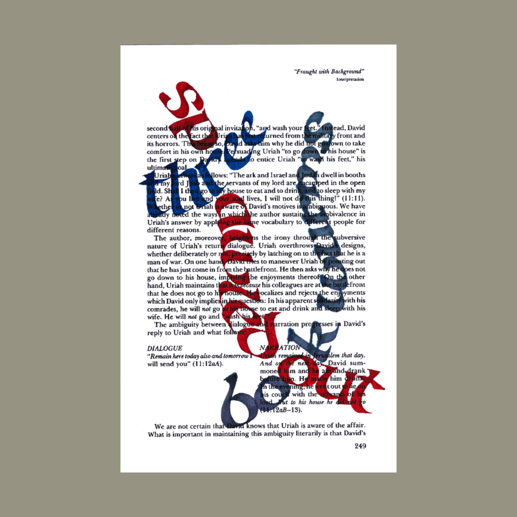
PS–Reciprocal Paradox
As a Project Manager I try to cultivate a feeling of psychological safety with my design team. I hope this will draw out that “edge” from each individual on that team.
But if I don’t sense that “edge”, I will judge the heck out of you as a professional.
,
PPS-1901Modern Pen and Ink
As a dude with money to purchase (and the time to read) a 123 year old book on pen and ink printings, I have more in common with the socialites depicted on these pages than the exhausted workers toiling in their slums.
Privilege is a weird thing. In today’s chaos, it’s easy to feel that we’re the victims of our story, but every single person reading this has been gifted with a cornucopia of great things (such as a flat screen monitor/device integrated with an unimaginably cheap, powerful, and small supercomputer).
,
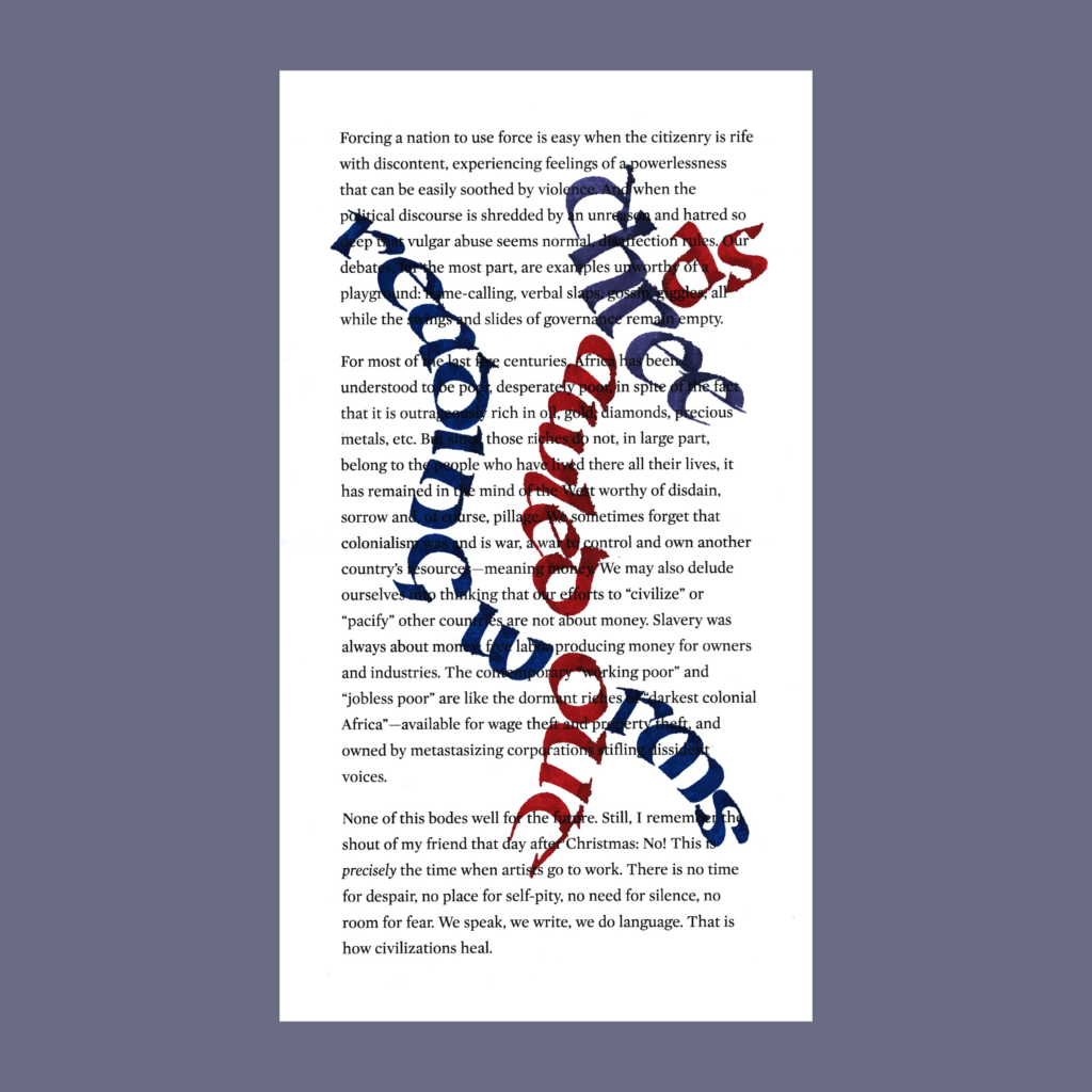
PPS-Reactionary Classics
Earlier this year, academia hosted a plagiarism kerfuffle which has driven me deeper into my preference for “great books”. If nothing is guaranteed (and now likely laundered by AI), at least the classics have stood the test of time.
Yes, these classics are plagiarized works themselves—bits and bobs accreted over decades until they were frozen for millennia. But the ones that have survived to the present were so damn good that generation after generation thought it was worthy to reproduce by hand.
Having wrapped up the daily challenges of the October and November, I’m slowly playing through old weekly prompts from #Inktober52 along with random 5WP’s that pop in my head.
It will take a few shots to find the right feel for these posts, but at the moment I’ll be posting a five-pack of 5WPs along with a hastily edited old blog draft that needs to be finally pushed into the wild.
Here’s to new-old projects, starting on the last month of the year!
,
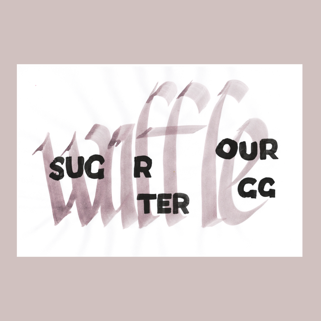
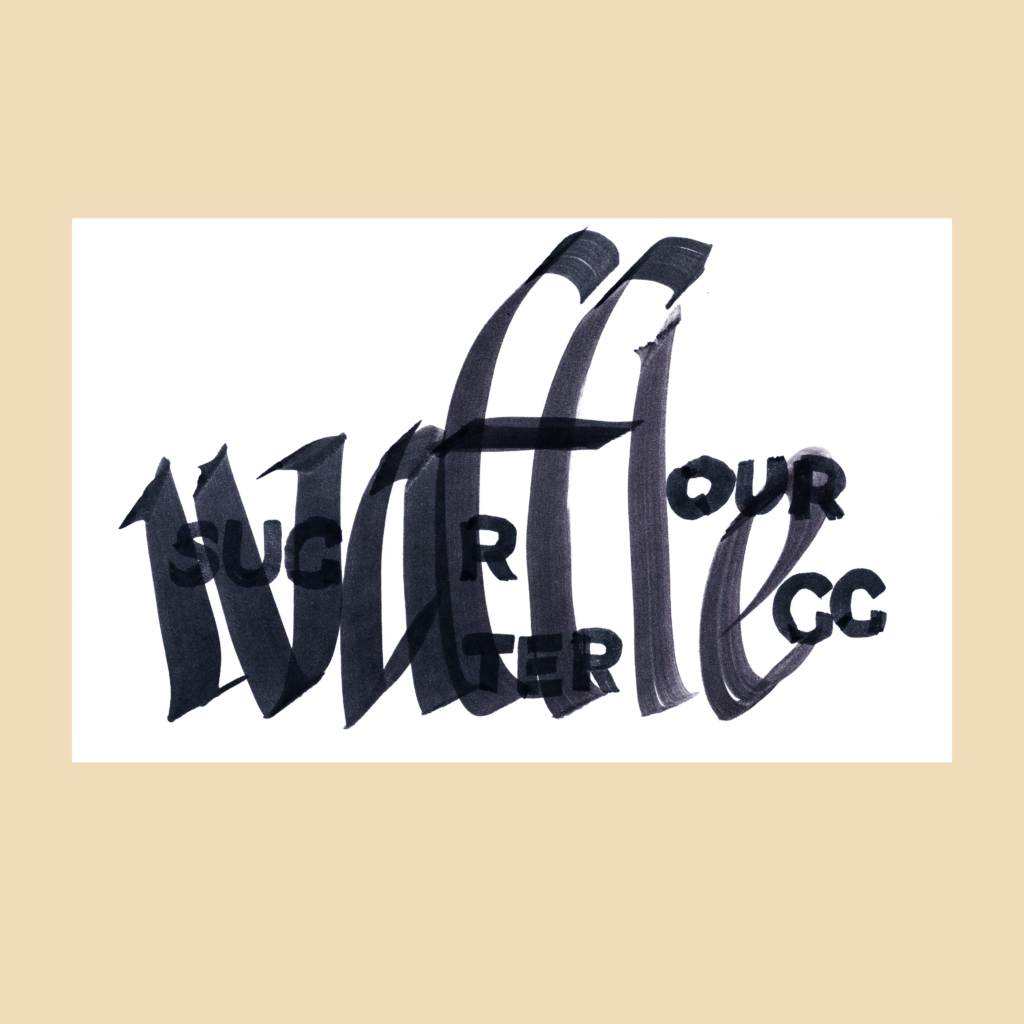
11/16—Inktober 52, week 46
waffle water sugar flour egg
My favorite book on bread baking is Tartine Book No. 3. Chad Robertson’s ambition is breathtaking. I am also fond of Ken Forkish’s Flour Water Salt Yeast, which a huge help when starting my sourdough journey.
,
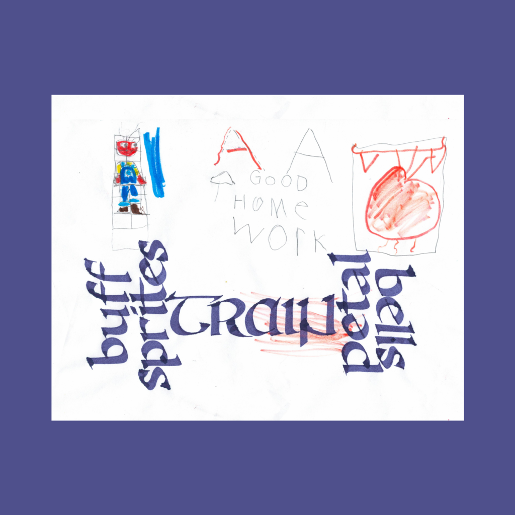
11/23—Inktober 52, week 47
buff sprites train petal bells
The visual pun to make a dumbbell of words didn’t land perfectly, but it was greatly helped when I flipped “petal” to align with ” buff sprites”. For many attempts I kept “petals bells” oriented towards “train”, but it read as “train bells petal”. On the other hand, the letters clash if “bells” is flipped into alignment with the other three lines.
But I don’t totally mind the orientation weirdness of “petal bell” because it emphasizes the rhyme pun of that pairing.
,
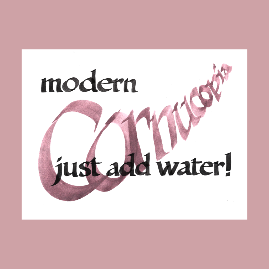
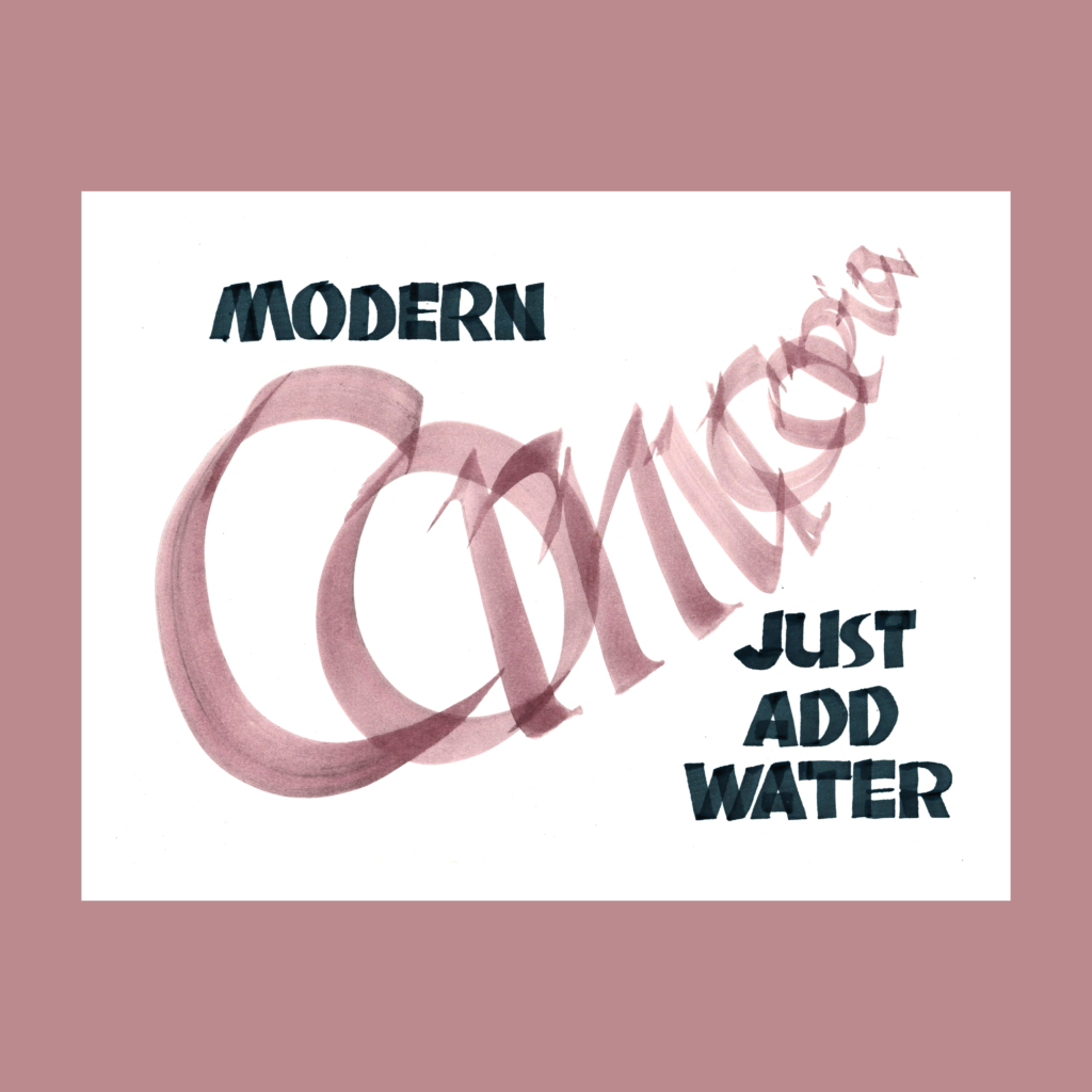
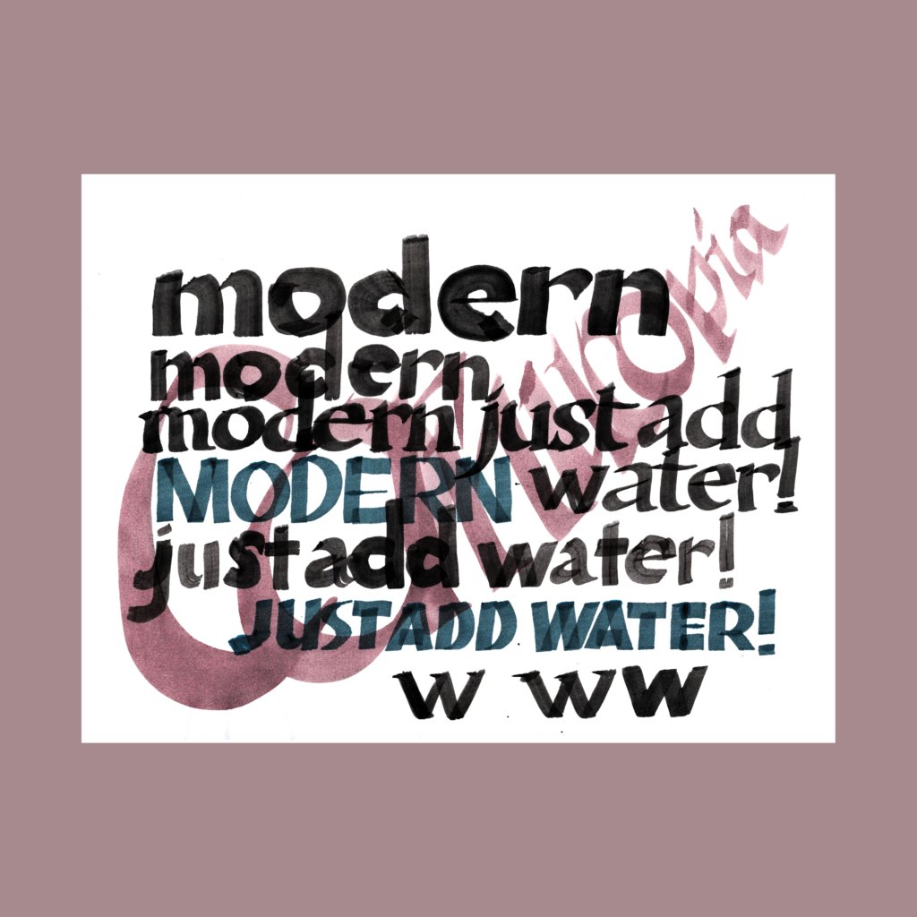
12/3—Inktober52, week 48
modern cornucopia just add water
My standard process with super-graphics:
Sketch a concept with thumbnails.
Warm up on previously failed sheets.
Take a bunch of shots on “good” paper.
Fill in the remaining four words of the 5WP in varying ways until I run out of patience/paper. (The thumbnail sketches never work full size, so I usually flail around for a few sheets before settling on a couple decent solutions.)
Scan them in.
A few days later (after the rush of the moment has cooled), I make final selections and complete the edits on the computer.
BTW, I’m fond of this failed sheet which became the background for testing scripts.
,
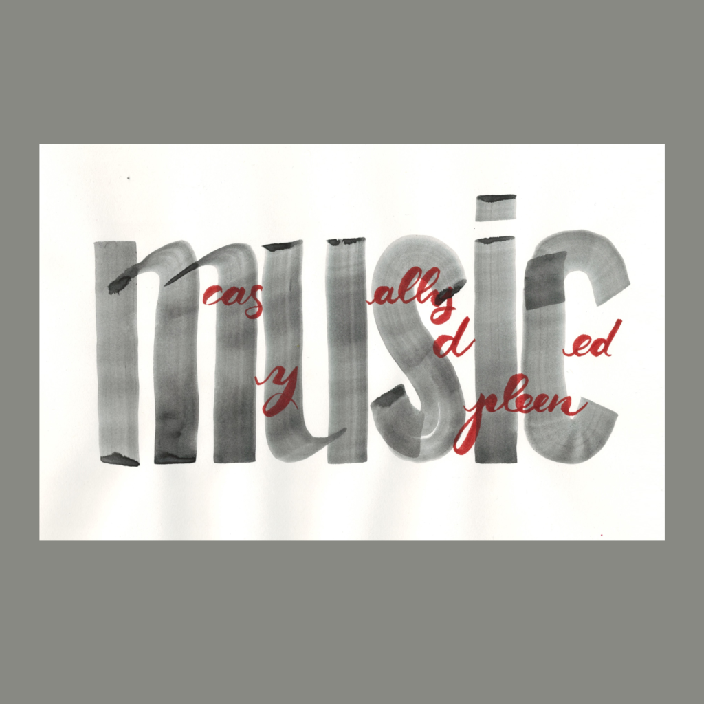
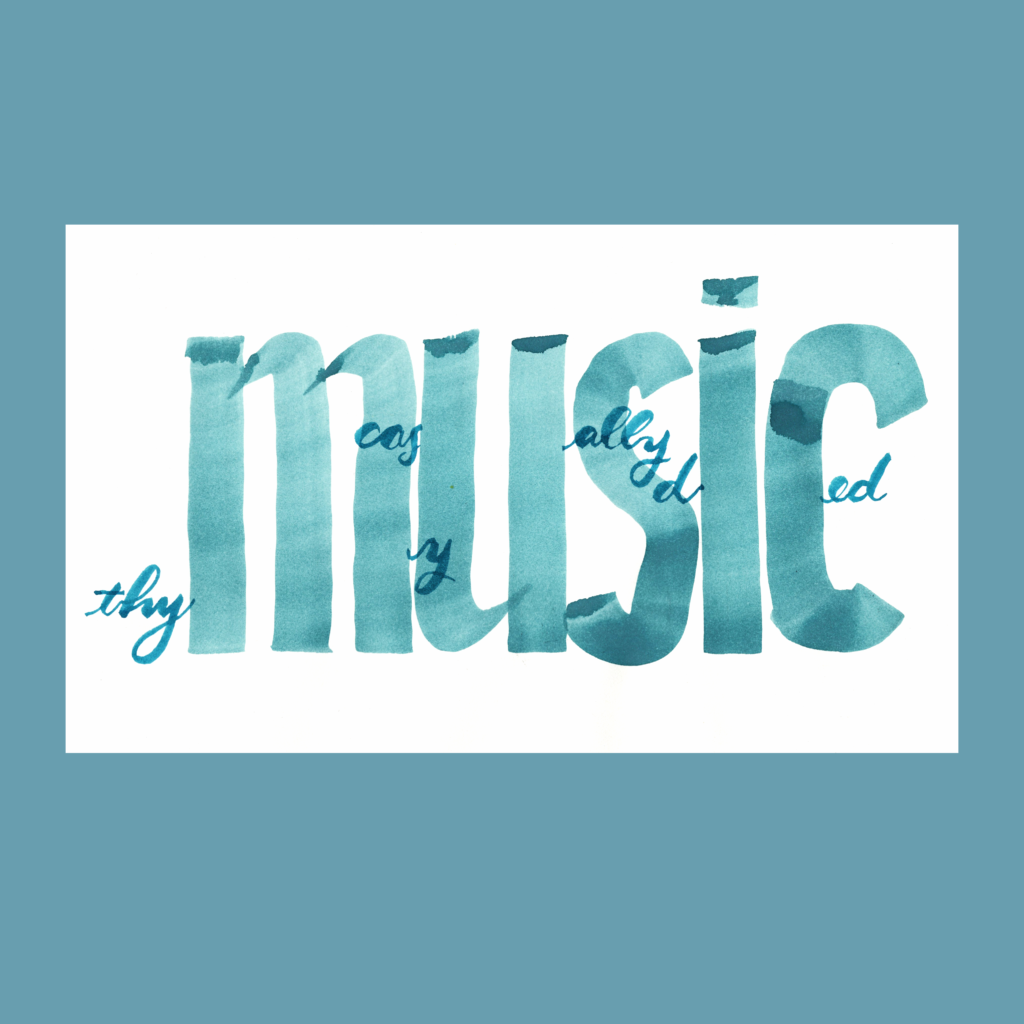
12/4—Inktober52, week 36
music casually diced my spleen
Even though I already played with the visual concept of interlaced words on “boss” and “waffle”, there’s always more to explore—along with thymus and spleen, I also considered pancreas and kidneys.
On a serious note, check out Nadia’s beautiful essay about music and healing.
,
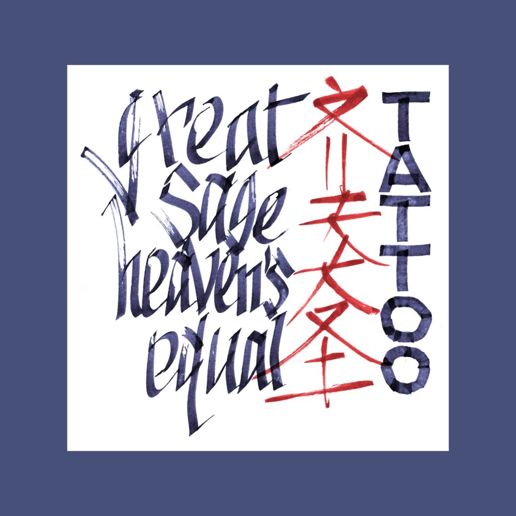
12/5—Inktober 52, week 37
great sage heaven’s equal tattoo
My Chinese calligraphy is awful, but this prompt begs for bad Asian brushwork! Unlike my frustrations with an art I’ve never practiced, I had fun going brush-ish with the Pilot Parallel—it felt simultaneously of street-ish and asian-ish.
I don’t have a tattoo, but if forced to pick something, I would adopt the bravado of this Monkey King’s self-granted title…maybe to compensate for the lack of such bravado in real life!Plus a hard recommend for the Journey to the West. It’s truly one of the four classics novels.
,
A full week after the official end of the challenges (and three weeks after actually finishing my paper graphs for the prompts) my brain has finally slowed down enough to let me practice without feeling a need to produce another 5WP every morning.
As threatened over the last two months, I’m back to practicing Copperplate, learning to wrangle that flexible pointy nib and trying to avoid gigaton ink blobs after dipping the pen.
It’s a simple meditative morning practice. I listen to a podcast while doing three lines of basic strokes and then fill a page in the sketchbook with whatever words that pop into my brain from that podcast.
There are a couple of enticing project ideas the horizon, so I expect to crank up the machine again, but it’s nice to enjoy the downtime.
Cya next time!
.
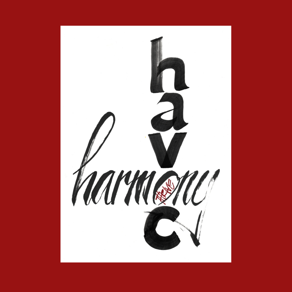
PS-Social Media Indulgences
In June, I drafted this listicle of lists from various social media posts. I was trying to keep a monthly streak alive, but it never got published!
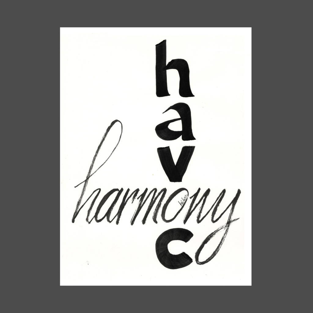
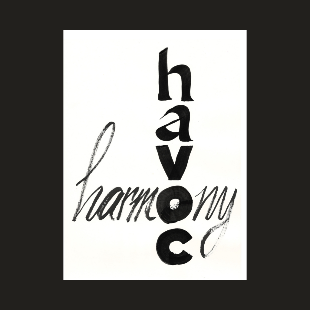
I finished this piece ten days before prepping the scan for upload. Plenty of time to forget the exact wording before final edits in the computer. So I came up with “better” wording, dragging me back to the drawing board. I didn’t like the initial version (with the cursive harmony O) so I tried again with the heavy O.
Two extra trips to the drawing board before remembering the original wording and realizing that the alternate version only has 4 words.
That’s why it’s important to write things down!
harmony hides in havoc
,
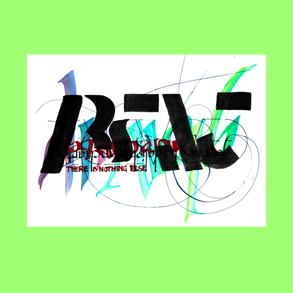
aesthetic without rigor is nothing
5WP as a math problem.
,
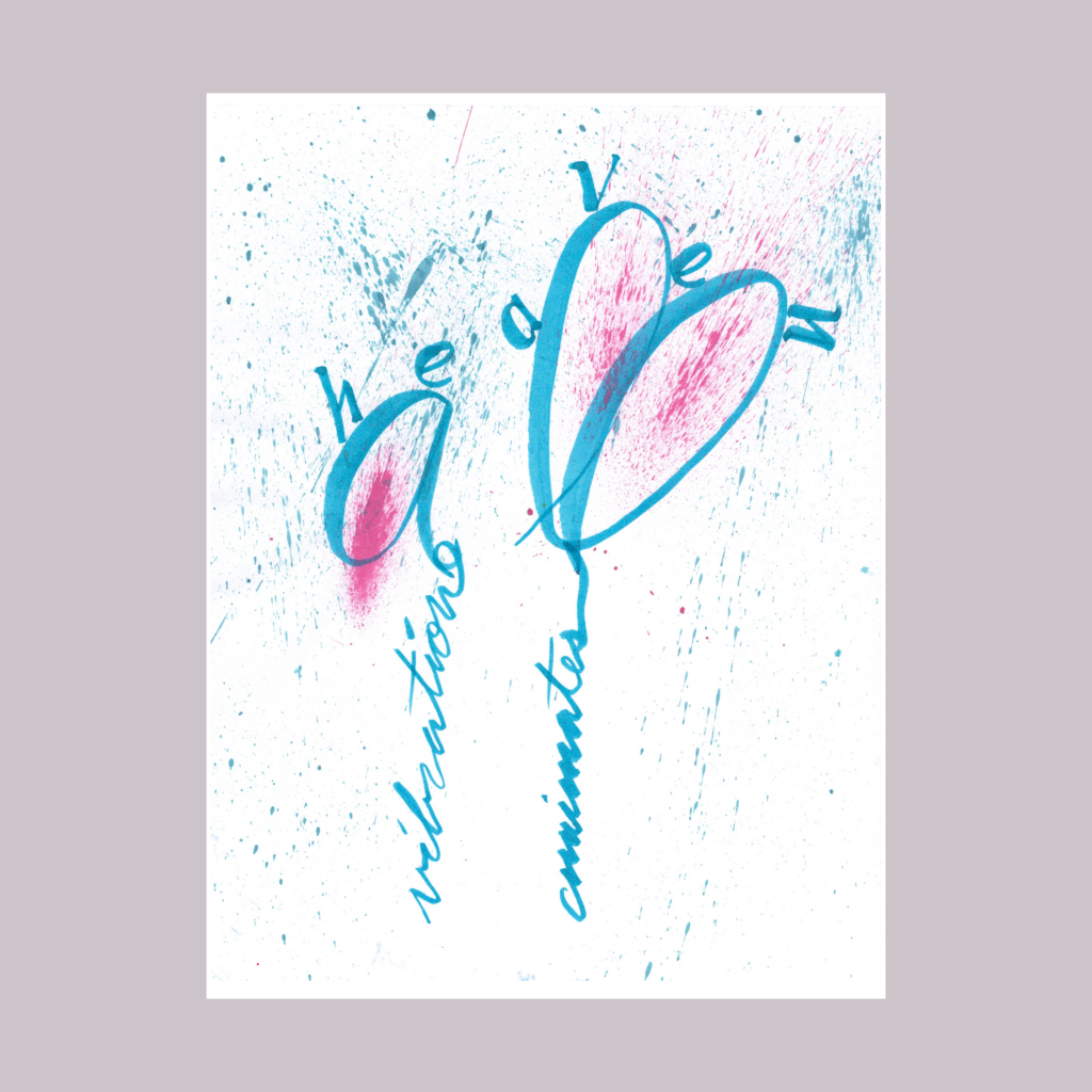
vibration animates all under heaven
Inspired by the occasional reading of old Chinese philosophy. The piece felt a bit dry after graphing, so I added splatters. Ideally the page would be energized by the graphs themselves, but I need a lot more practice with brush cursive. Until then, I’ll shamelessly rely on gratuitous noise.
,
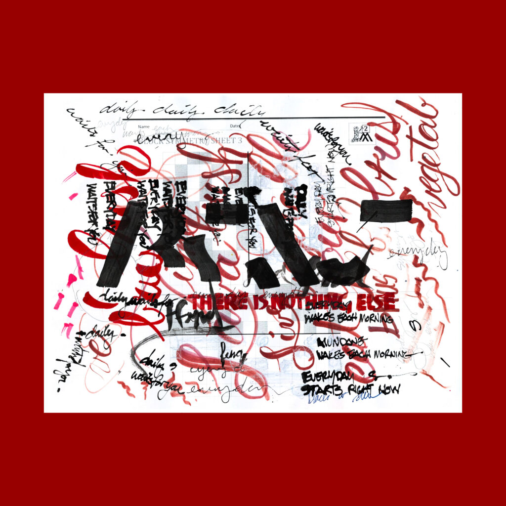
11/28
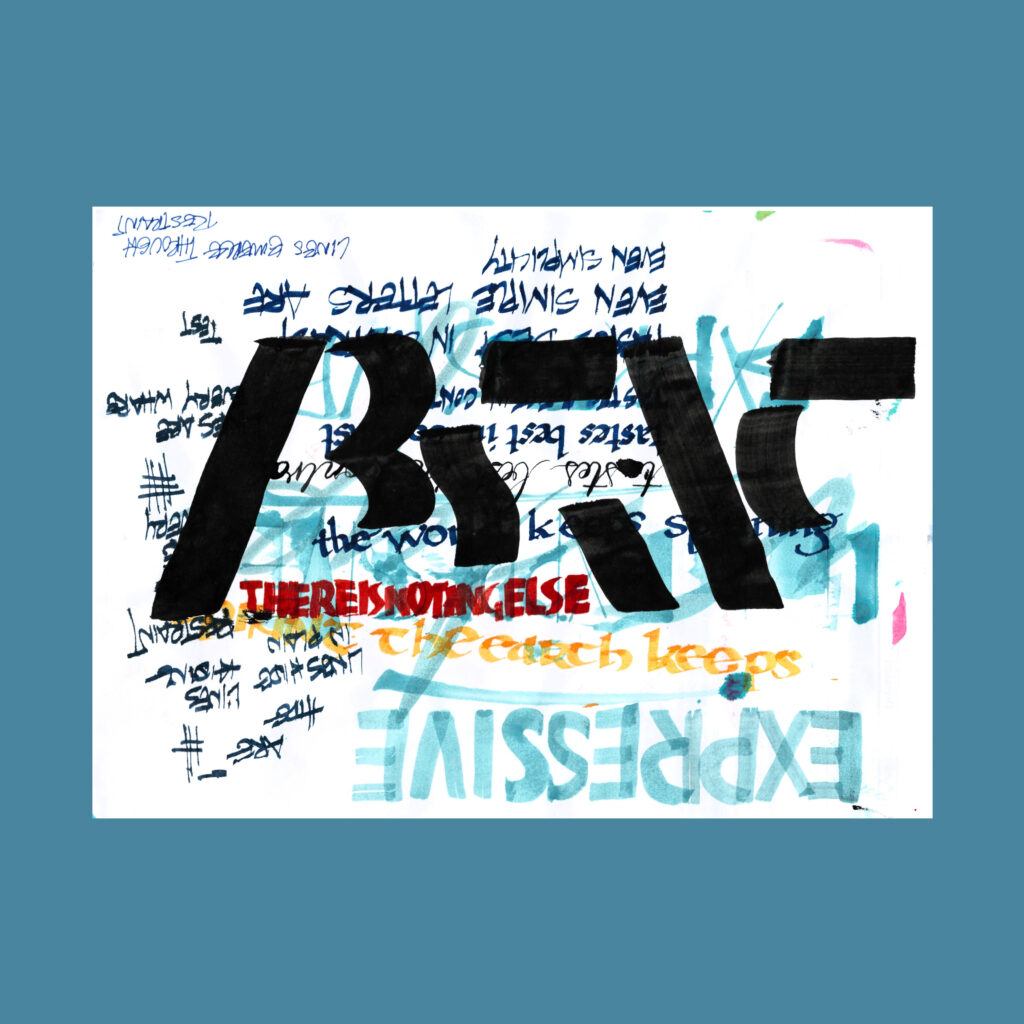
abstract, there is nothing else
I love using the heavy black brush over busy backgrounds. But that leaves the problem of getting the other four words readable within the noise.
,
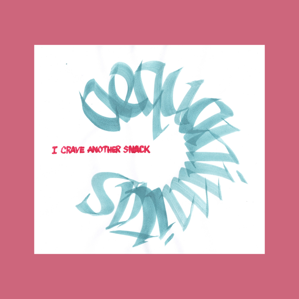
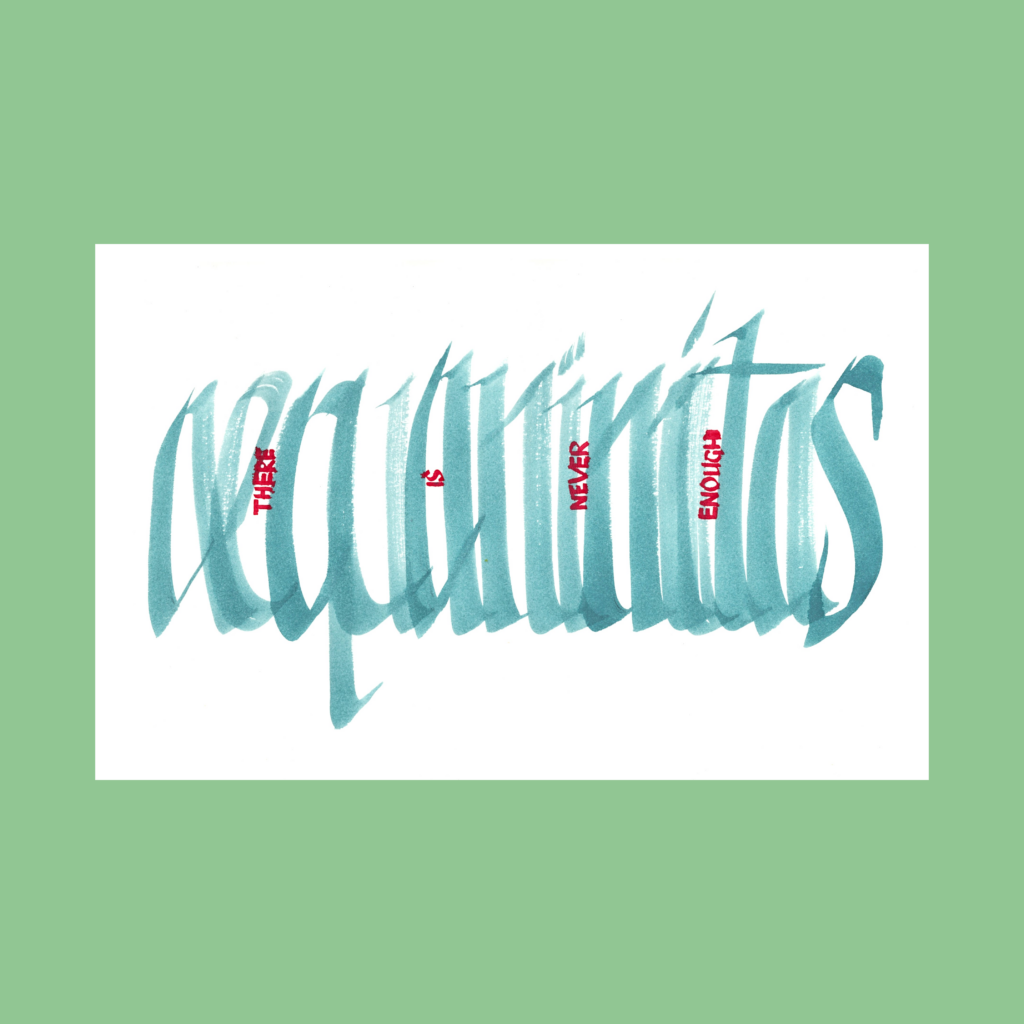
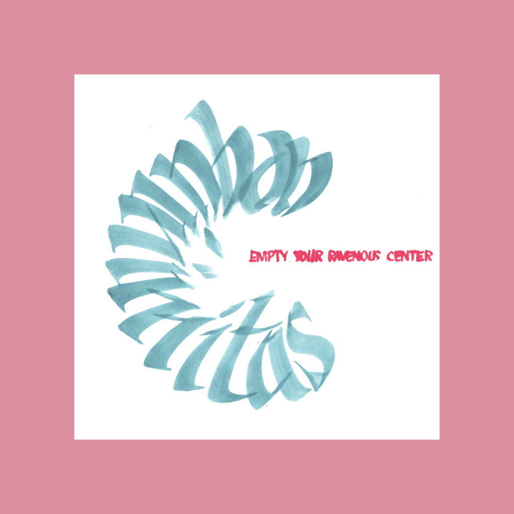
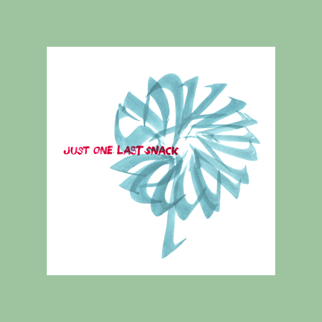
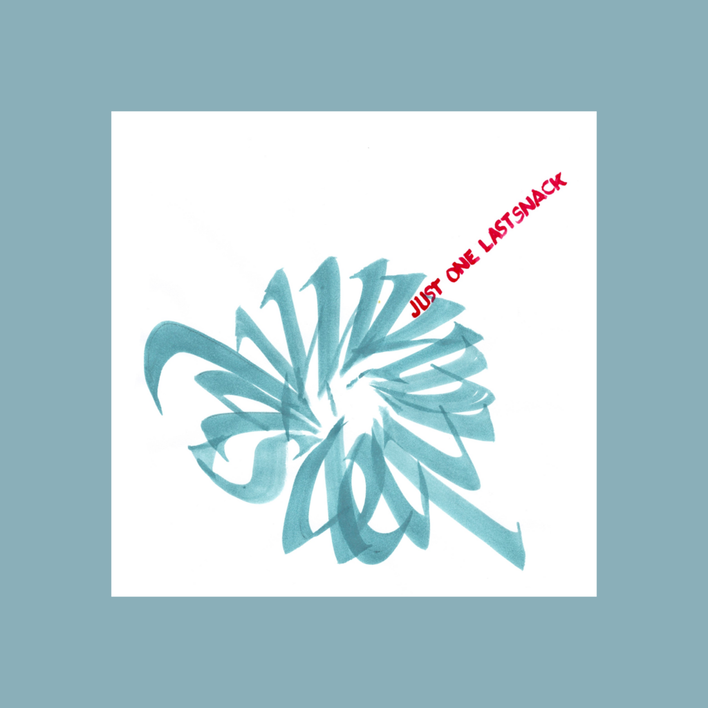
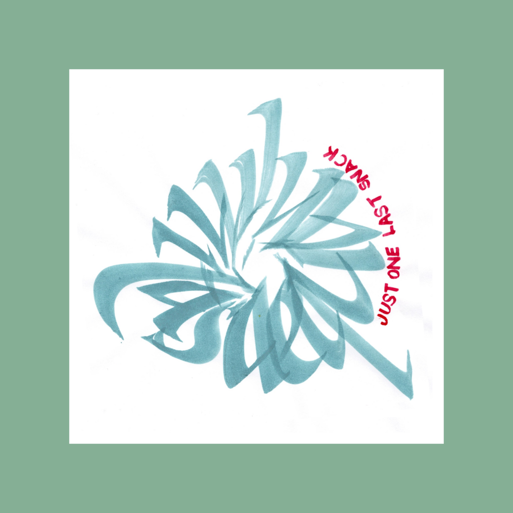
aequaminitas just one last snack
This one flowered into a bunch of variations, which is fitting for this 5WP.
Aequaminitas means equanimity. I first took it as the disappointment that always comes after completing a piece (even though I quickly recover by jumping into the next piece). Playing with the wording led to the realization that calligraphy always tantalizes the practitioner that the next graph will perfectly match the vision.
This hobby is such a tease!
,
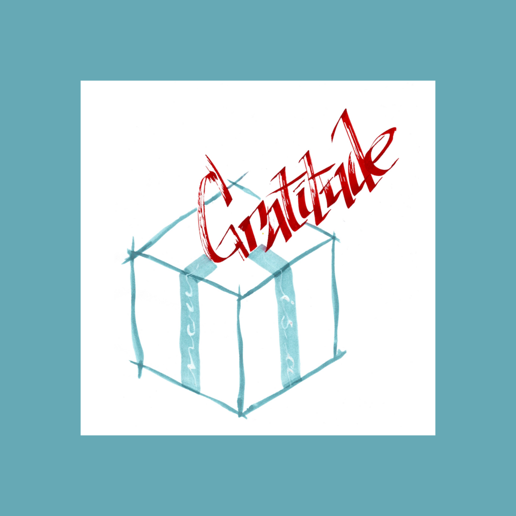
gratitude now is a present
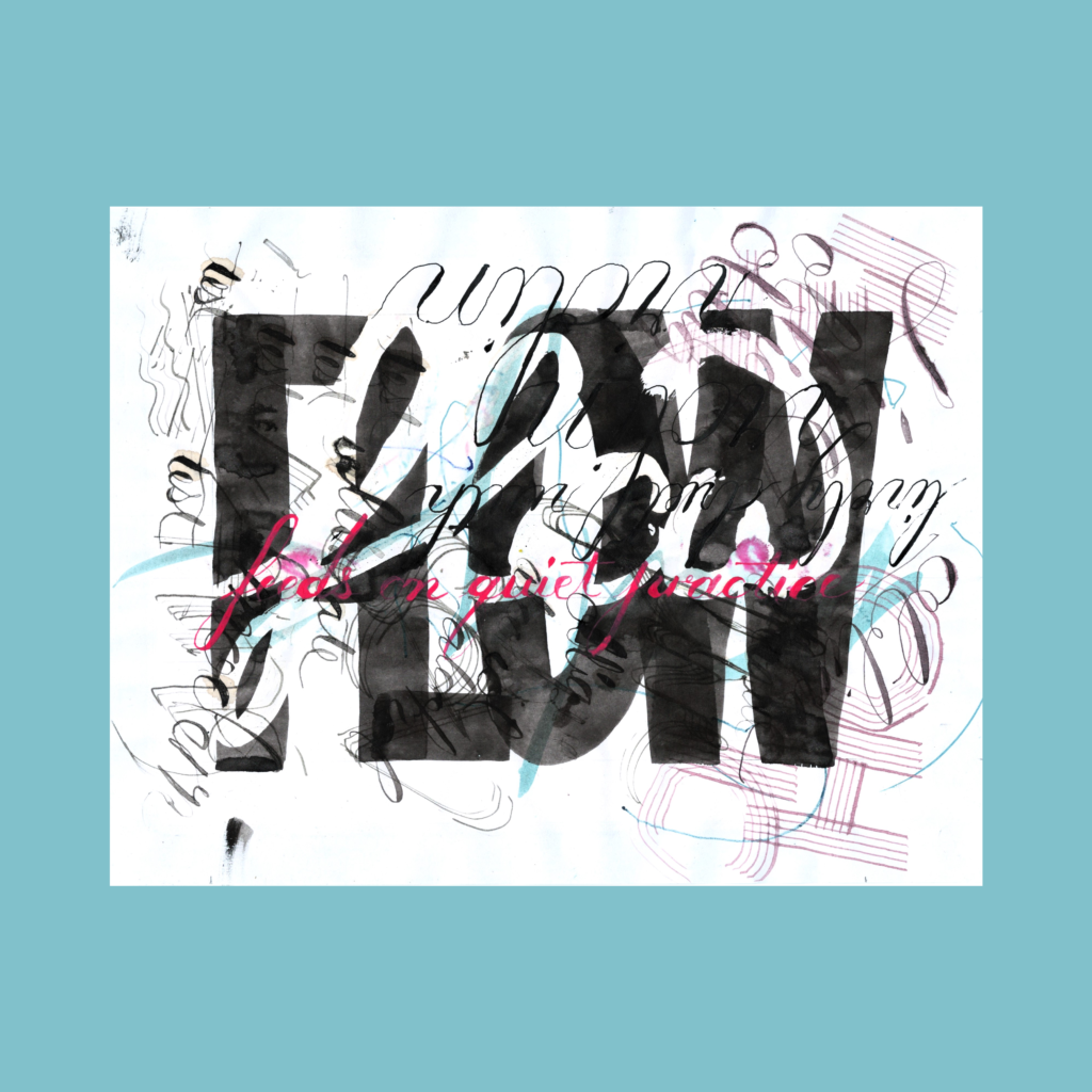
At first I tried using the words as ribbons but my script skills weren’t good enough. I settled with a flat brush and then going white over it.Turned out to be a nice recall of the first word of Callivember 2024, with “flow” written in mastic.
11/1
,
It’s been sixty-one days of a part time job where the pay is a pile of (hopefully) pretty papers and approximately one thousand digital hearts. And the skill to do it better. I’ve often told young architects you get paid in money and experience. In this case, $0 and a ton of experience.
Moving forward, I’m going to keep hitting the drawing board, but I’m not grinding to produce something every day. The holiday season is here, gotta wrap presents, bang out Christmas cards, tidy the abode, only to jump into tax season.
But as with all my hobbies, we’ll see where it goes. Hopefully it keeps growing as a meditative creative practice, but history predicts a slow fade as soon as something else catches my fancy.
In the meantime, I have a growing backlog of Inktober 52 pieces so there’s enough to
Cya next week!
,
PS
12/1
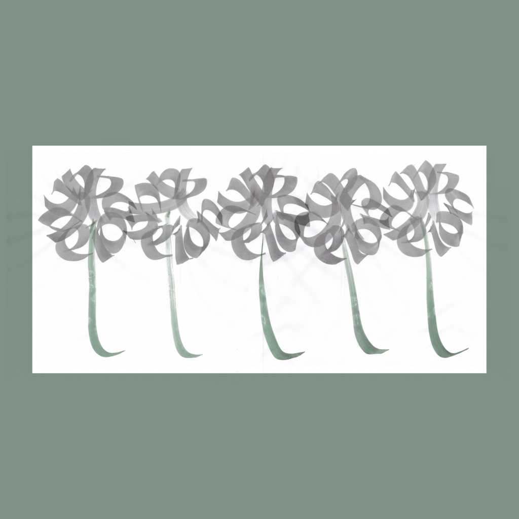
five dandelions in a row
While working on aequaminitas I was inspired to graph a dandelion. As always, it took a few tries to get the composition right. As my habit, I took a few extra shots for good measure (I’m rarely happy with the results at the table). The morning after, I had a hard time picking the best version so I chose them all (using multiply layers on the opacity function). This turned a single word into a 5WP.
,
PPS
11/30
three sprawled out reading worms
The kids and I spent the other night reading books, all sprawled out in the bedroom. Mama would have yelled at us if she walked in before I fell asleep. The next morning, I found out that a Substack buddy just reached 333 subscribers, celebrating with this song. The coincidence was too much, I had to celebrate too.
That version was good enough to post in the moment, but I was unsatisfied with the composition and wording. It was originally oriented as a horizontal piece, but given the power of the background words, I pulled it vertical, but it felt off. Plus, I had gotten too cute by choosing “reading” instead of the obvious “book” worm.
More digital manipulation this week. More subtle than last week, but still not “raw on page”.
Of course, I prefer to get things right on the paper, but 99.999999% of viewers will only ever see it on their screens. So I don’t feel obligated to physical reality after it’s been translated into 1’s and 0’s.
Even so, I generally avoid pushing digital limits, unless the piece demands to go hard in the computer. Always listen to the work.
,
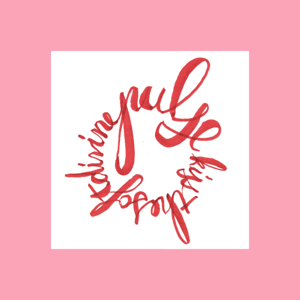
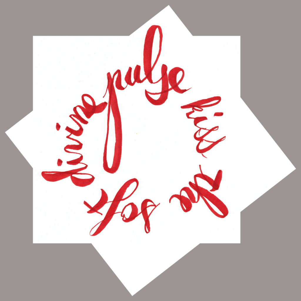
11/19
kiss the soft divine pulse
Given the constraints, the circles weren’t perfectly centered on the page. With a white background, it’s easily fixed in the computer. Then, digital space insisted on a funky paper space. I obliged.
,
11/20
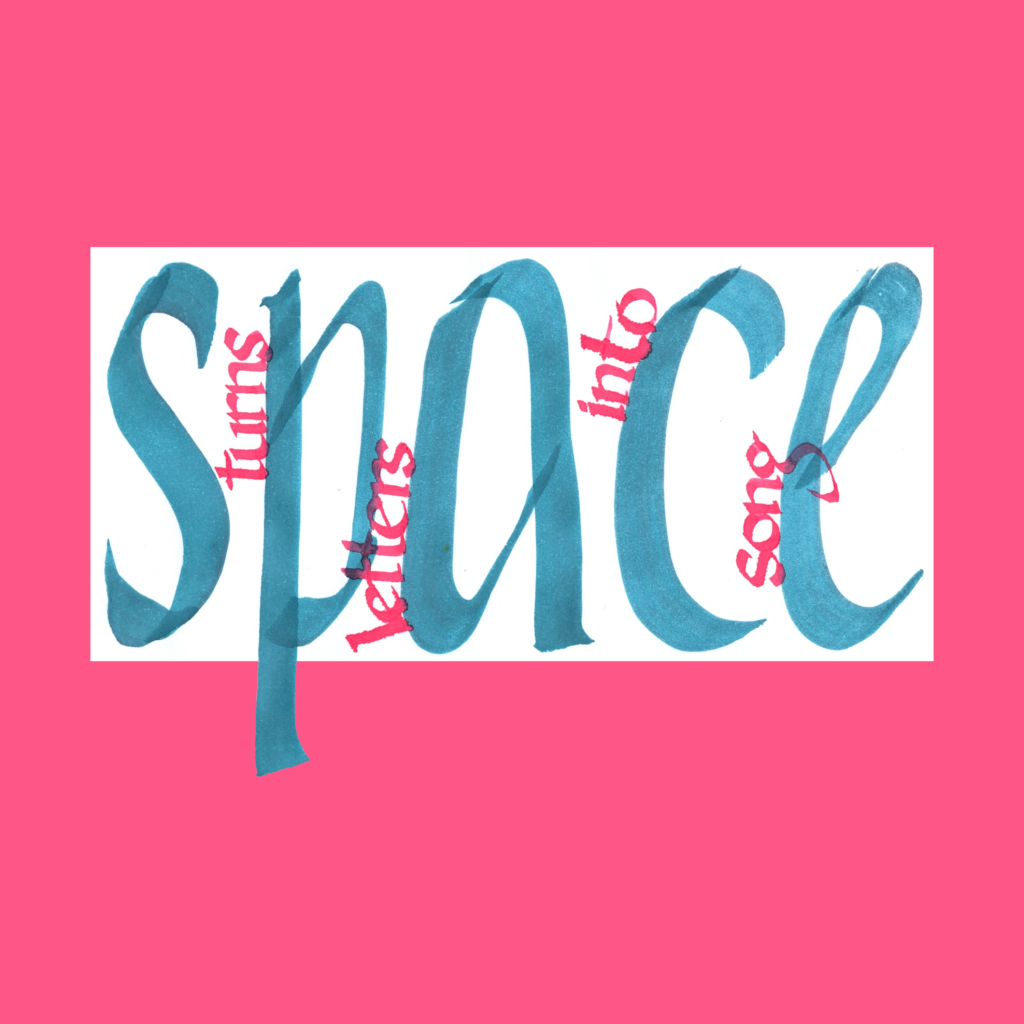
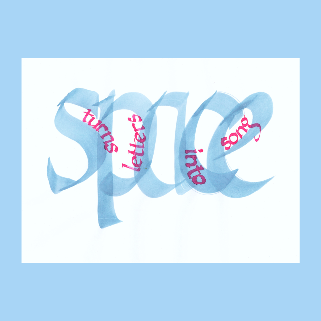
space turns letters into song
I’m not sure that letting the “p” descend below the white page was a good idea. Experiments can fall flat if the payoff isn’t worth breaking convention.
,
11/21
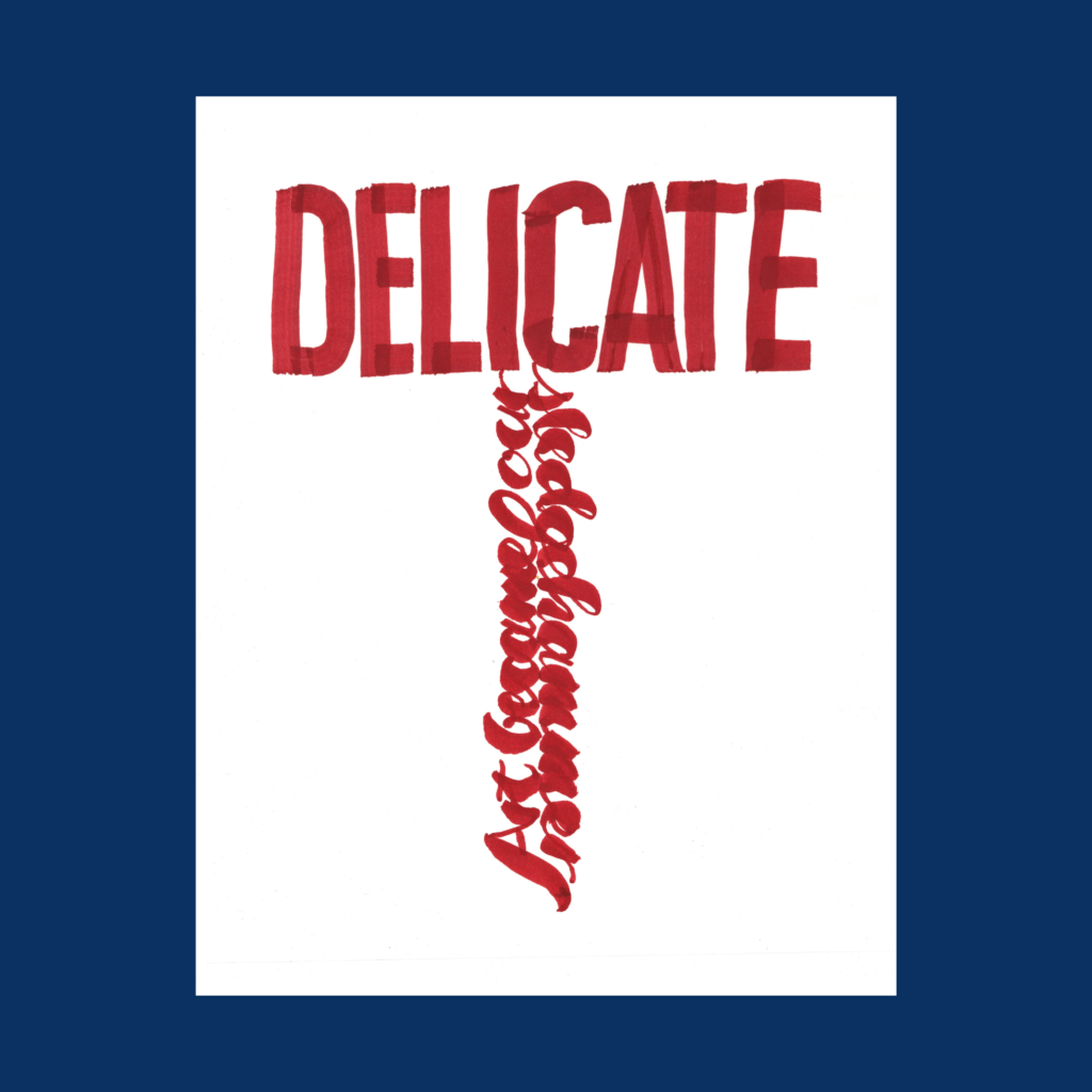
art becomes our delicate sledgehammer
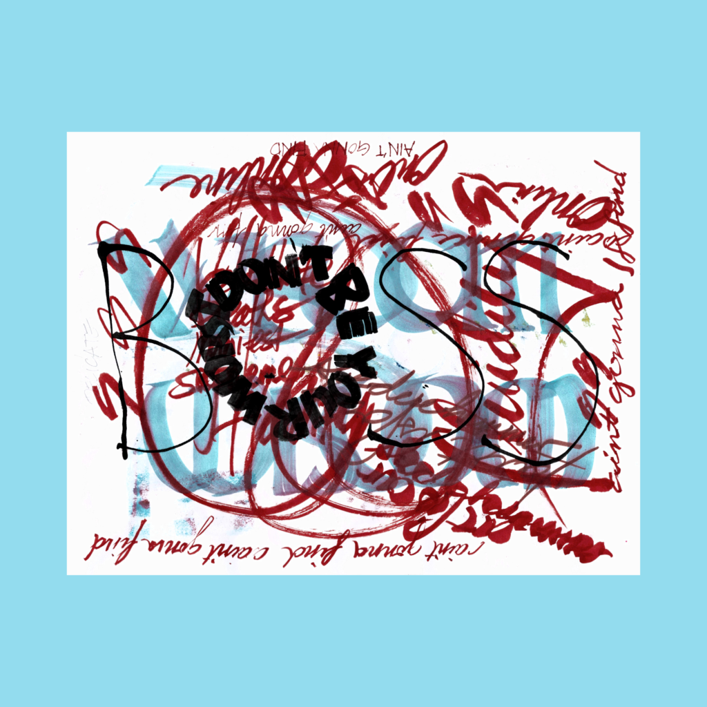
I merged the handle from my second attempt with the hammerhead from the first attempt. Interesting that I started the week with three digitally manipulated 5WP’s. Last week, my wife convinced me to stop using the back of old printouts for these pieces. Default white backgrounds simplifying digital play might be an unforeseen consequence this change.
,
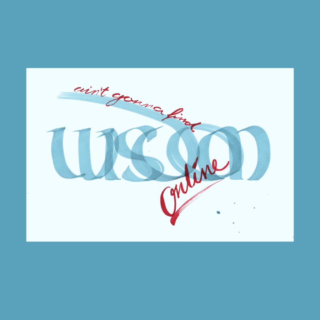
11/22
ain’t gonna find wisdom online
Sometimes you think the flashier version might work but ultimately upload the simpler one. The good thing with simpler pieces is that it’s easy to try a lot of variations on paper, especially if an early shot is “good enough”. After that you’re playing with house money.
In the moment, it’s hard to tell which version is “better”, but time sorts things out. Often, the winner is an early attempt (maybe even that first “good enough” shot). If I was a professional with billable hours, this dynamic would be a problem, but amateurs can afford such luxurious whimsies.
,
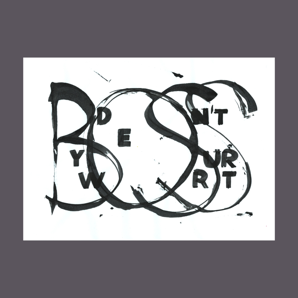
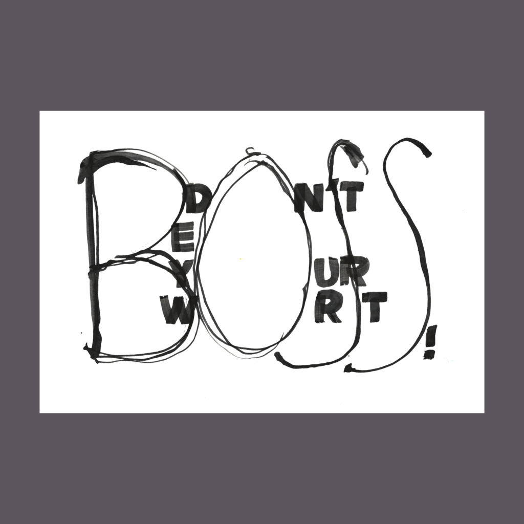
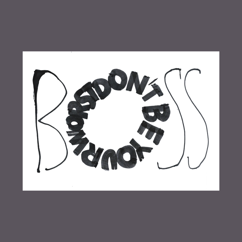
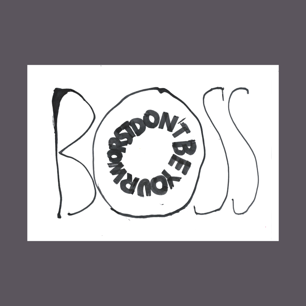
11/23
don’t be your worst boss
I still need to learn control over a ruling pen for deliberate scripts, but I’m now comfortable with being primitive using this tool. Being unpredictable is the point using a ruling pen, but it can’t be totally out of control.
And yes, the last two versions were from the same scan, I upsized the inner circle to see how it would feel. But my wife is right, it’s cuter with the donut.
,
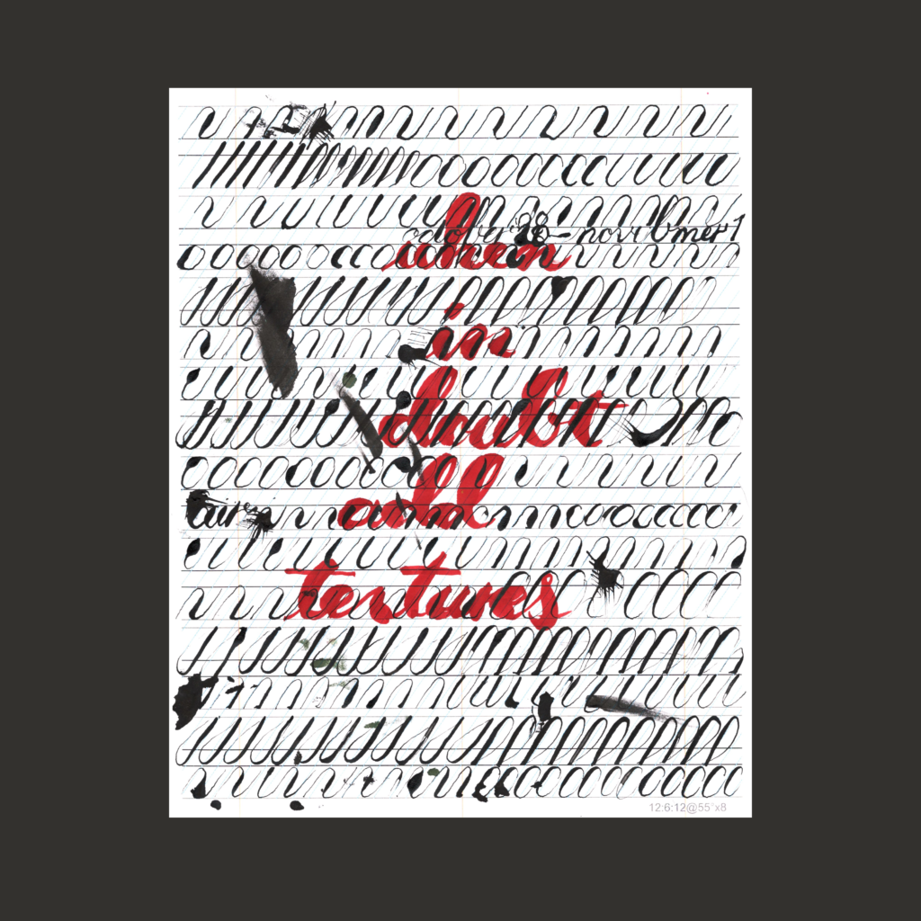
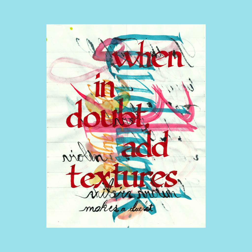
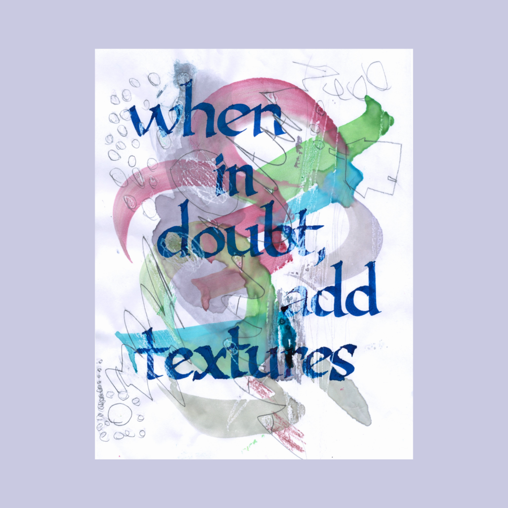
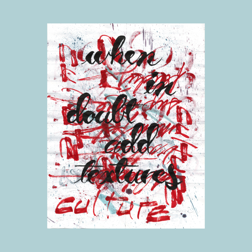
11/24
when in doubt add textures
My personal mantra has been “when in doubt add noise” but the prompt “textures” is close enough. For this, I went back to my simple five line 5WP format. With this much texture/noise, no need to get cute with the composition.
,
These compilation posts have become a journal on my social media meanderings, so hello Bluesky!
I’m really happy with how I’ve trained the Substack algorithm—a wide variety of interesting art, photography, essays, and poetry, and no politics. It’s a vast garden of delights.
But FOMO is the demon of our age, so I’ve joined the crowd checking out Bluesky. A couple of the folks I met on Post had migrated there, so it is nice to catch up with them.
But I’m weary of establishing beachheads on yet another platform. At the moment I’m just cross posting the images I upload to on Instagram. Maybe Bluesky will grow into something interesting. Or maybe I’ll stop and my profile will just be a snapshot in time.
If I had to bet, I’ll most likely keep Substack as my social media home, visit Instagram as a gallery of gorgeous calligraphy and participate in occasionally group challenges, and go dormant on Bluesky.
But that’s tomorrow’s problem. Time to wrap up November and get going on the holiday postcards.
Cya next week!
,
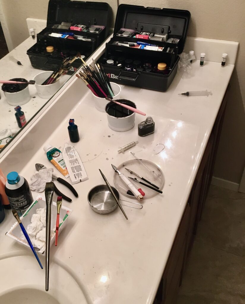
PS—One last studio photo of our washroom across the hallway. I suspect that this tract home had an upgrade option for a second lavatory in this counter. Thankfully, the original buyers declined, leaving a big workbench for spreading out out my tools. This sink is also integral to the surface, so no seams. It’s a perfectly clean setup!
Of course clean is a relative term. My wife generally puts up with my hobbies, maybe because she knows they are always a passing phase. At least this one doesn’t take up a ton of storage space (unlike board games).
,
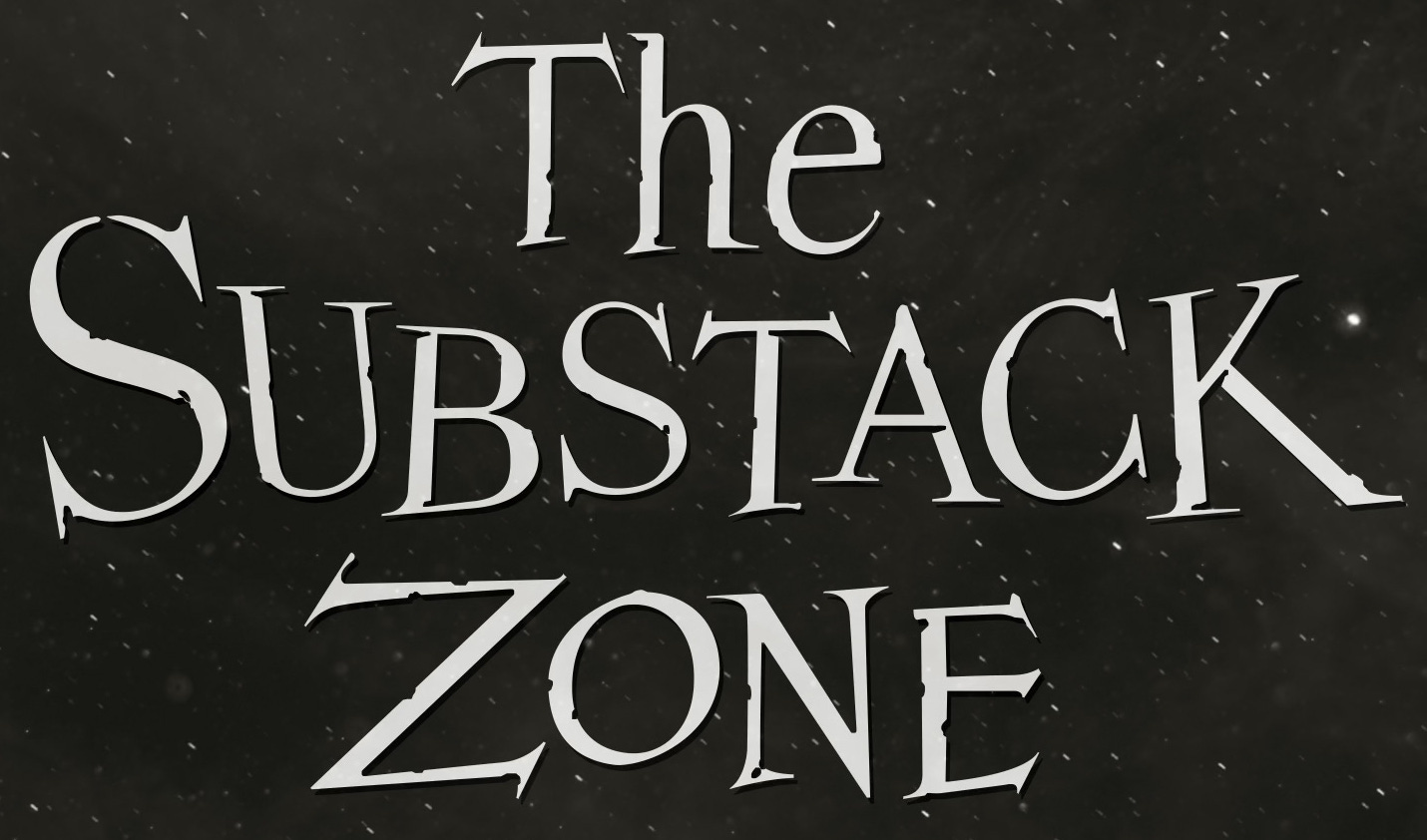
PPS—The boy said this in October, but I just scanned it yesterday.
A cohort of 31 fiction authors and artists released stories on Substack to celebrate the anniversary of the first airing of the Twilight Zone on 11.24.1968.
I’m a sucker for internet moments, so here is a little something to celebrate with a 5-word microfiction.
,
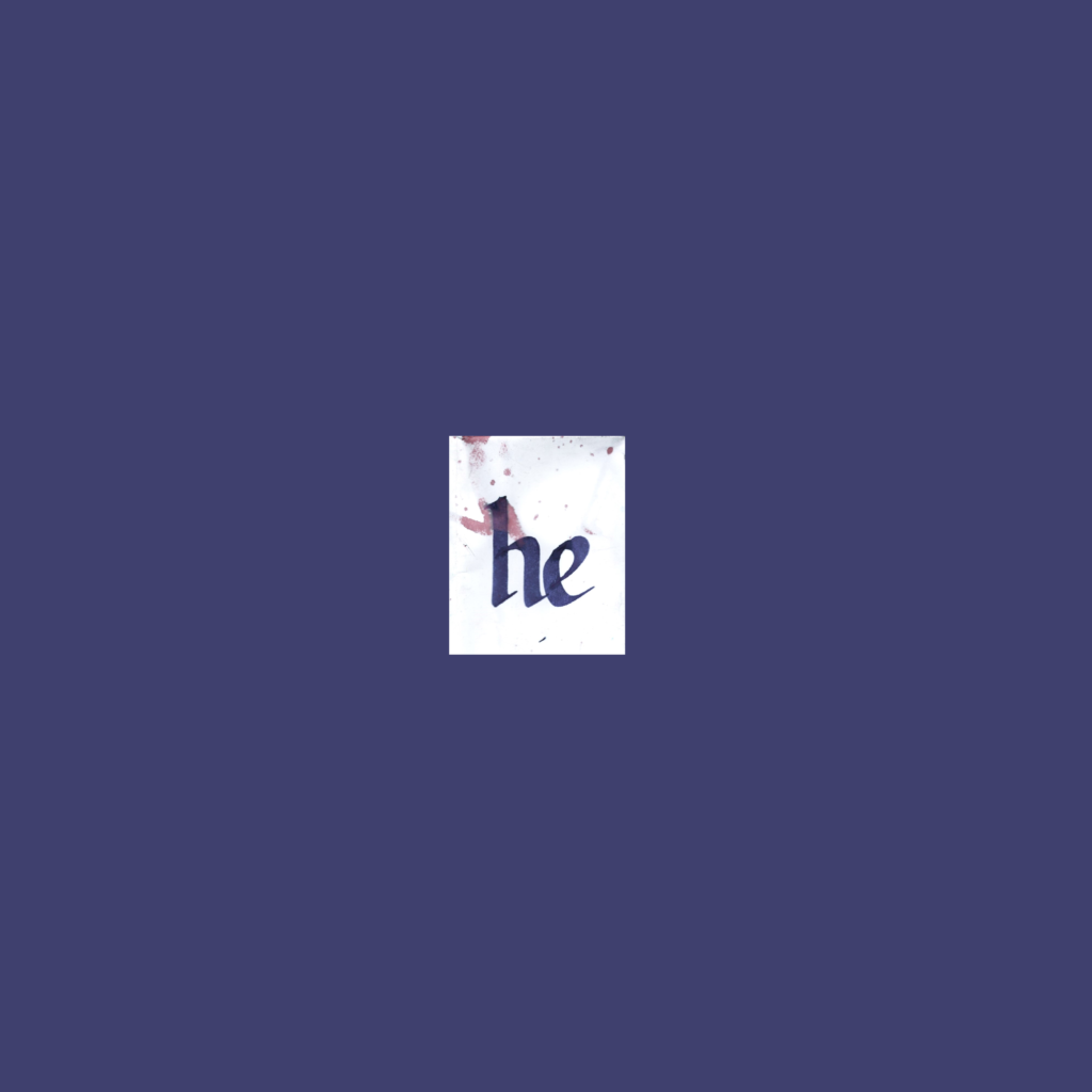
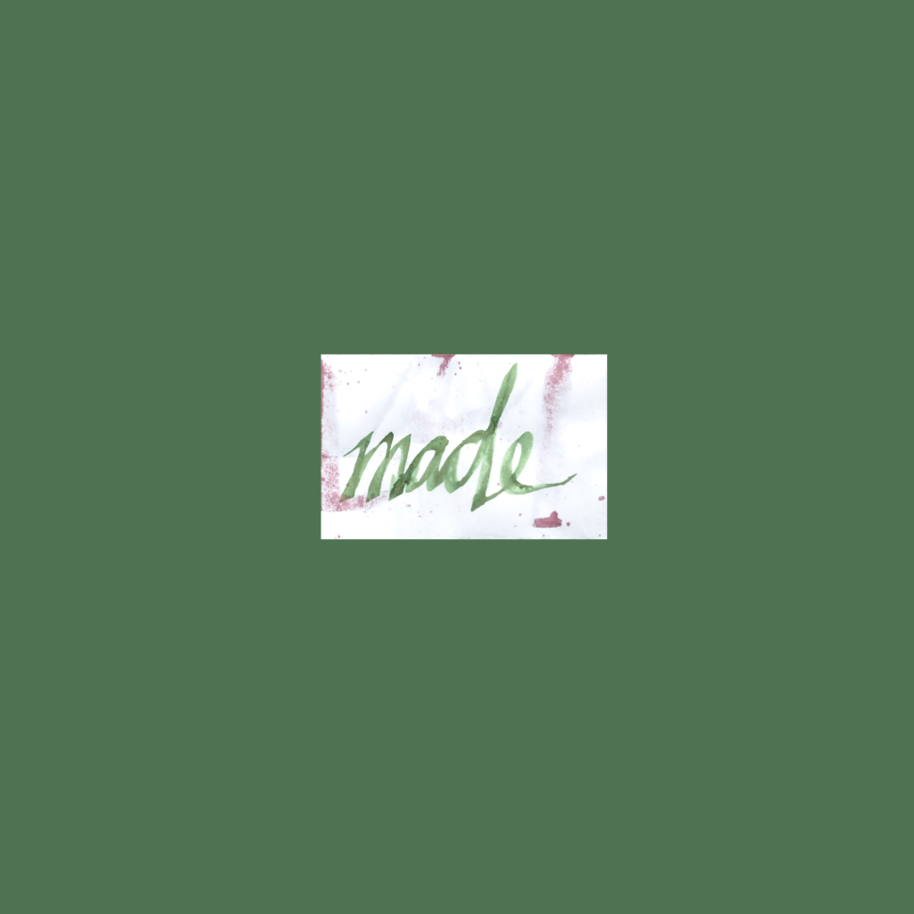
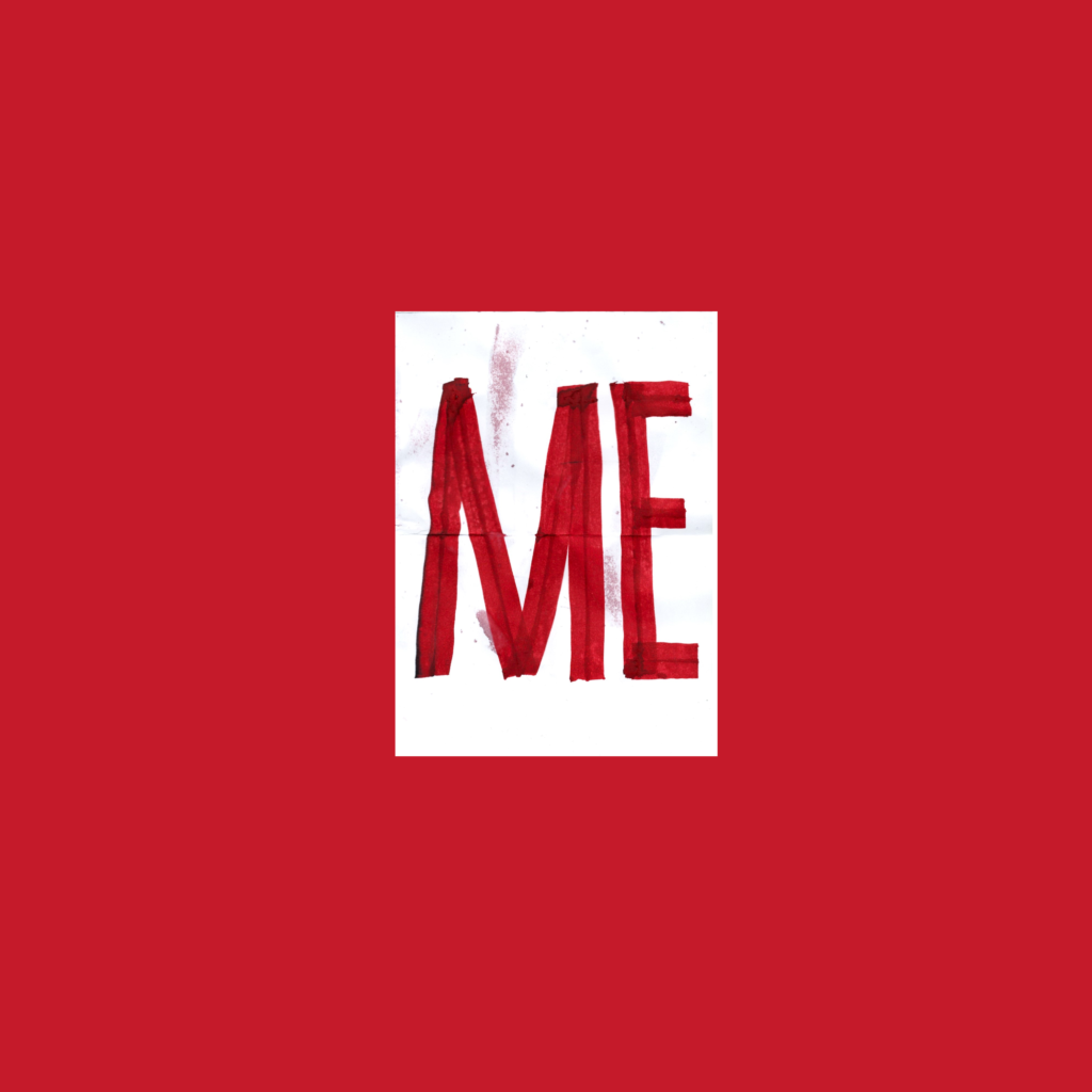
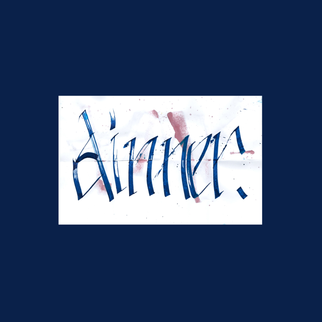
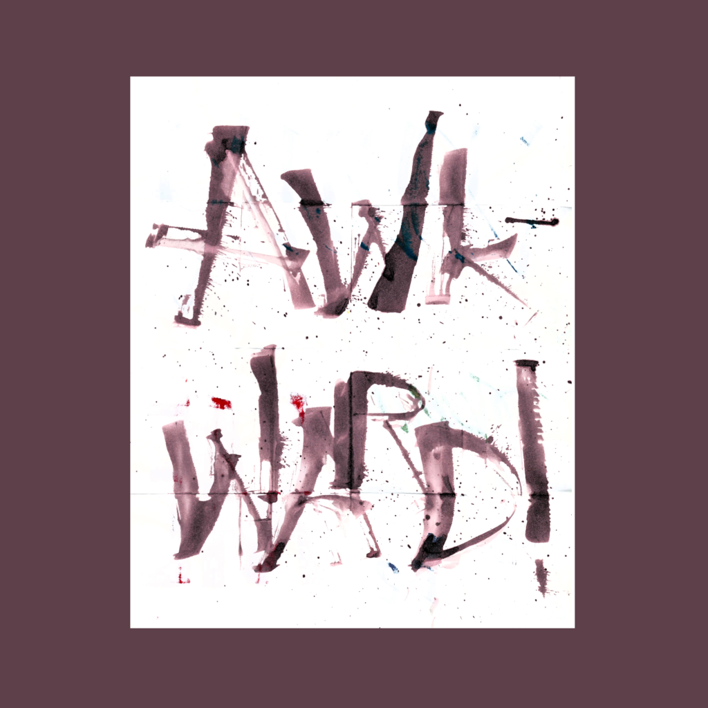
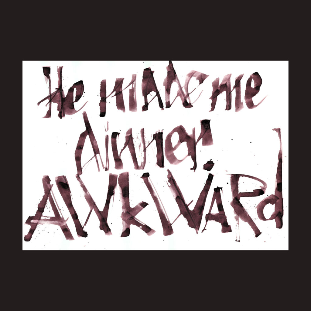
he made me dinner. awkward!
This 5WP is based off the Twilight Zone episode “To Serve Man”. As a kid, we didn’t watch much TV, but I saw this episode on Nickelodeon at my cousin’s place. In a pre-streaming world, this was a completely random occurrence. As luck would have it, the only episode that I’ve ever watched turned out to be one of their more famous episodes.
,
Physically, this was the drawn and formatted as a foldy comic. If you’d like to read this book as designed, download my PDF.
I initially graphed the piece with a ruling pen on a single page. After scanning it in, I realized that shape and order of words was perfect for a foldy comic. Plus it would be a special way to fete this event.