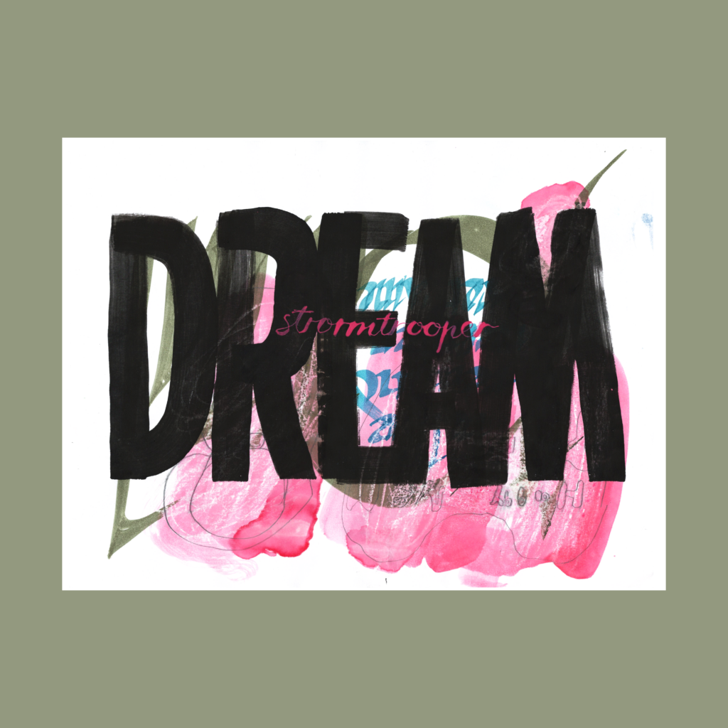
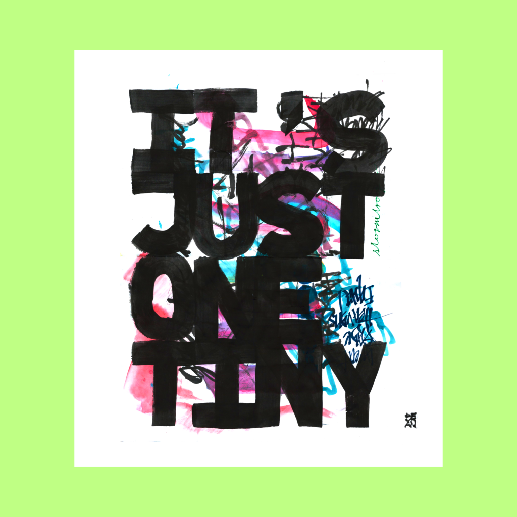
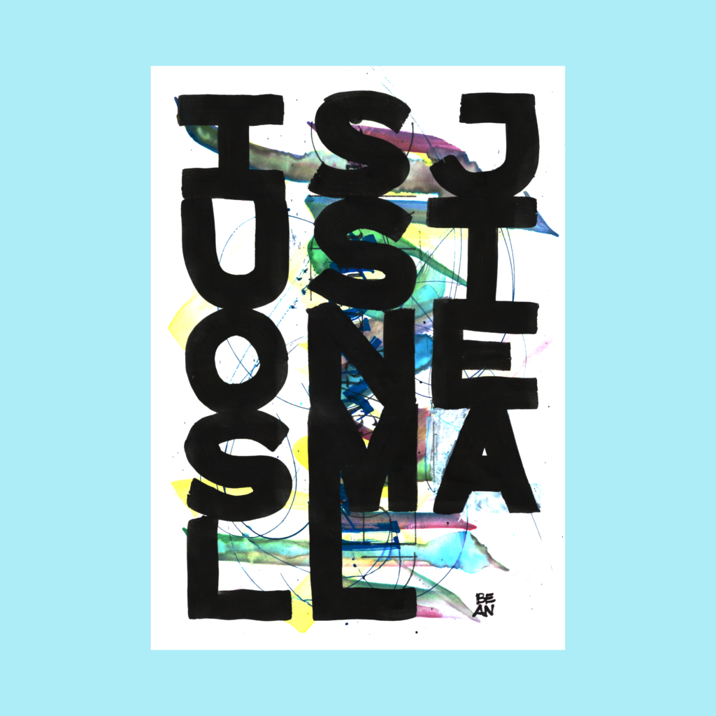
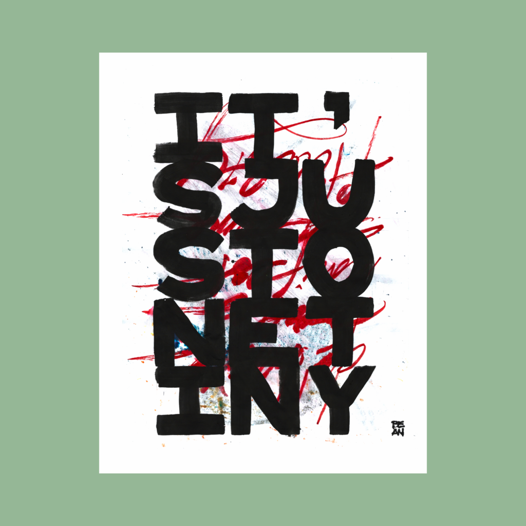
GRIZZLY PEAR

written snapshots

Category: 5 Word Piece

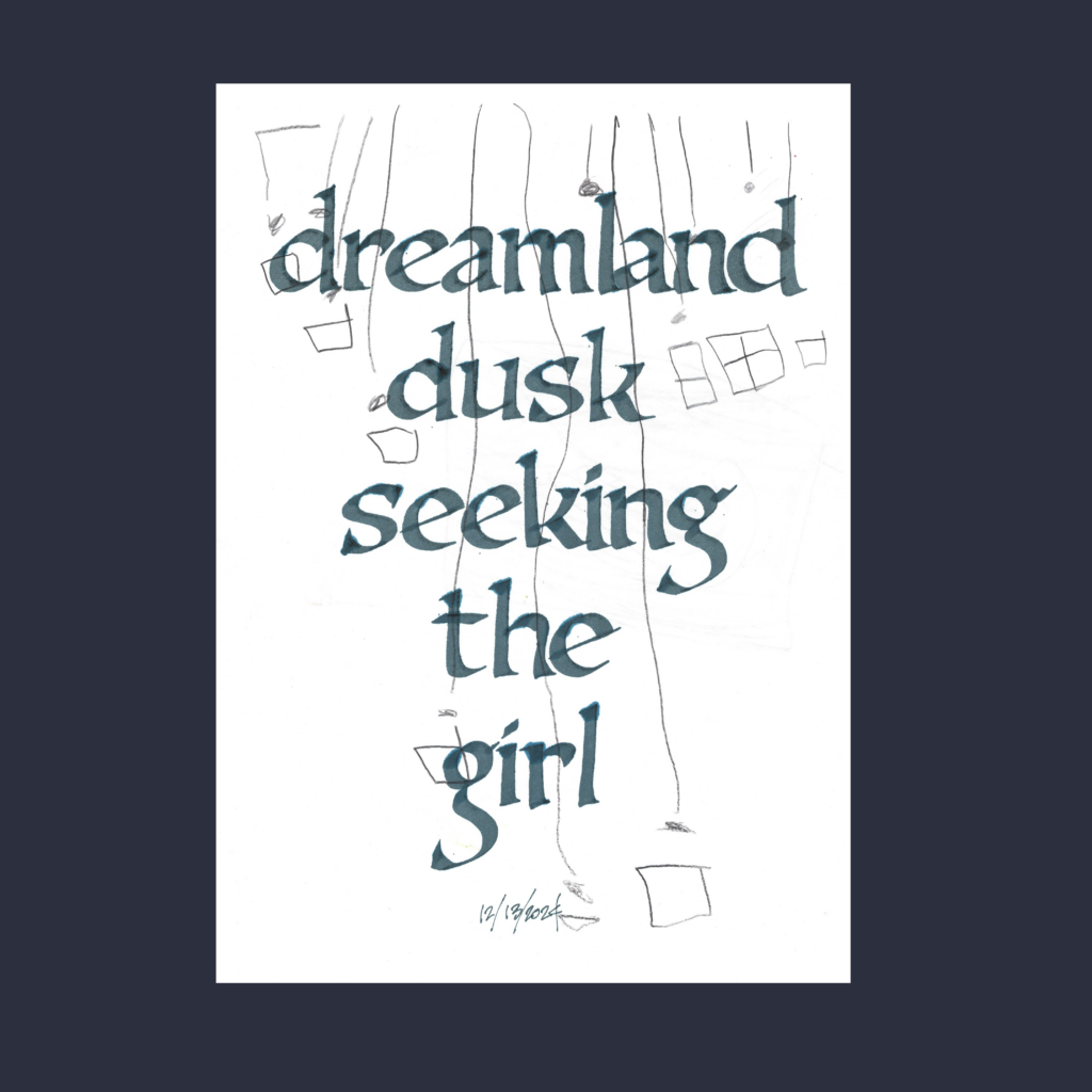
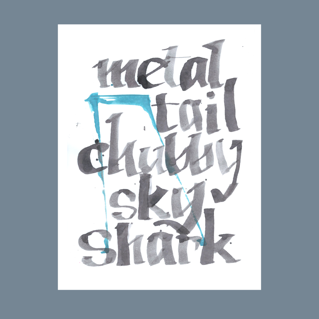
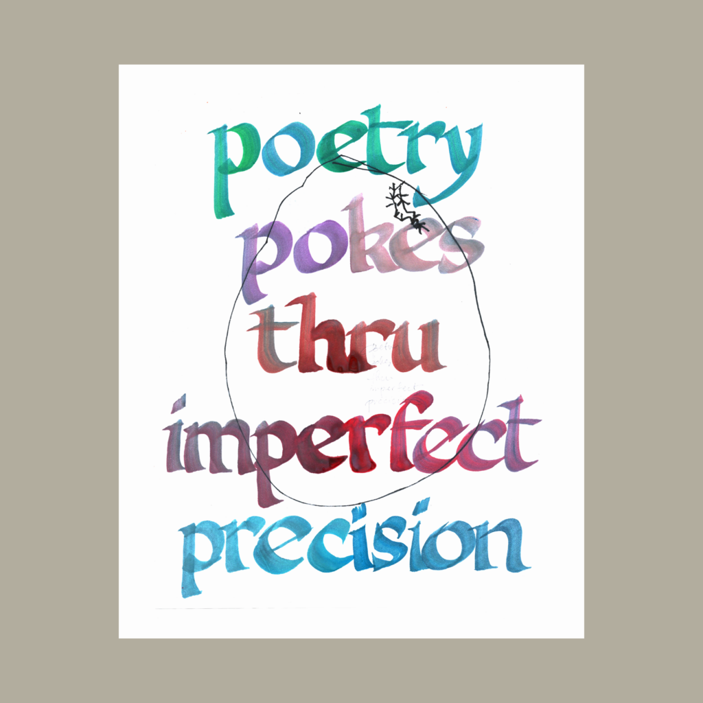
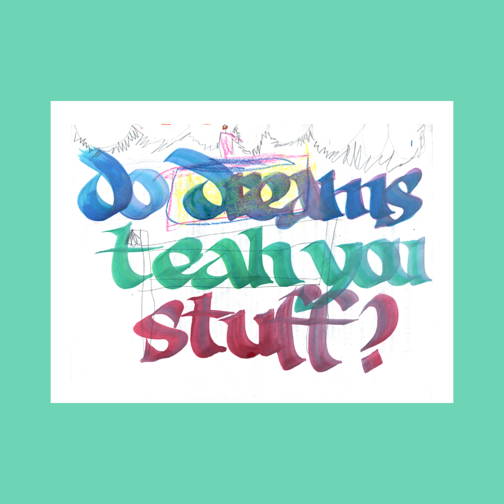
  • My own 5WP’s, (five-pack two+Reciprocal Paradox+1901 Modern Pen and Ink+Reactionary Classics)

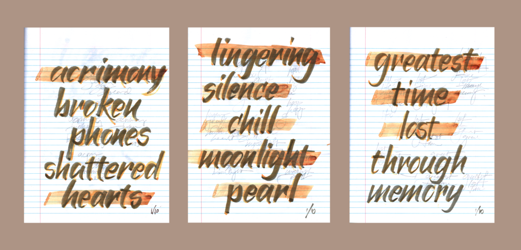
    Here are five non-prompted 5WPs that popped up over the past few weeks. It’s a fun challenge to memorialize a moment using only five words and then make it pretty.

    ,

    11/26

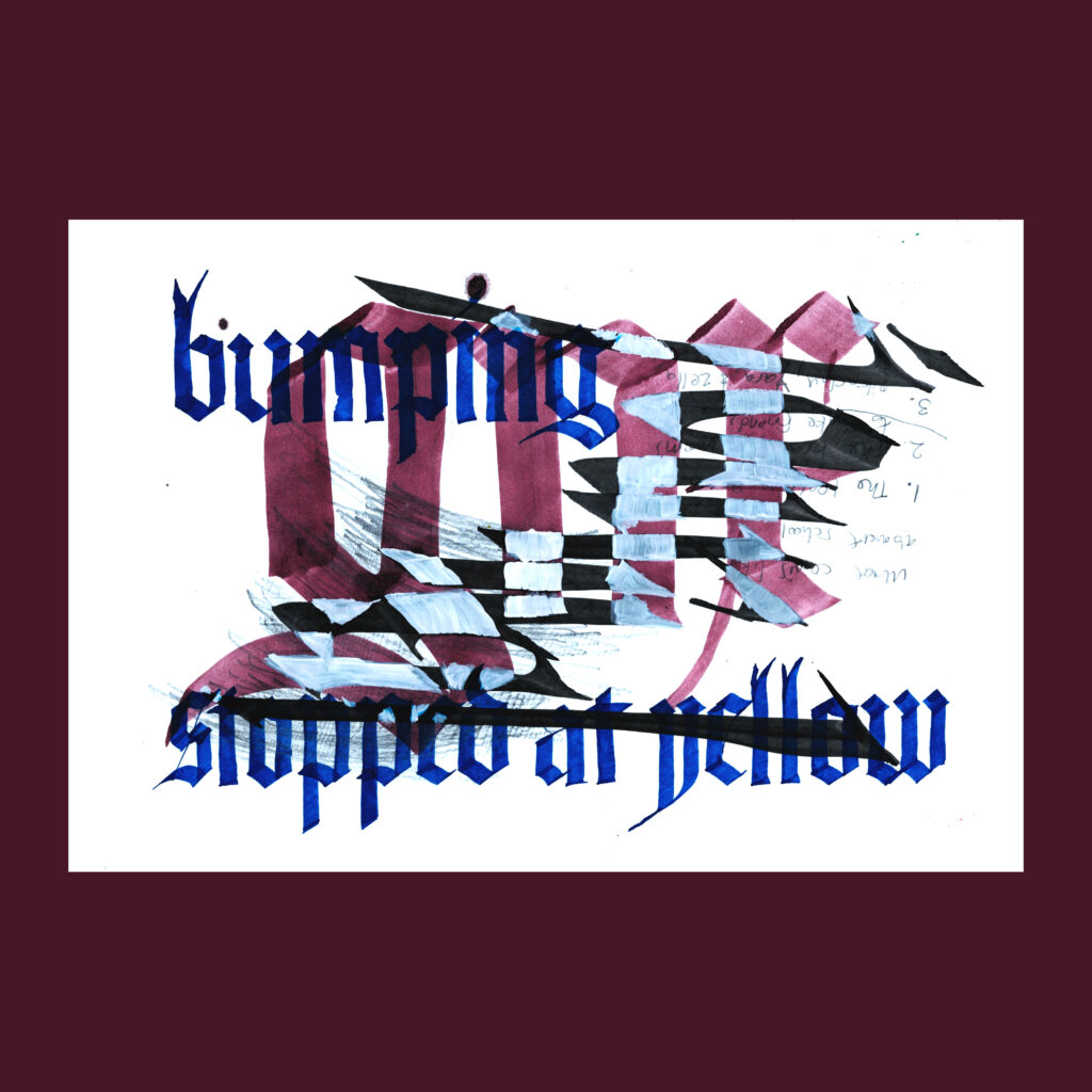
    bumping
    gnx
    stopped at yellow

    I had just hit 55mph on the highway when the light turned yellow. Even though I was vibing hard to the first track on Kendrick’s new album gnx, I slowed down and stopped.

    ,

    12/5

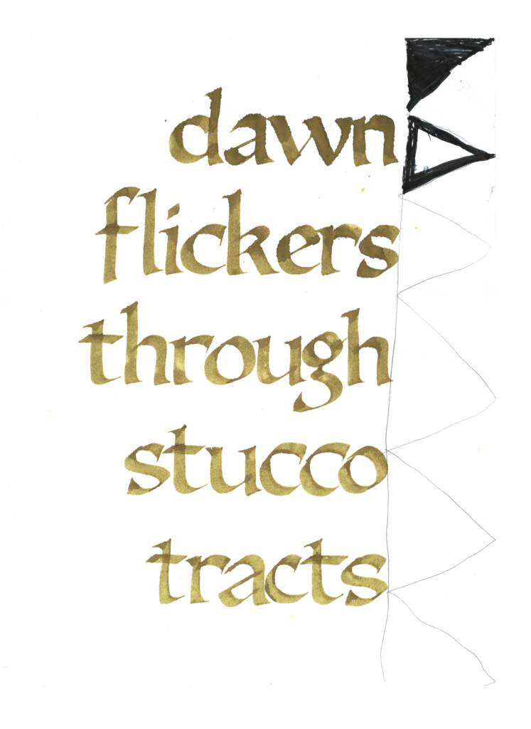
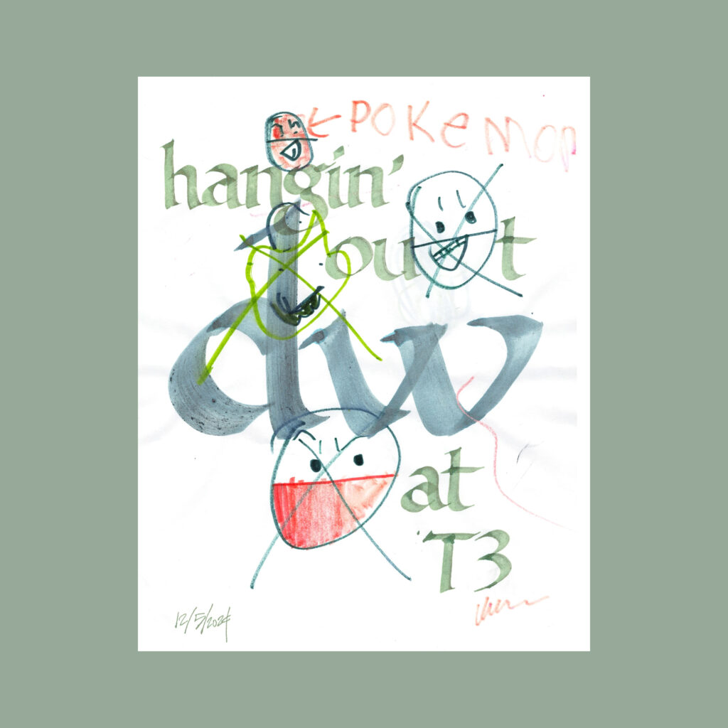
    hangin’ out
    d. w.
    at T3

    On Thursday, my sister’s flight was delayed a couple of hours so I got a little extra time to hang out with them. That evening, my substack friend d.w. was flying out of town, so I hung out with him at the airport bar. It’s a big perk to join folks for their last few moments in Vegas.

    ,

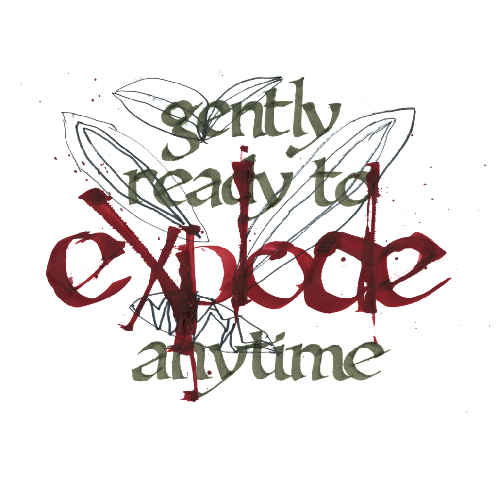
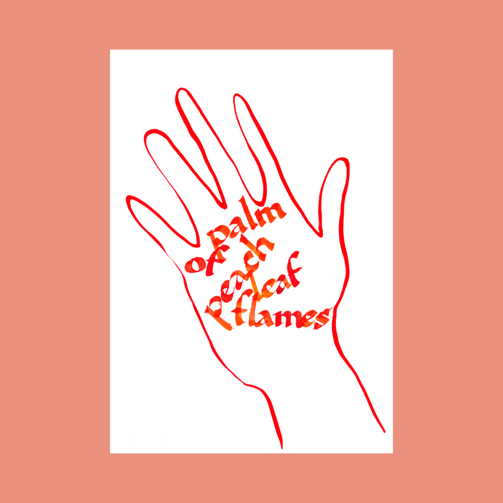
    palm
    of
    peach
    leaf
    flames

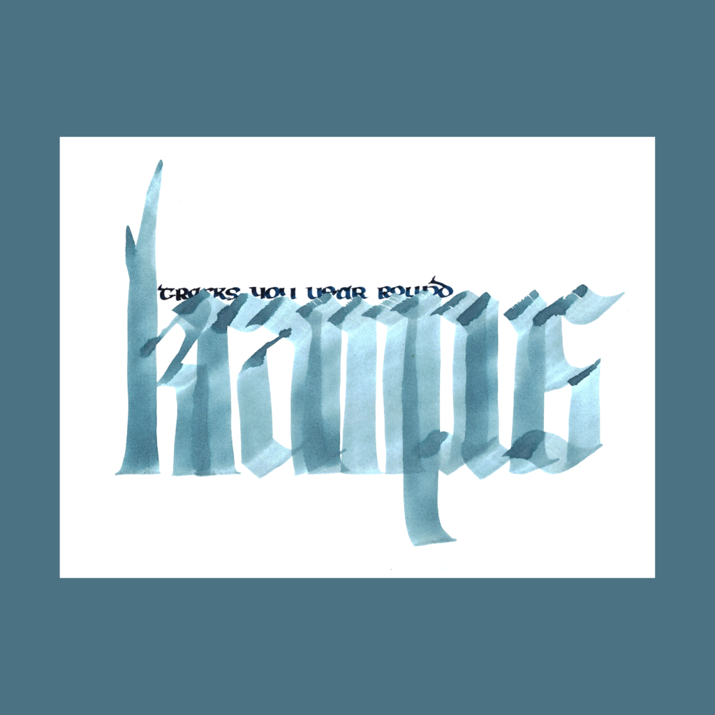
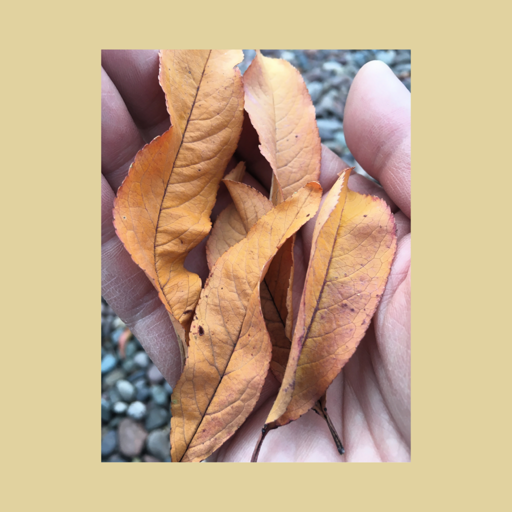
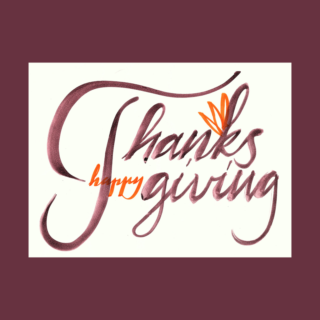
    We visited the grandparents after Thanksgiving. This popped up while helping the kids collect leaves and twigs to make a nest on the patio.

    12/6

    ,

    12/9

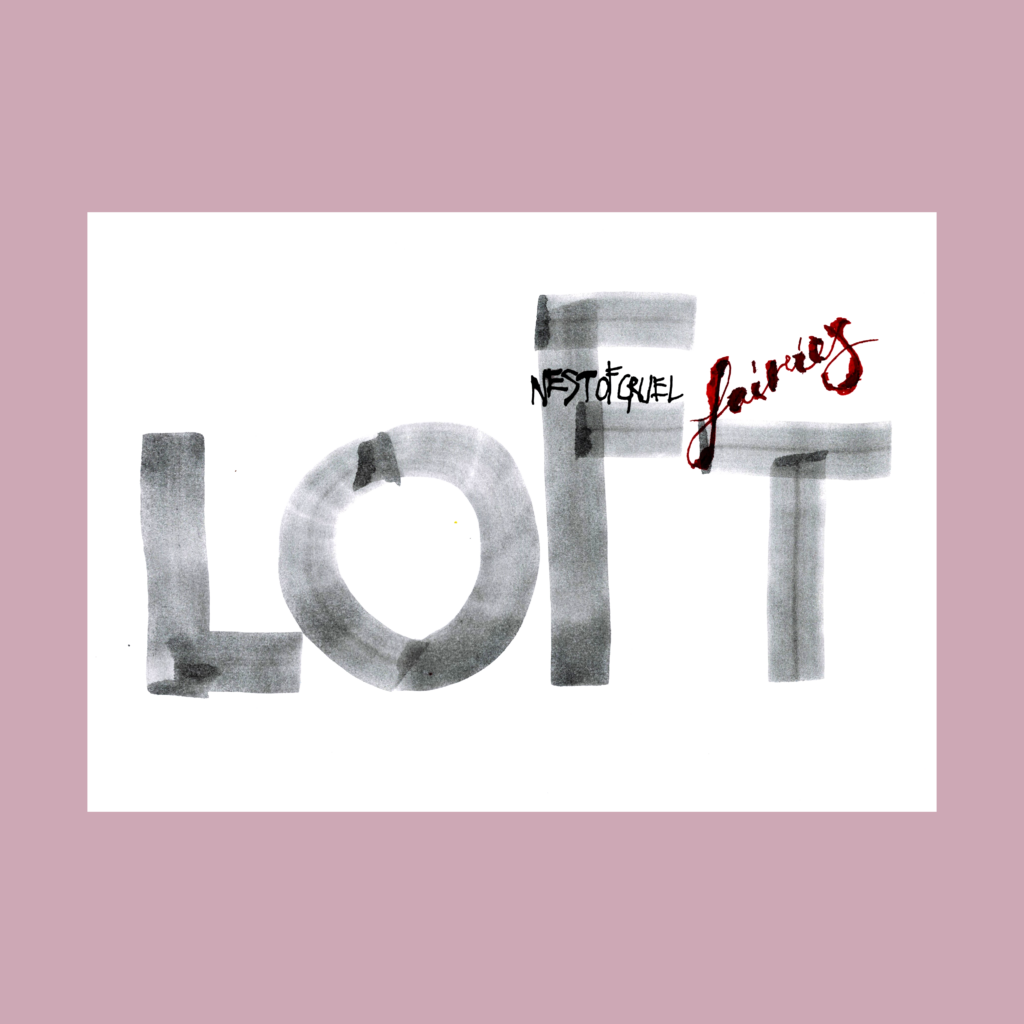
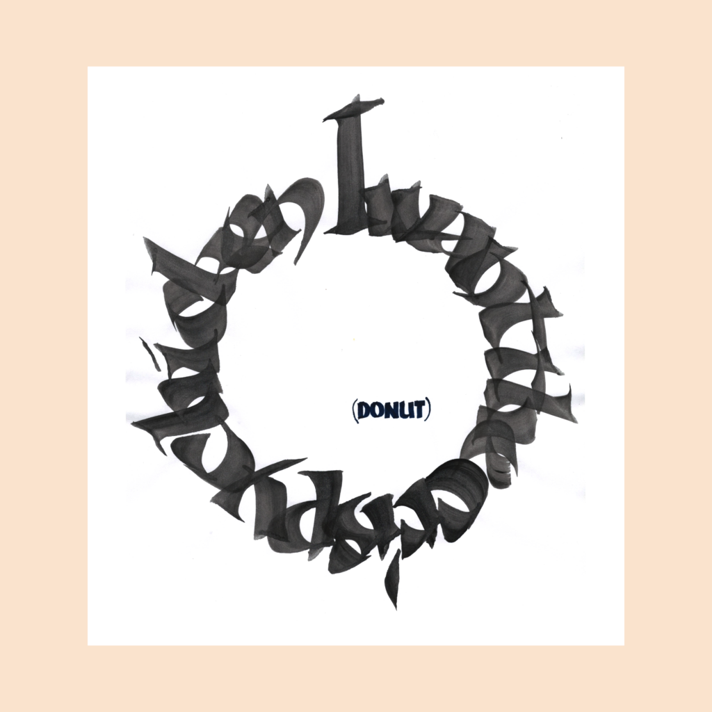
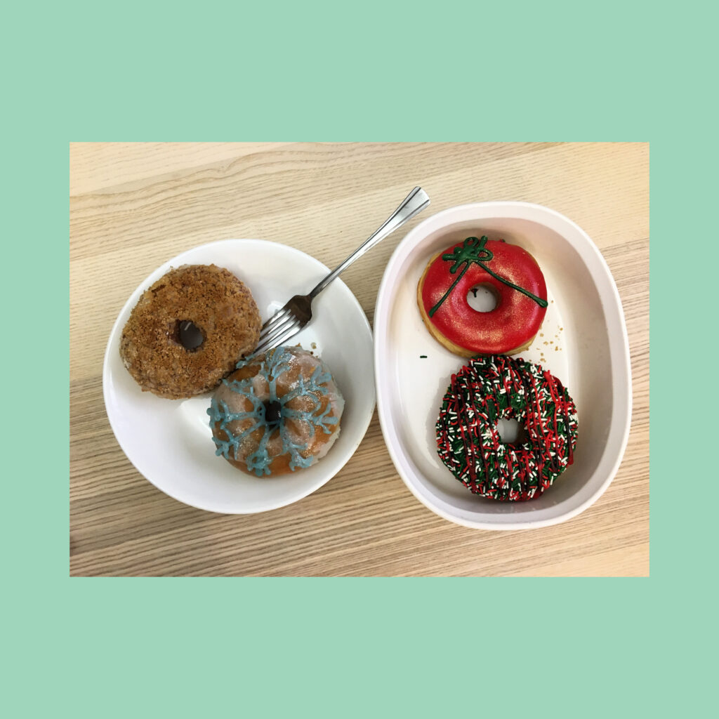
    I want the crispy chicken

    (donut)

    We had fried chicken for Thanksgiving. A week later I bought four donuts from Randy’s Donuts (a chain entering the Vegas market). This was his choice for the first day.

    ,

    12/10

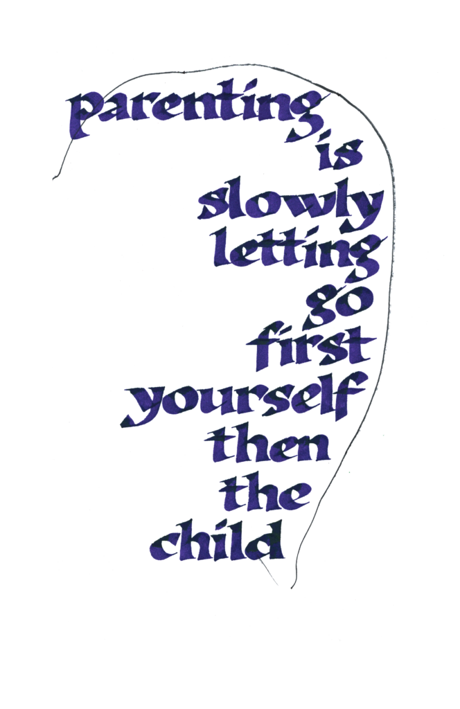
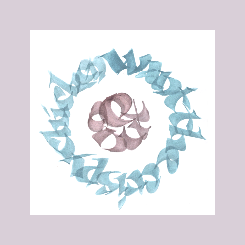
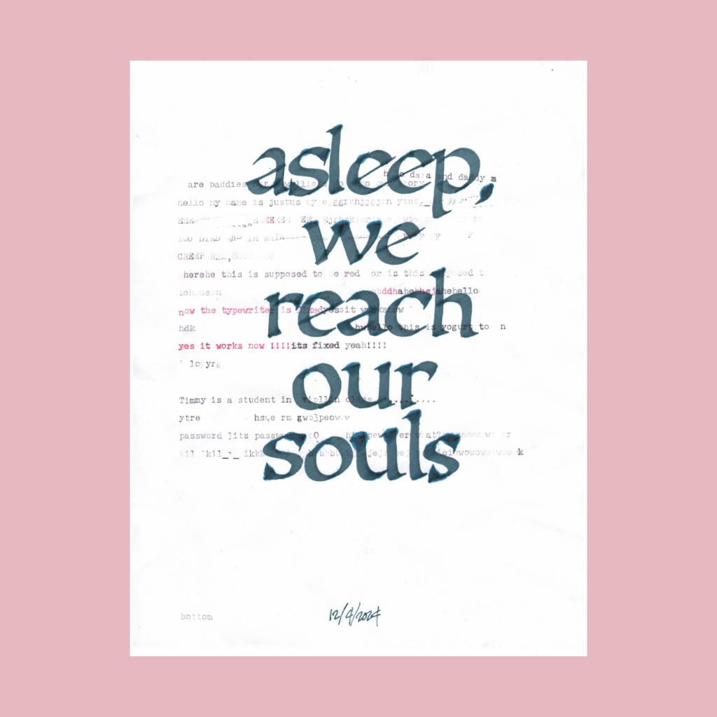
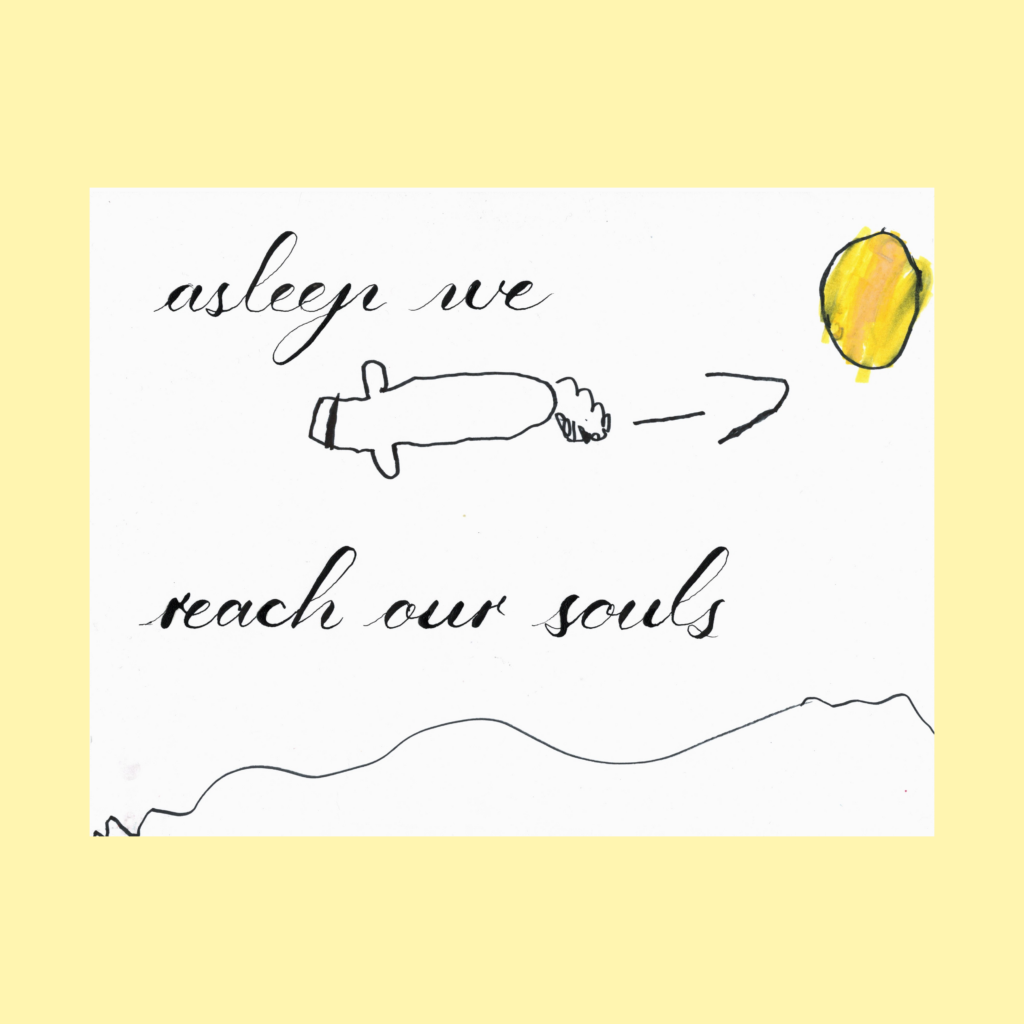
    asleep we reach our souls

    I have no idea how this line popped into my head, but it was a perfect 5WP.

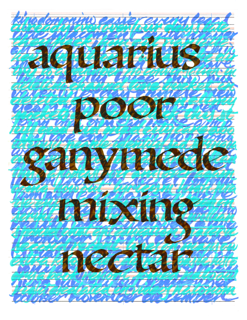
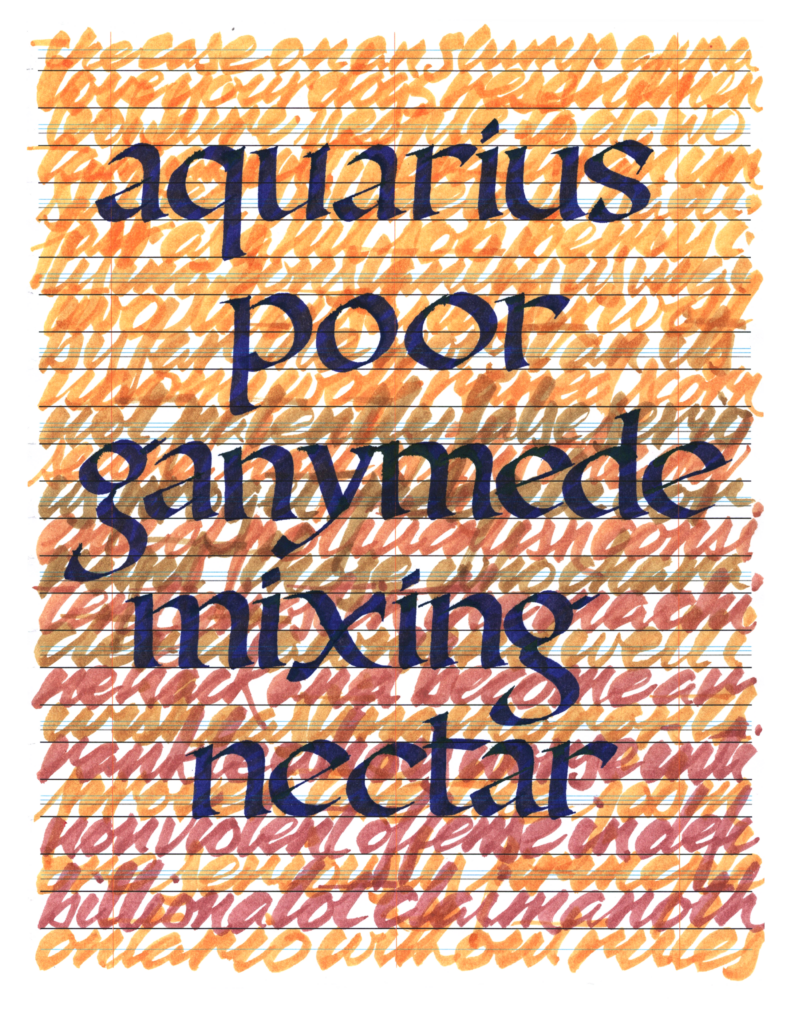
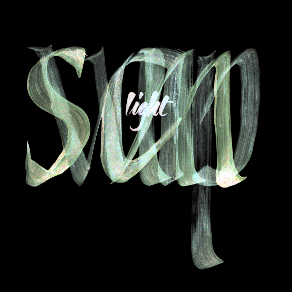
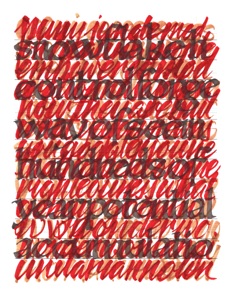
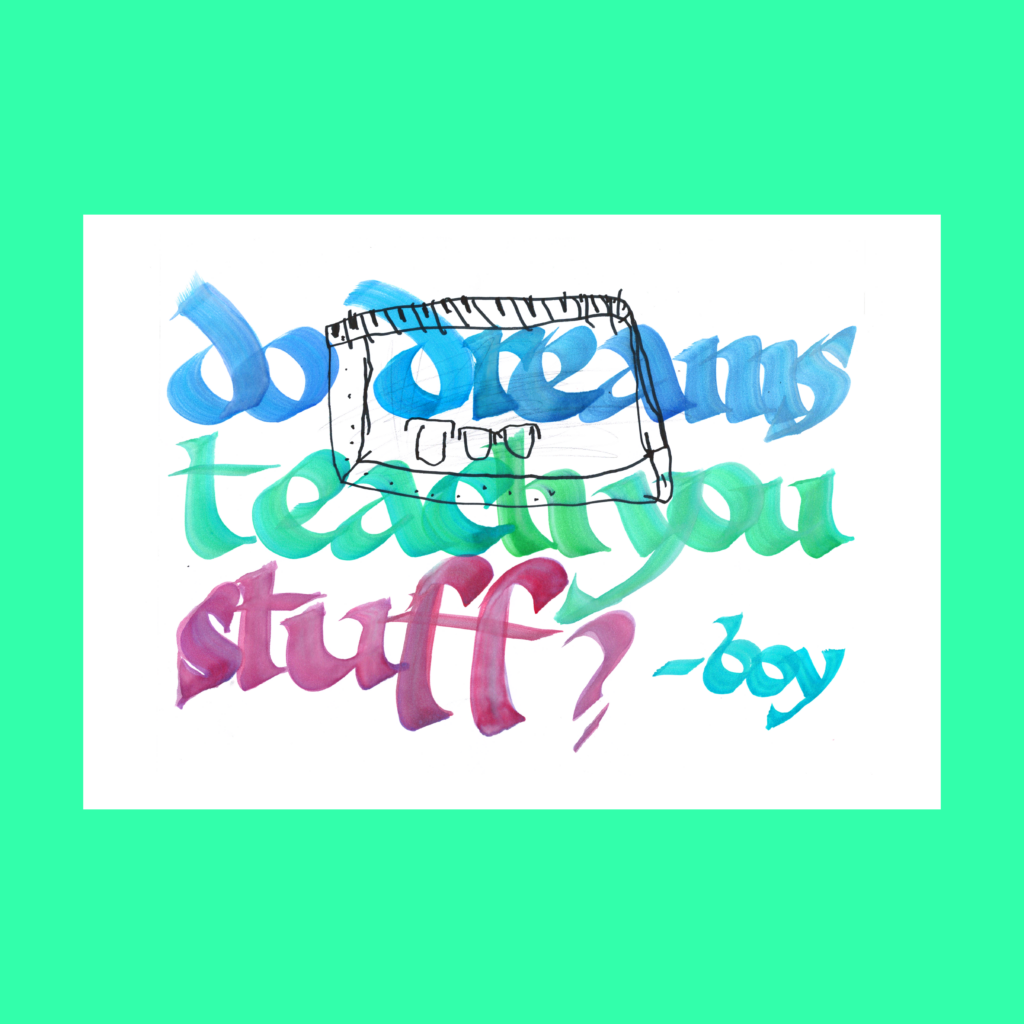
    On the first version, the boy typed the background text while testing a new ribbon for my typewriter. It doesn’t scan dark, but it’s a huge improvement over the twenty year-old ribbon. In undergrad, I didn’t use the computer for art or architecture work. When applying to grad school I bought a Remington Quiet-Riter so I scan in real typewritten text to emphasize my hand work. I got into almost all of the schools, so I guess they appreciated my devotion to this illusion.

    ,

    A few weeks ago, I deleted all social media apps from my phone to detox from those random dopamine hits keep us constantly distracted. The only exception was YouTube, because it has become a second podcast player. In the void, YouTube started creeping up.

    I found a solution in ZenScreen, a simple free app that delays how long it takes before YouTube opens. If it’s important, I can wait 60 seconds. If not, I’ll lose patience and slip over to the podcast or music app.

    I don’t care about their tracking features, but the core delay feature works perfectly….though I’m not sure how long it will last. I find that most life-hacks are only effective for about six weeks before my monkey brain finds a workaround back to the juice.

    Cya next time!
    Justus

    ,

    PS–Reciprocal Paradox

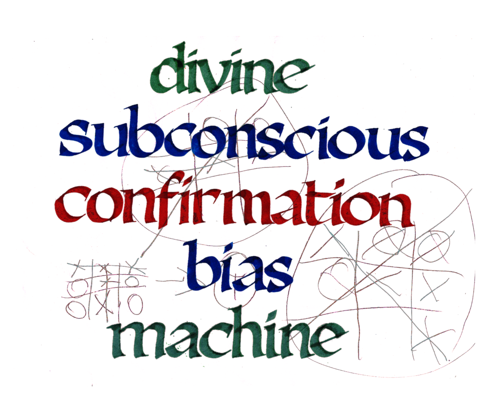
    As a Project Manager I try to cultivate a feeling of psychological safety with my design team. I hope this will draw out that “edge” from each individual on that team.

    But if I don’t sense that “edge”, I will judge the heck out of you as a professional.

    ,

    PPS-1901 Modern Pen and Ink

    As a dude with money to purchase (and the time to read) a 123 year old book on pen and ink printings, I have more in common with the socialites depicted on these pages than the exhausted workers toiling in their slums.

    Privilege is a weird thing. In today’s chaos, it’s easy to feel that we’re the victims of our story, but every single person reading this has been gifted with a cornucopia of great things (such as a flat screen monitor/device integrated with an unimaginably cheap, powerful, and small supercomputer).

    ,

    PPS-Reactionary Classics

    Earlier this year, academia hosted a plagiarism kerfuffle which has driven me deeper into my preference for “great books”. If nothing is guaranteed (and now likely laundered by AI), at least the classics have stood the test of time.

    Yes, these classics are plagiarized works themselves—bits and bobs accreted over decades until they were frozen for millennia. But the ones that have survived to the present were so damn good that generation after generation thought it was worthy to reproduce by hand.

    So there must be something there there? Right?

    .

  • a few #Inktober52’s (five-pack one) + Social Media Indulgences

    Having wrapped up the daily challenges of the October and November, I’m slowly playing through old weekly prompts from #Inktober52 along with random 5WP’s that pop in my head.

    It will take a few shots to find the right feel for these posts, but at the moment I’ll be posting a five-pack of 5WPs along with a hastily edited old blog draft that needs to be finally pushed into the wild.

    Here’s to new-old projects, starting on the last month of the year!

    ,

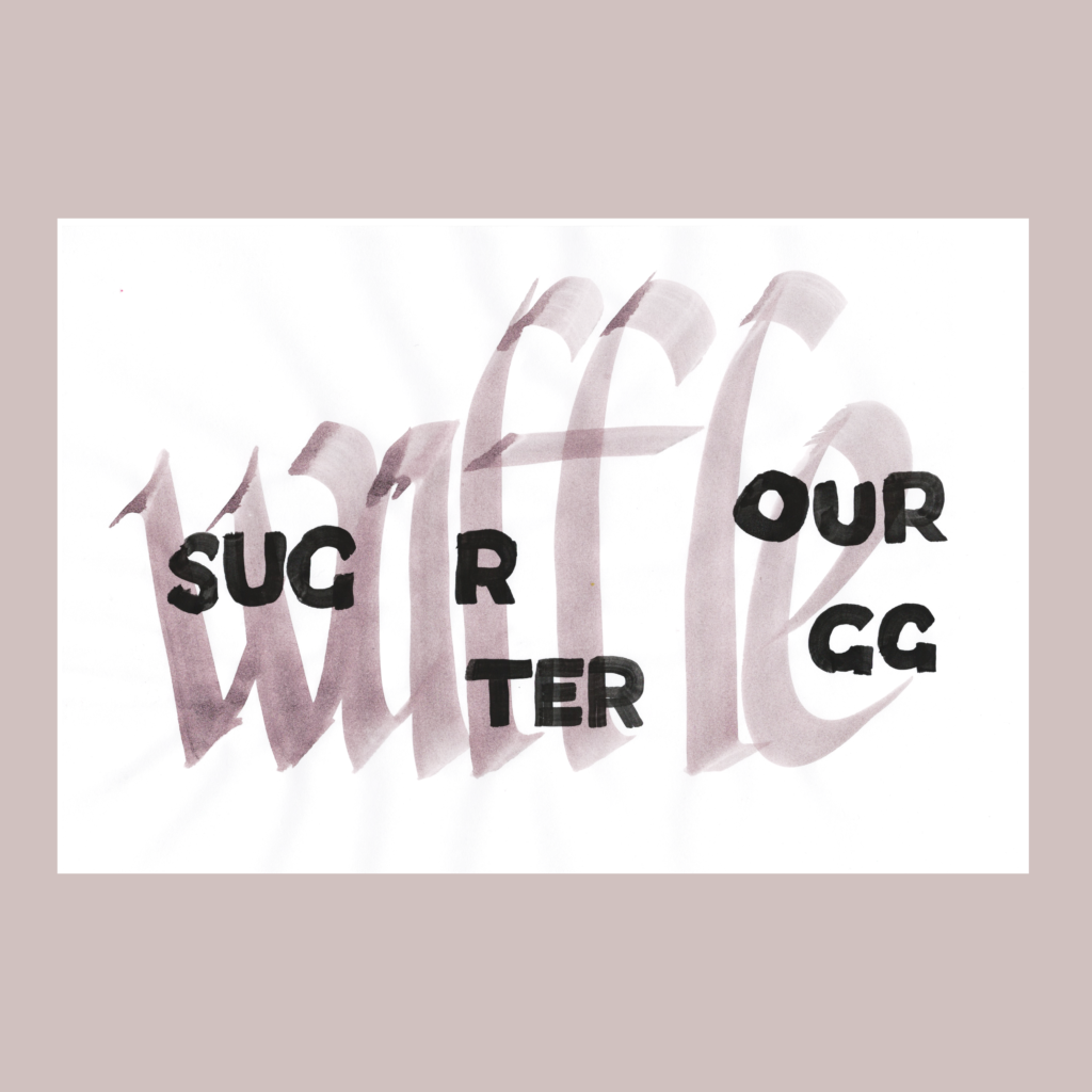
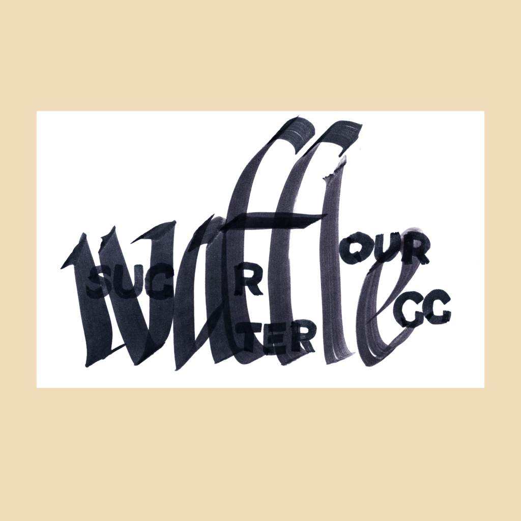
    11/16—Inktober 52, week 46

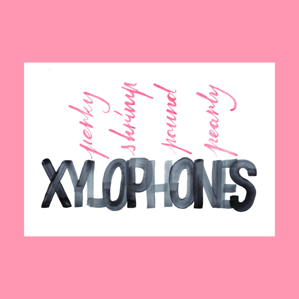
    waffle
    water
    sugar
    flour
    egg

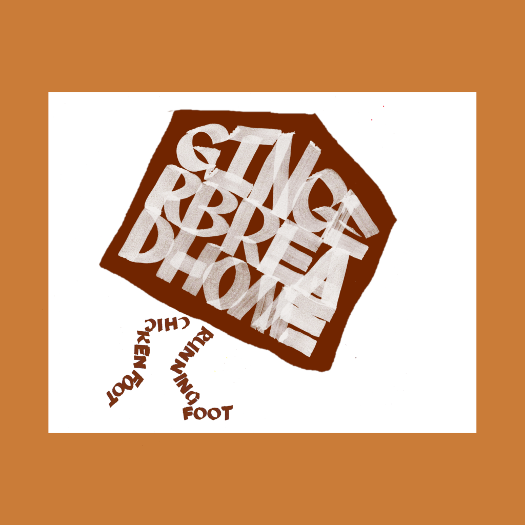
    My favorite book on bread baking is Tartine Book No. 3. Chad Robertson’s ambition is breathtaking. I am also fond of Ken Forkish’s Flour Water Salt Yeast, which a huge help when starting my sourdough journey.

    ,

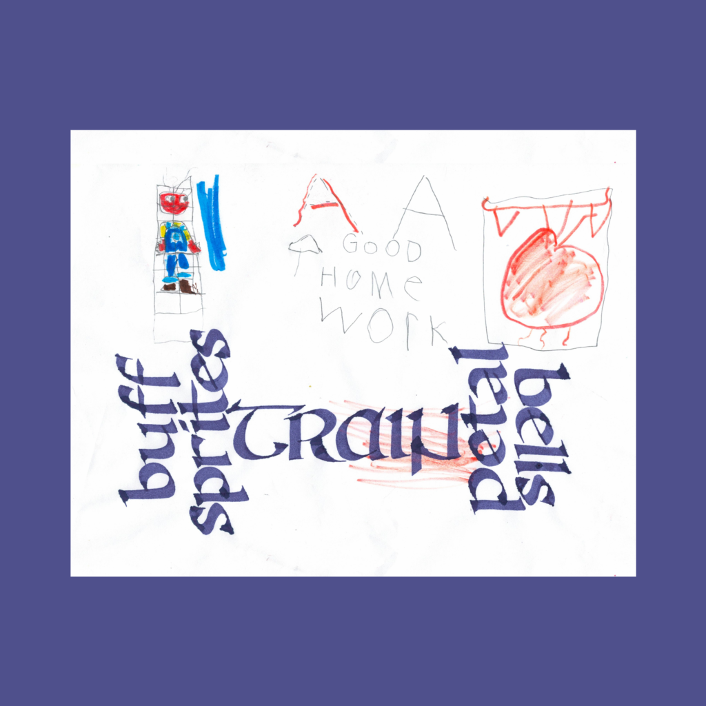
    11/23—Inktober 52, week 47

    buff sprites
    train
    petal bells

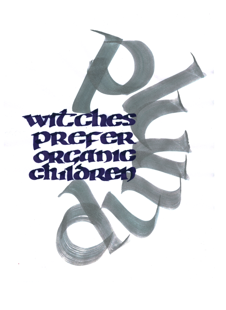
    The visual pun to make a dumbbell of words didn’t land perfectly, but it was greatly helped when I flipped “petal” to align with ” buff sprites”. For many attempts I kept “petals bells” oriented towards “train”, but it read as “train bells petal”. On the other hand, the letters clash if “bells” is flipped into alignment with the other three lines.

    But I don’t totally mind the orientation weirdness of “petal bell” because it emphasizes the rhyme pun of that pairing.

    ,

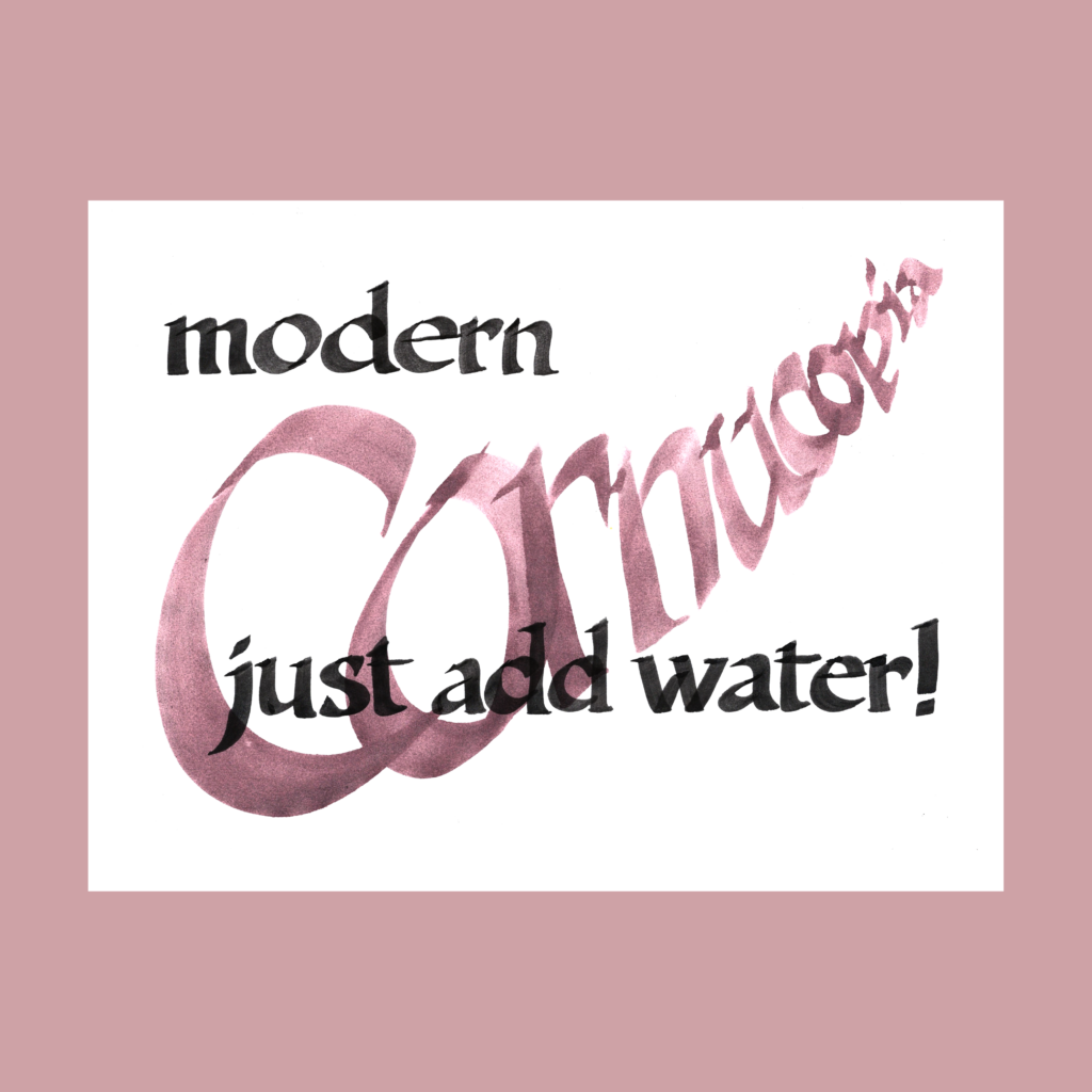
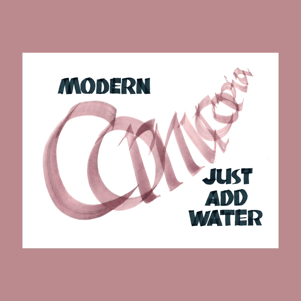
    12/3—Inktober52, week 48

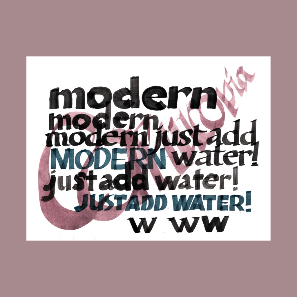
    modern
    cornucopia
    just add water

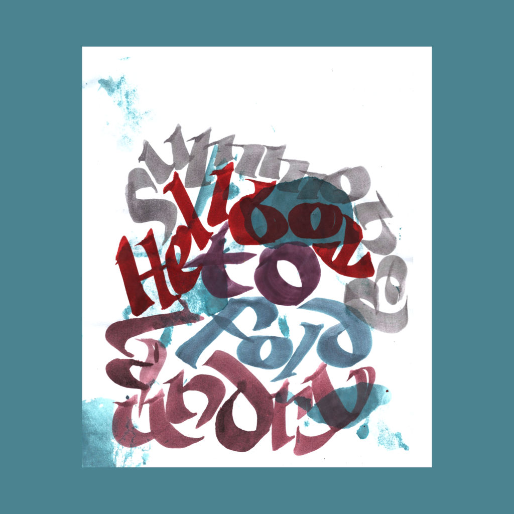
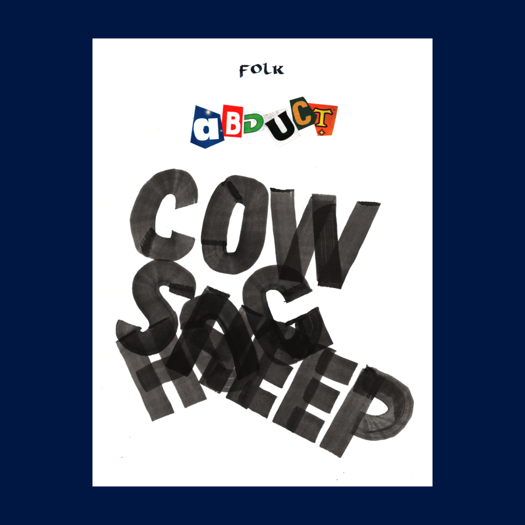
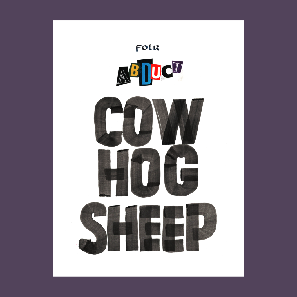
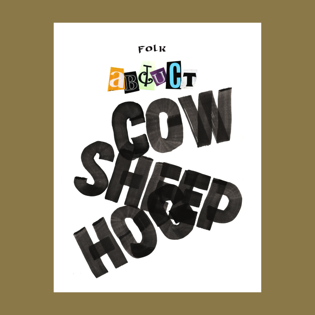
    My standard process with super-graphics:

    1. Sketch a concept with thumbnails.
    2. Warm up on previously failed sheets.
    3. Take a bunch of shots on “good” paper.
    4. Fill in the remaining four words of the 5WP in varying ways until I run out of patience/paper. (The thumbnail sketches never work full size, so I usually flail around for a few sheets before settling on a couple decent solutions.)
    5. Scan them in.
    6. A few days later (after the rush of the moment has cooled), I make final selections and complete the edits on the computer.

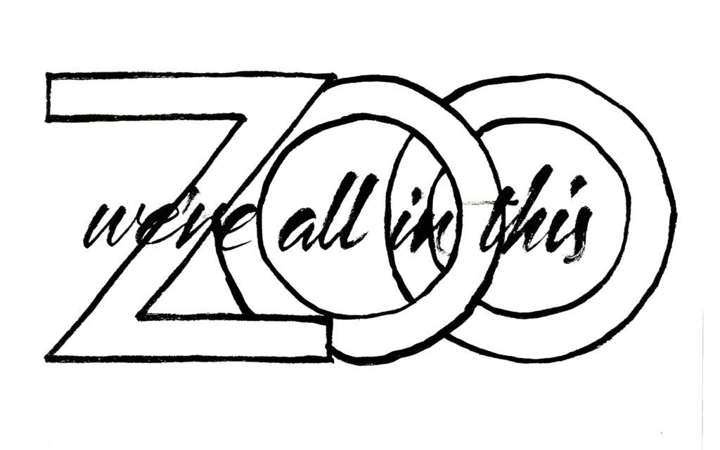
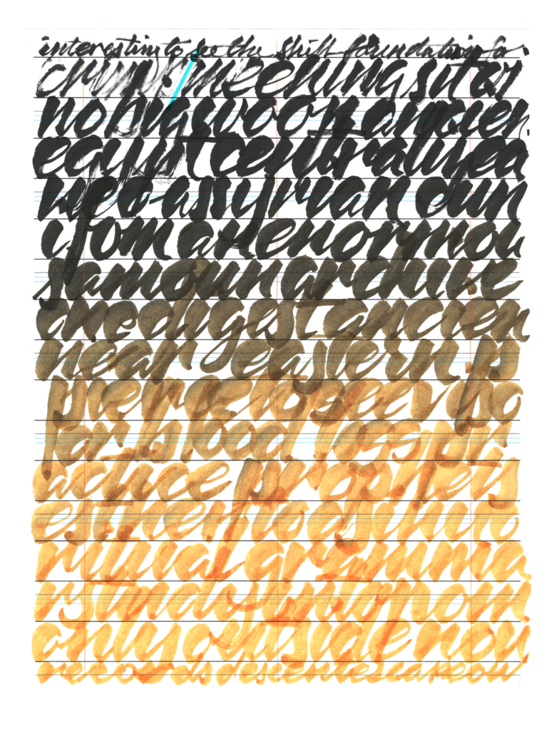
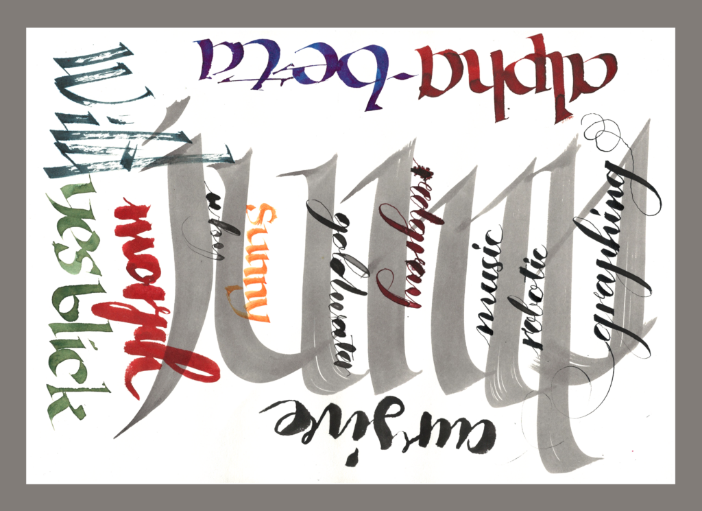
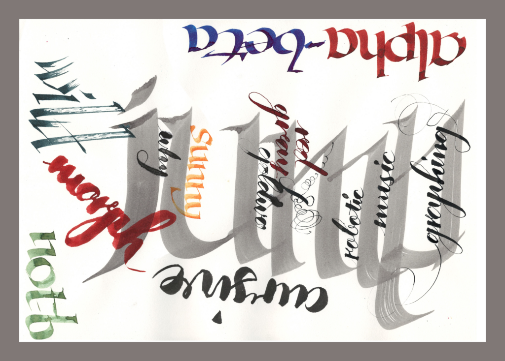
    BTW, I’m fond of this failed sheet which became the background for testing scripts.

    ,

    12/4—Inktober52, week 36

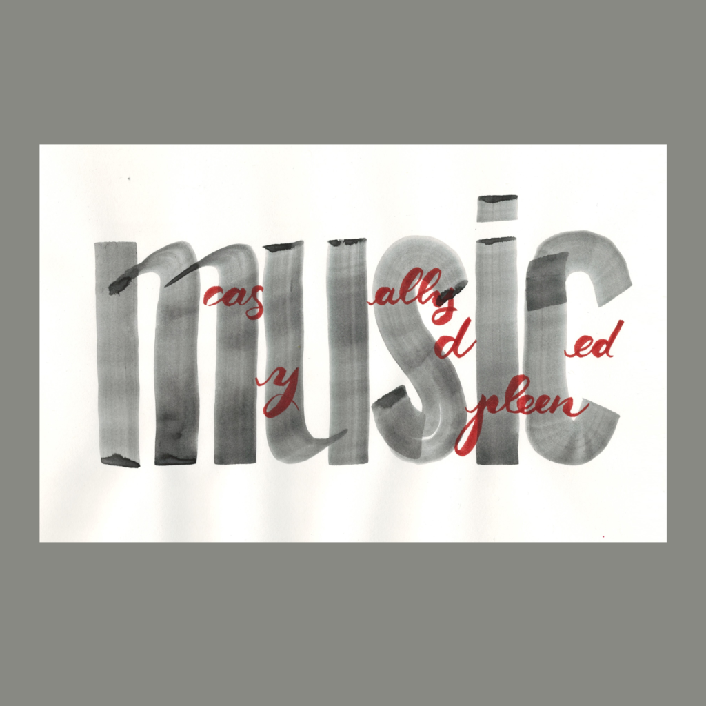
    music
    casually
    diced
    my
    spleen

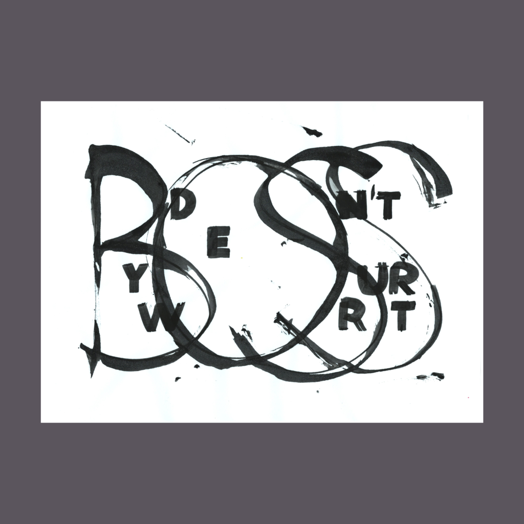
    Even though I already played with the visual concept of interlaced words on “boss” and “waffle”, there’s always more to explore—along with thymus and spleen, I also considered pancreas and kidneys.

    On a serious note, check out Nadia’s beautiful essay about music and healing.

    ,

    12/5—Inktober 52, week 37

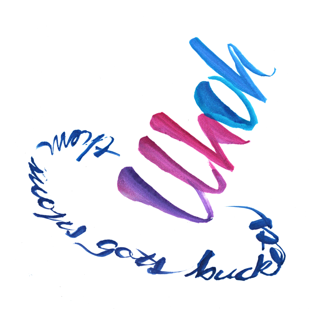
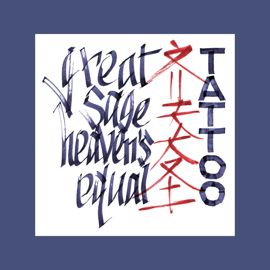
    great
    sage
    heaven’s
    equal
    tattoo

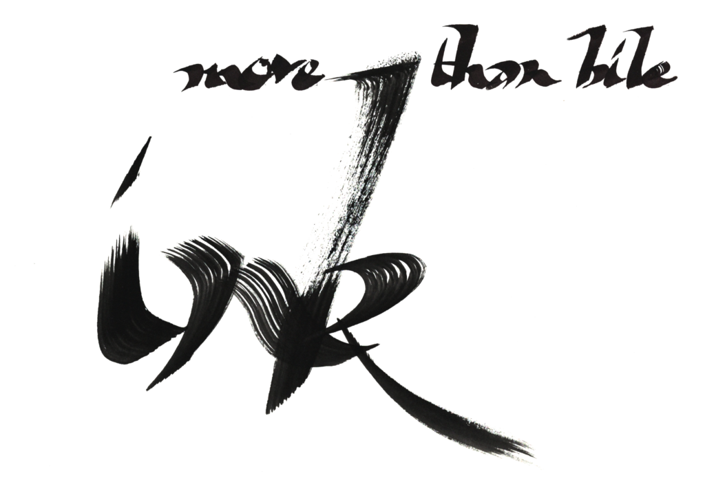
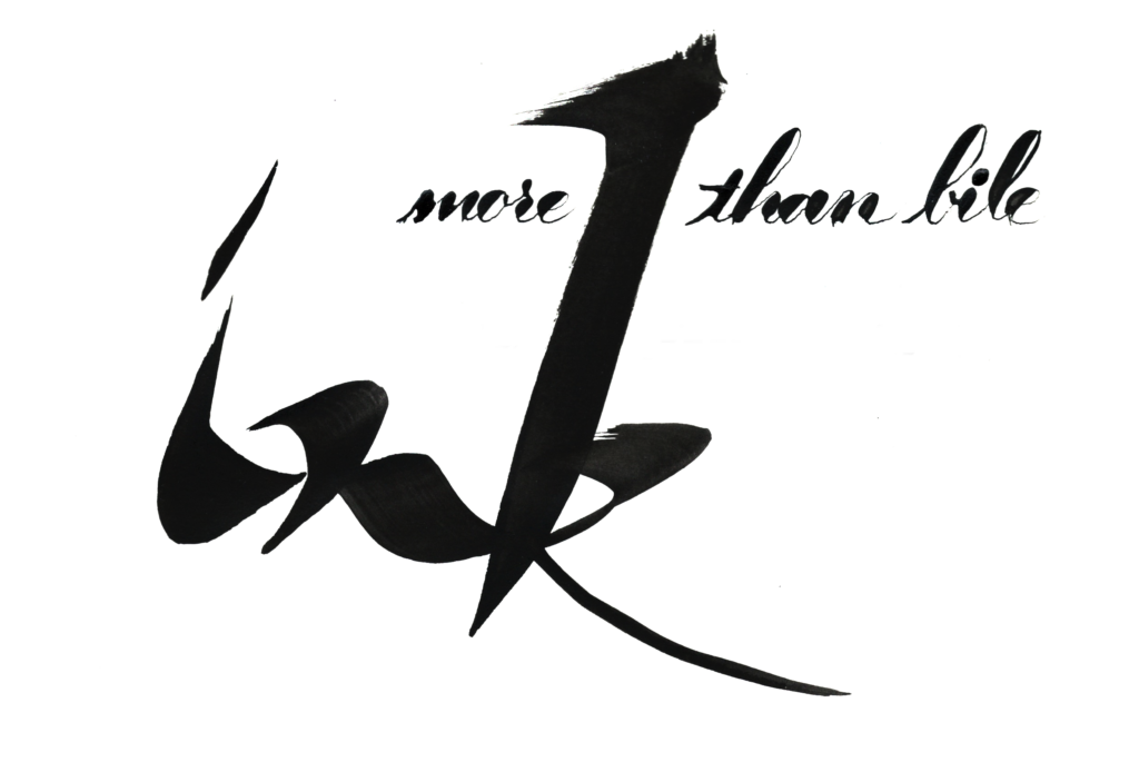
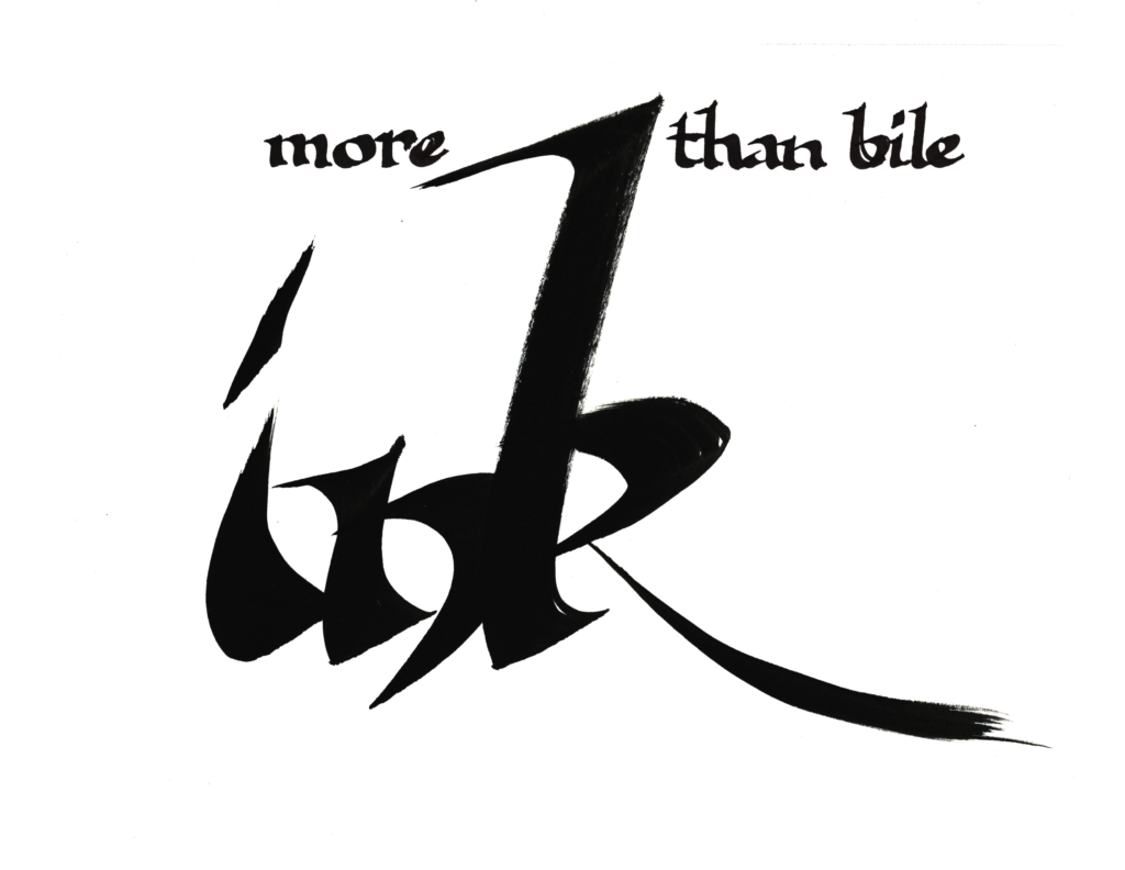
    My Chinese calligraphy is awful, but this prompt begs for bad Asian brushwork! Unlike my frustrations with an art I’ve never practiced, I had fun going brush-ish with the Pilot Parallel—it felt simultaneously of street-ish and asian-ish.

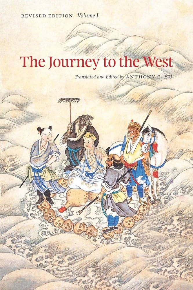
    I don’t have a tattoo, but if forced to pick something, I would adopt the bravado of this Monkey King’s self-granted title…maybe to compensate for the lack of such bravado in real life! Plus a hard recommend for the Journey to the West. It’s truly one of the four classics novels.

    ,

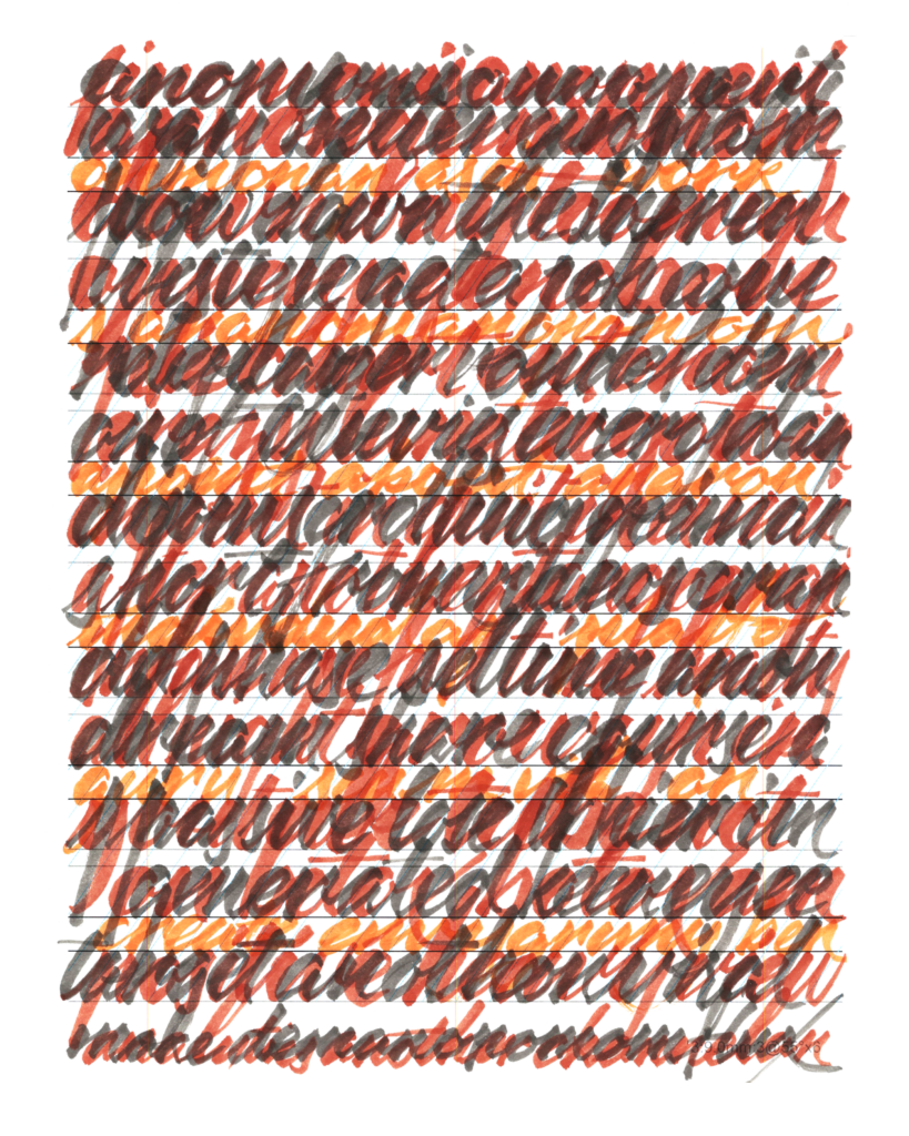
    A full week after the official end of the challenges (and three weeks after actually finishing my paper graphs for the prompts) my brain has finally slowed down enough to let me practice without feeling a need to produce another 5WP every morning.

    As threatened over the last two months, I’m back to practicing Copperplate, learning to wrangle that flexible pointy nib and trying to avoid gigaton ink blobs after dipping the pen.

    It’s a simple meditative morning practice. I listen to a podcast while doing three lines of basic strokes and then fill a page in the sketchbook with whatever words that pop into my brain from that podcast.

    There are a couple of enticing project ideas the horizon, so I expect to crank up the machine again, but it’s nice to enjoy the downtime.

    Cya next time!

    .
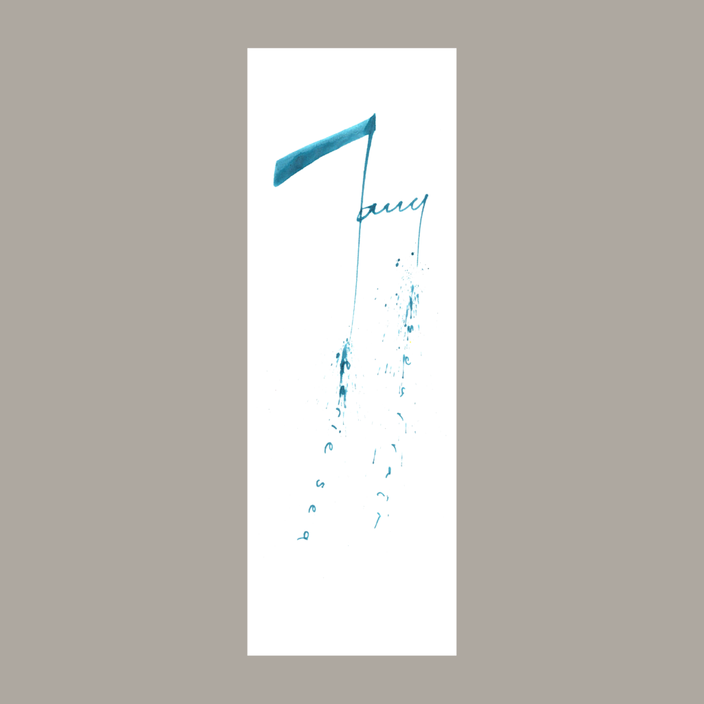
    PS-Social Media Indulgences

    In June, I drafted this listicle of lists from various social media posts. I was trying to keep a monthly streak alive, but it never got published!

    ,

    Purchases to celebrate a new job:

    • (Carlo) Scarpa, Complete Works
    • Magic Puzzle, Season 2
    • Magic Puzzle, Season 3
    • Journey to the West, volume 3 (of 4)
    • Sleeping by the Mississippi, Alec Soth
    • American Prospects, Joel Sternfeld

    ,

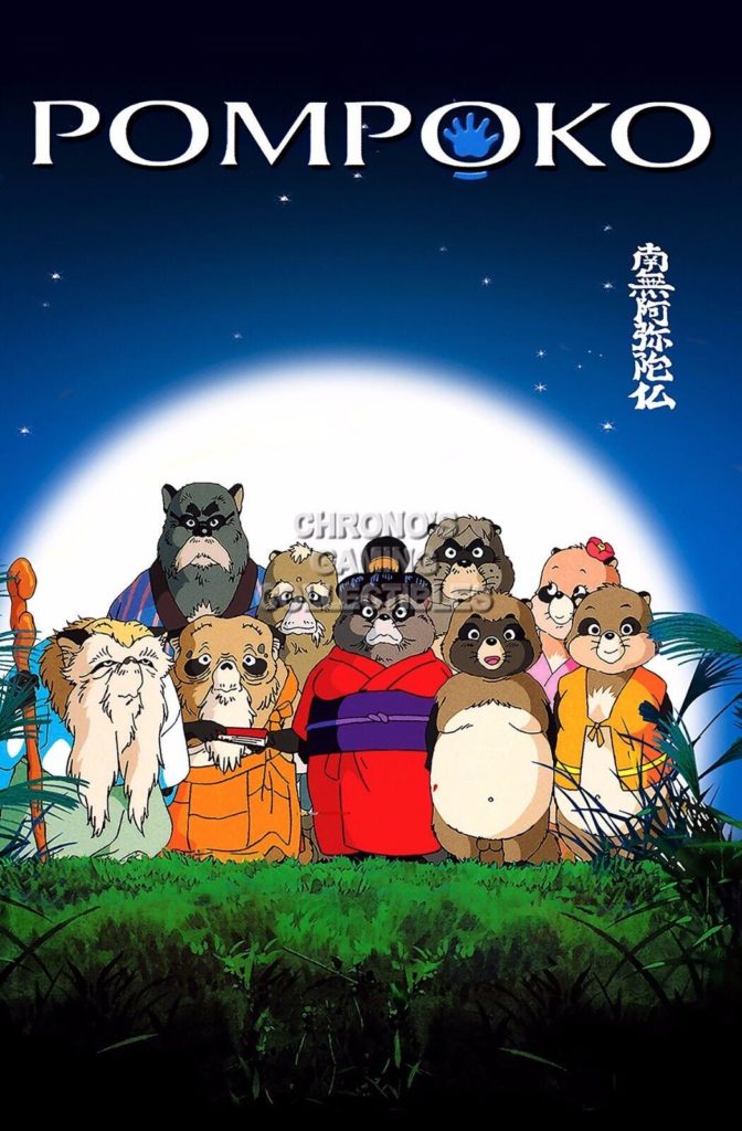
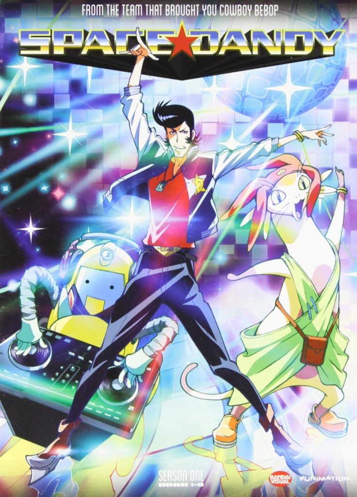
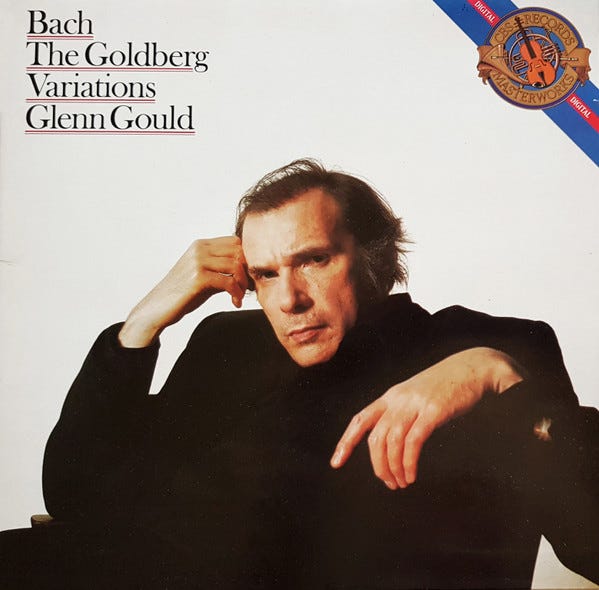
    4 covers (book, album, movie, television series)

    Honorable Mentions

    • Album: Koln Concert (Keith Jarrett), Chicken and Dumplin’s (Bobby Timmons), Alive 2007 (Daft Punk), Giant Steps (John Coltrane)
    • MovieWhisper of the HeartCollateral
    • TV ShowCowboy Bebop
    • BooksInvisible Cities (Italo Calvino), Labyrinths (Jorge Luis Borges), 40 Days in the Desert (Moebius)

    ,

    Three short stories

    • “Three Septembers and a January”, Neil Gaiman with Shawn McManus
    • “Tlön, Uqbar, Orbis Tertius”, Jorge Luis Borges
    • the passage on the giant bird Peng, Zhuangzi

    ,

    When in doubt

    • Bullet points are your friend.

    .
  • Callivember24, Week 5

    ,

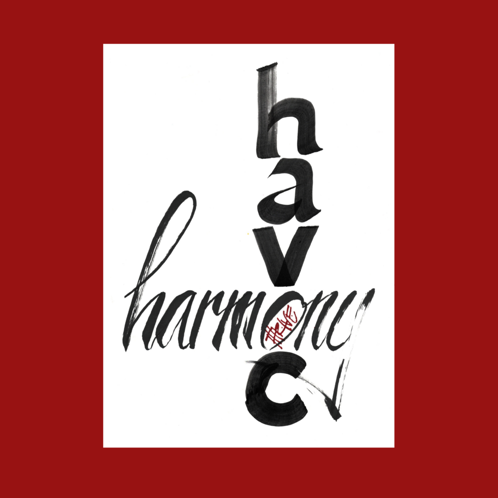
    11/25

    thrive
    where
    havoc
    crosses
    harmony

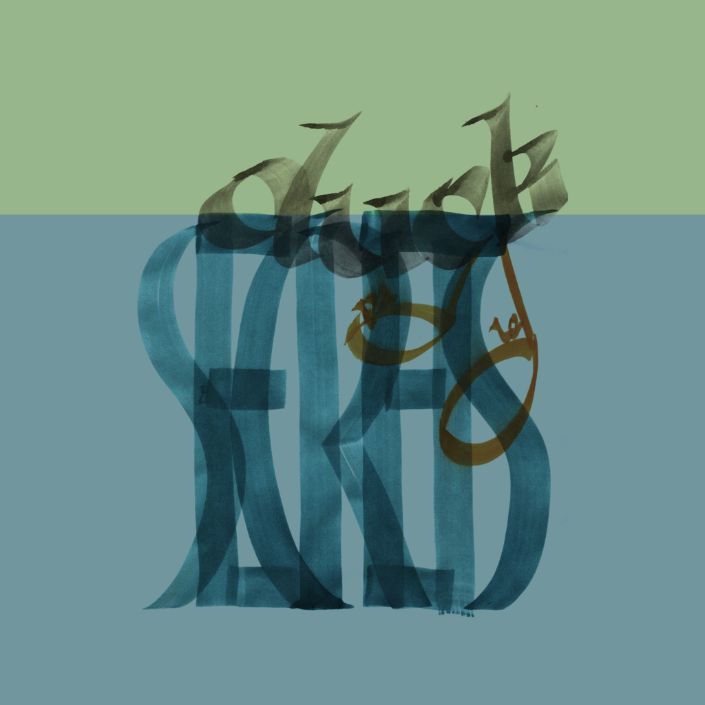
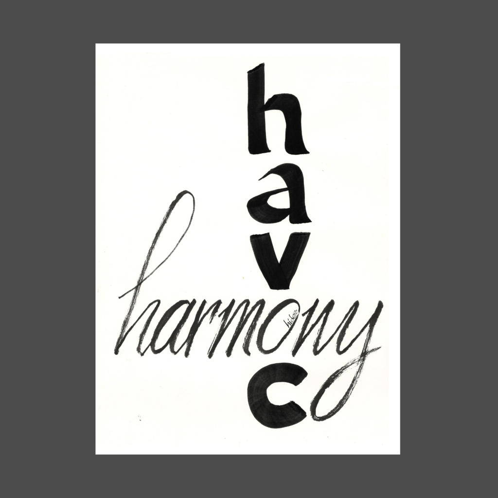
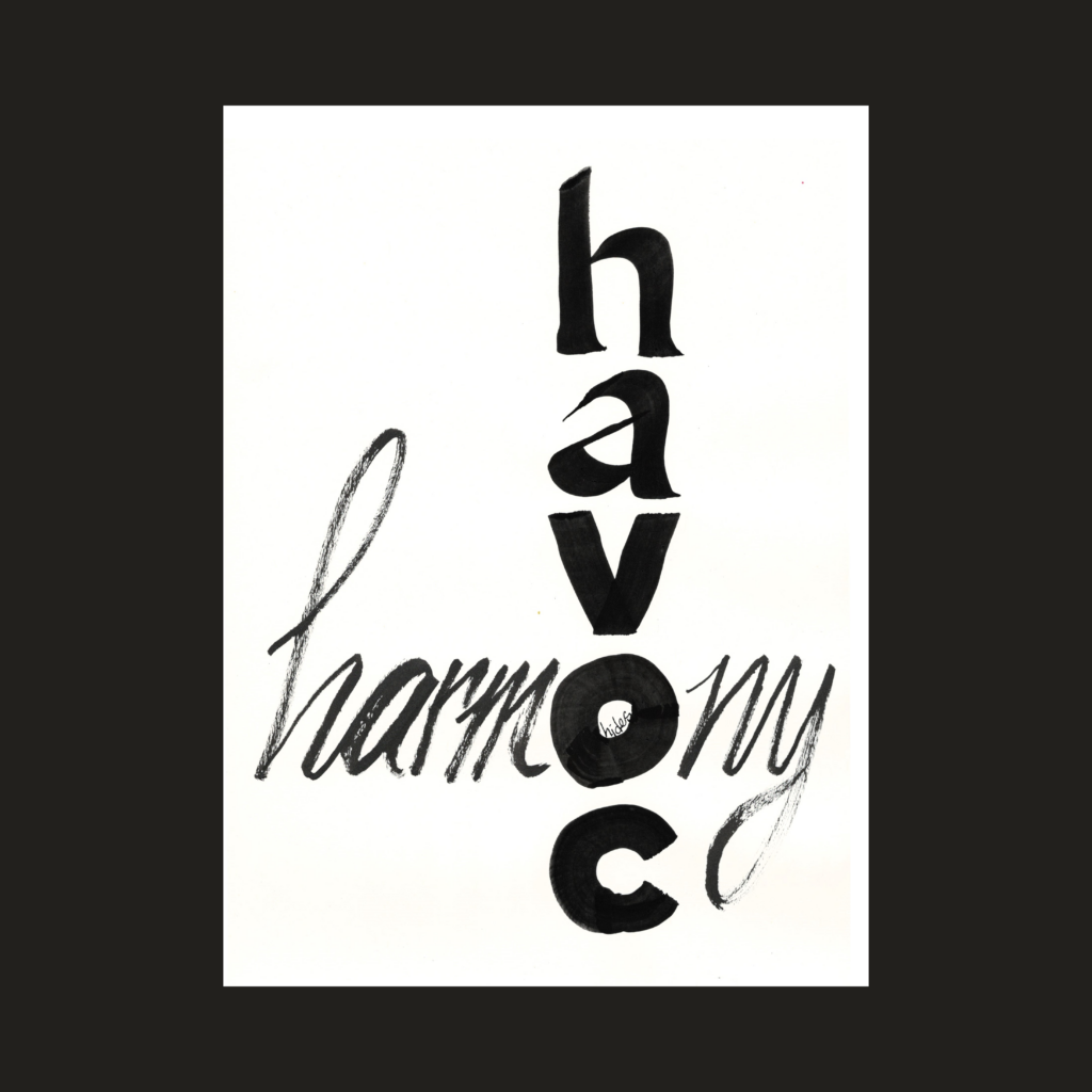
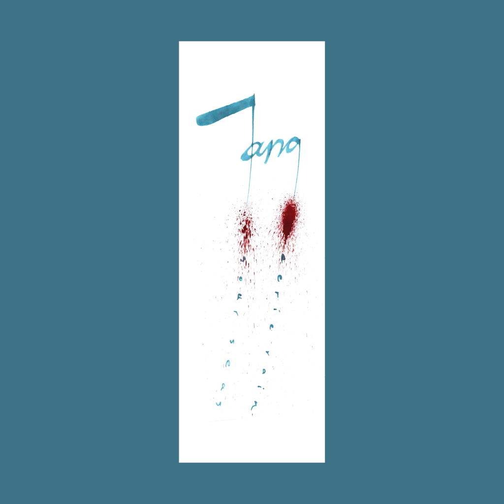
    I finished this piece ten days before prepping the scan for upload. Plenty of time to forget the exact wording before final edits in the computer. So I came up with “better” wording, dragging me back to the drawing board. I didn’t like the initial version (with the cursive harmony O) so I tried again with the heavy O.
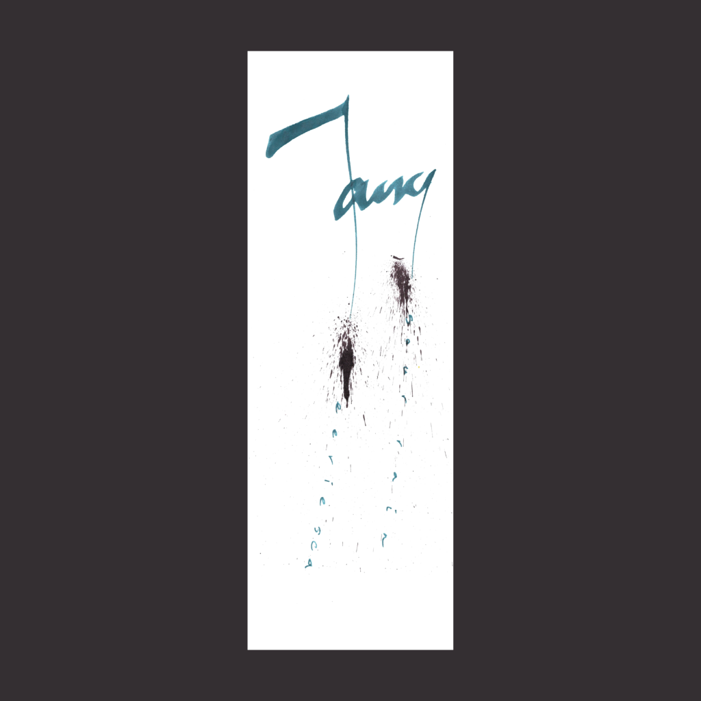
    Two extra trips to the drawing board before remembering the original wording and realizing that the alternate version only has 4 words.

    That’s why it’s important to write things down!

    harmony
    hides
    in
    havoc

    ,

    aesthetic
    without
    rigor
    is
    nothing

    5WP as a math problem.

    ,

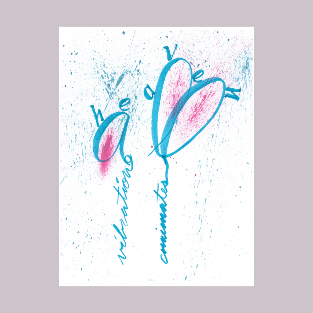
    vibration
    animates
    all
    under
    heaven

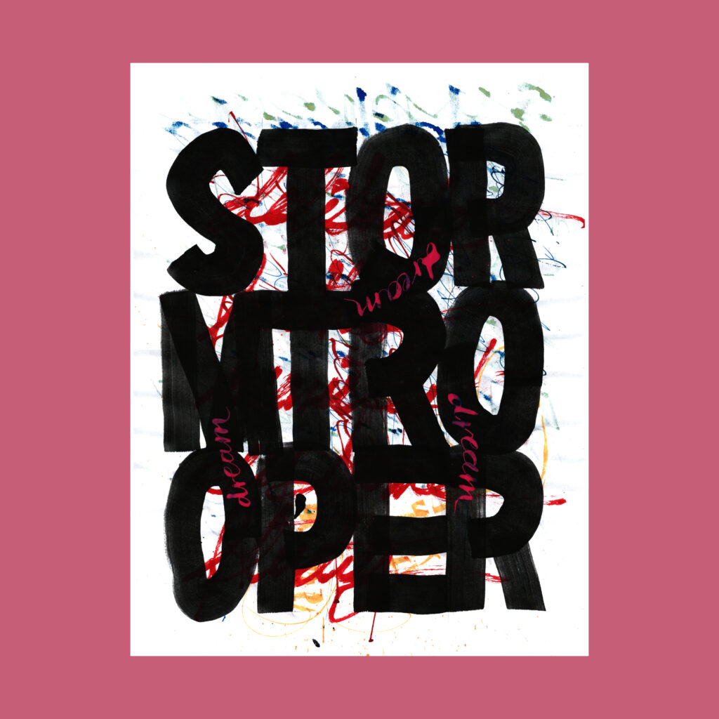
    Inspired by the occasional reading of old Chinese philosophy. The piece felt a bit dry after graphing, so I added splatters. Ideally the page would be energized by the graphs themselves, but I need a lot more practice with brush cursive. Until then, I’ll shamelessly rely on gratuitous noise.

    ,

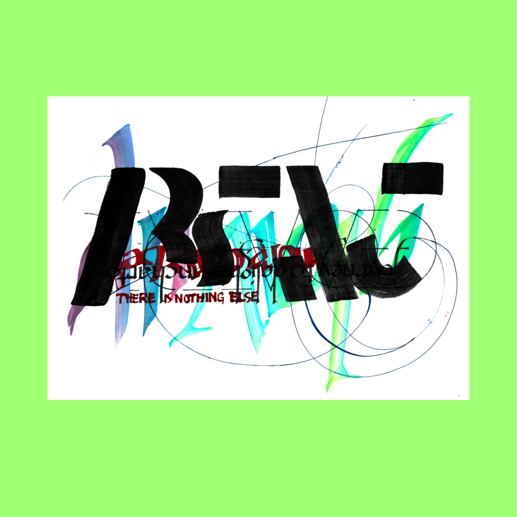
    11/28

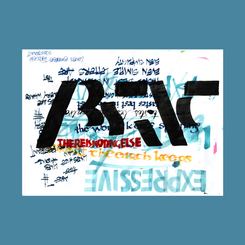
    abstract,
    there is nothing else

    I love using the heavy black brush over busy backgrounds. But that leaves the problem of getting the other four words readable within the noise.

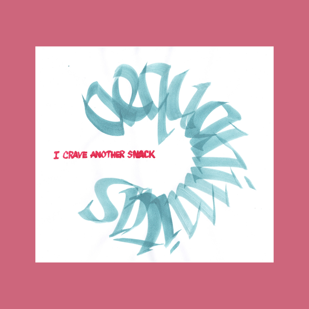
    ,

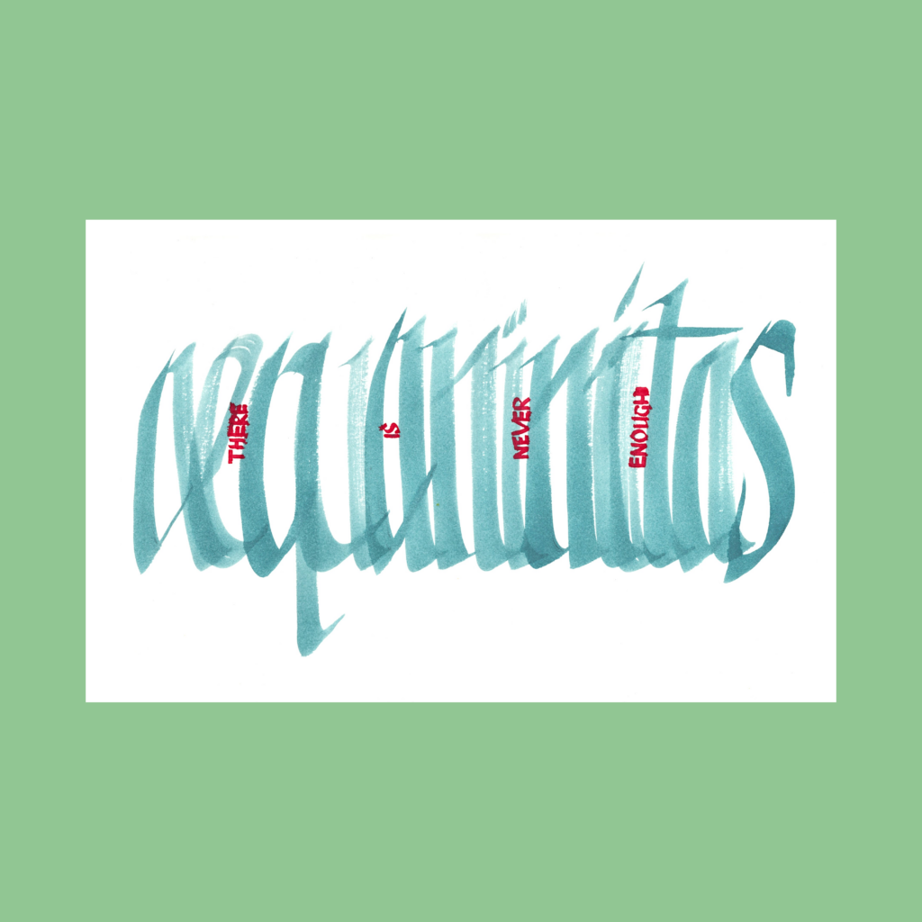
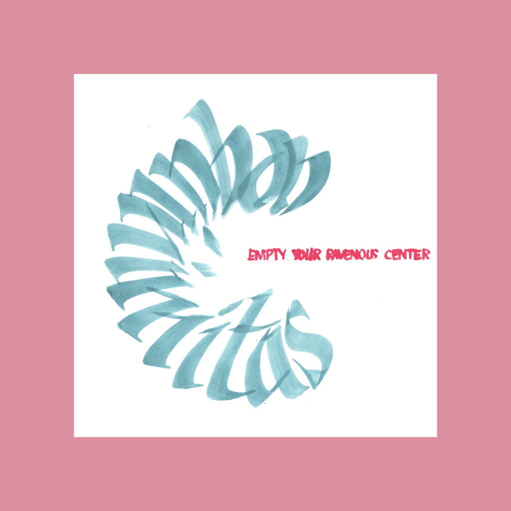
    aequaminitas
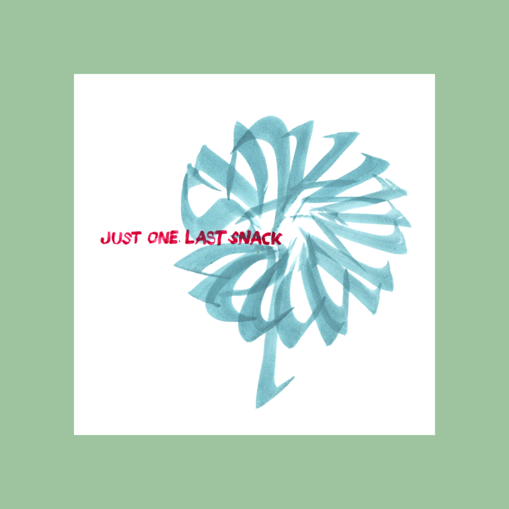
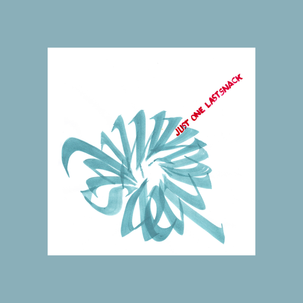
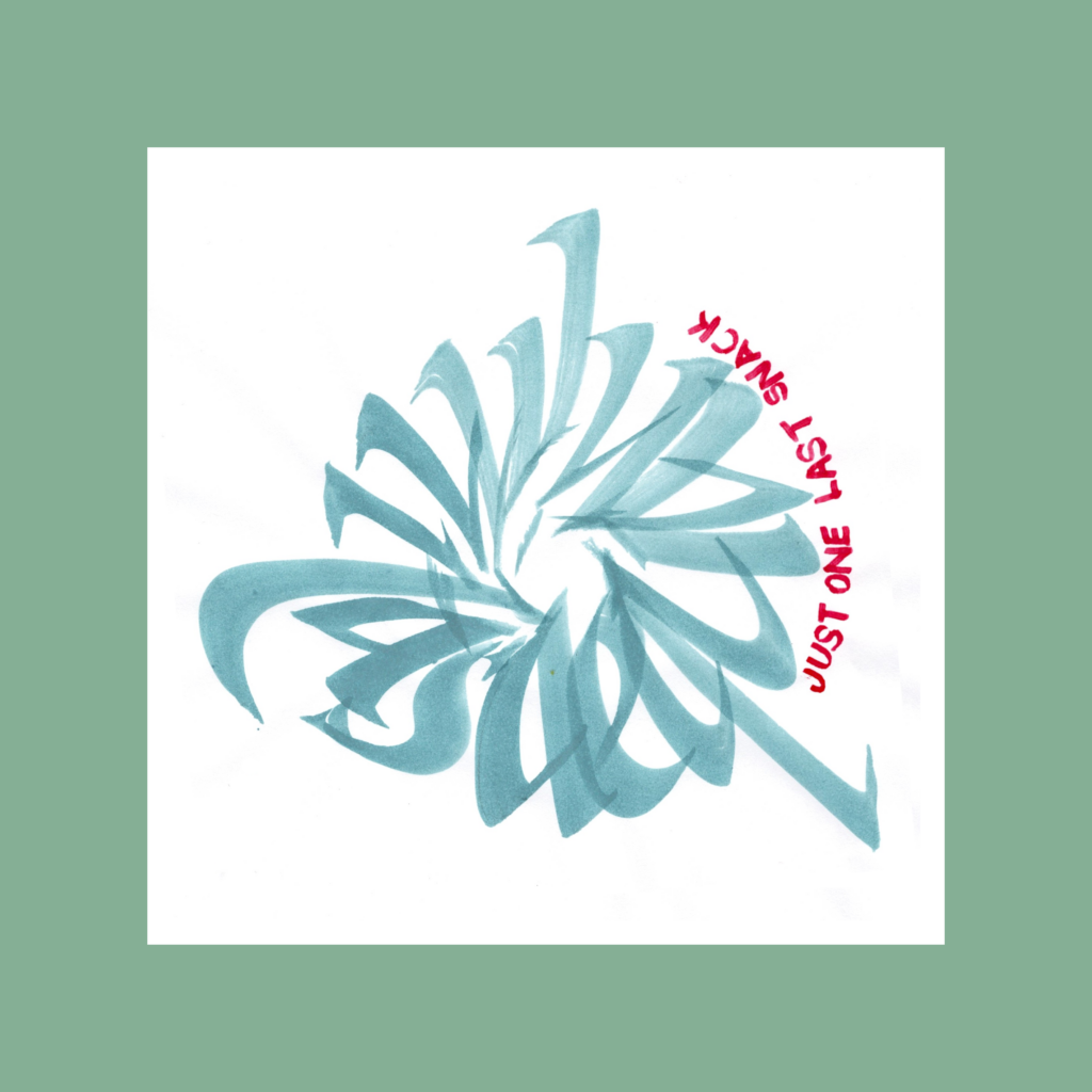
    just one last snack

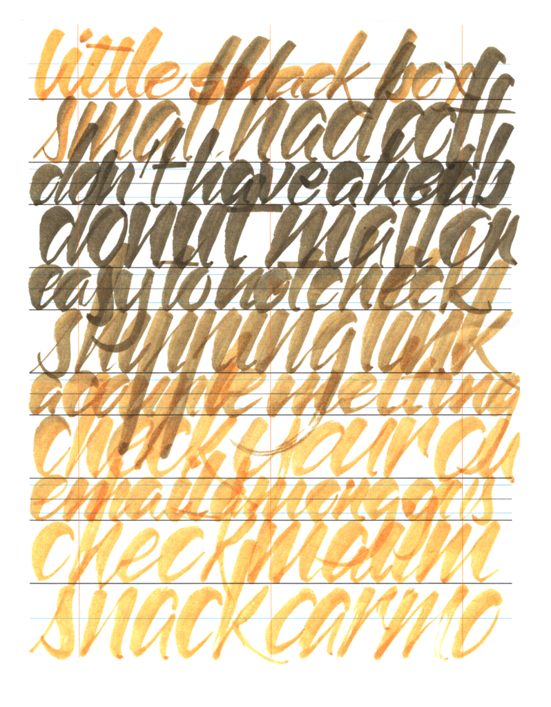
    This one flowered into a bunch of variations, which is fitting for this 5WP.

    Aequaminitas means equanimity. I first took it as the disappointment that always comes after completing a piece (even though I quickly recover by jumping into the next piece). Playing with the wording led to the realization that calligraphy always tantalizes the practitioner that the next graph will perfectly match the vision.

    This hobby is such a tease!

    ,

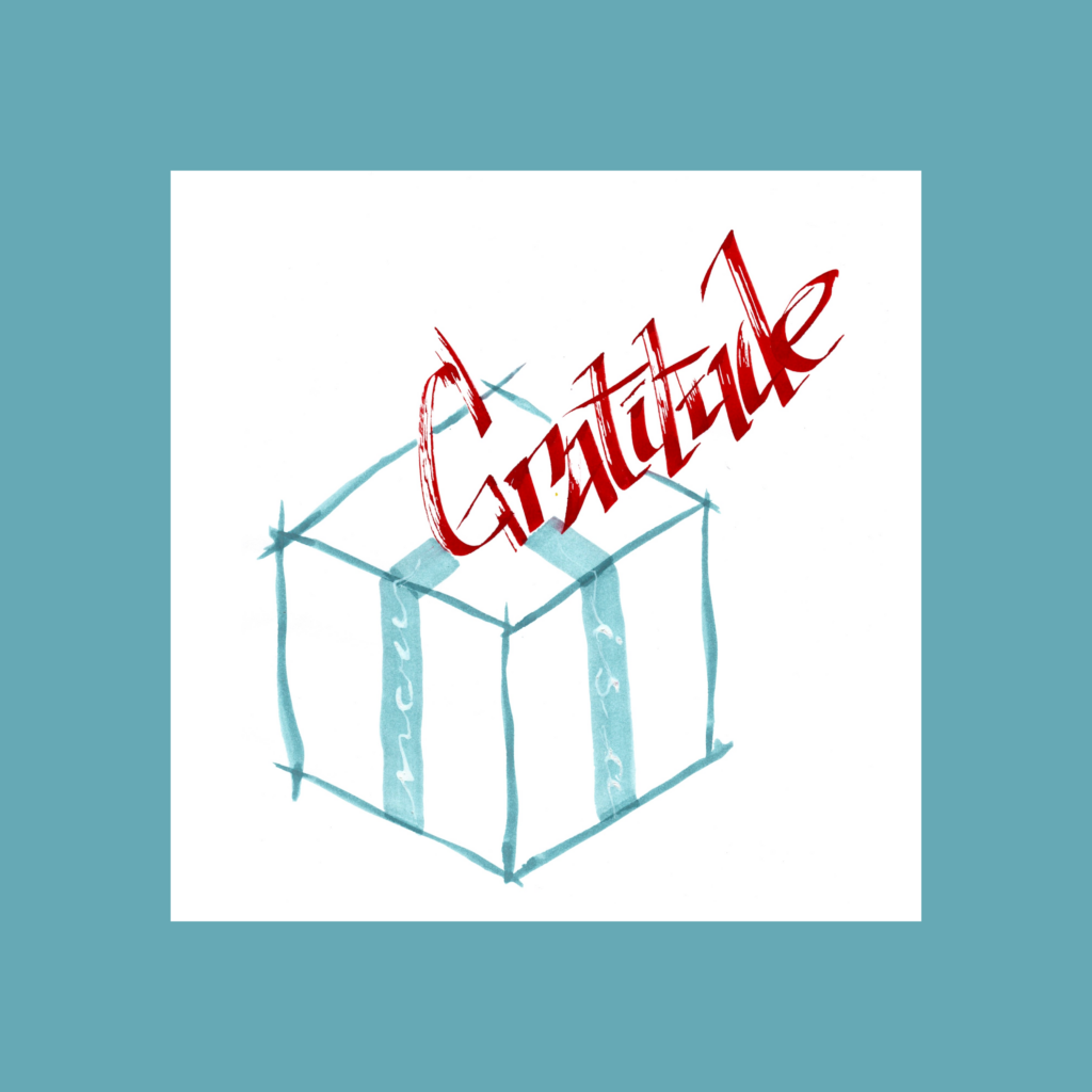
    gratitude
    now
    is
    a
    present

    At first I tried using the words as ribbons but my script skills weren’t good enough. I settled with a flat brush and then going white over it. Turned out to be a nice recall of the first word of Callivember 2024, with “flow” written in mastic.

    11/1

    ,

    It’s been sixty-one days of a part time job where the pay is a pile of (hopefully) pretty papers and approximately one thousand digital hearts. And the skill to do it better. I’ve often told young architects you get paid in money and experience. In this case, $0 and a ton of experience.

    Moving forward, I’m going to keep hitting the drawing board, but I’m not grinding to produce something every day. The holiday season is here, gotta wrap presents, bang out Christmas cards, tidy the abode, only to jump into tax season.

    But as with all my hobbies, we’ll see where it goes. Hopefully it keeps growing as a meditative creative practice, but history predicts a slow fade as soon as something else catches my fancy.

    In the meantime, I have a growing backlog of Inktober 52 pieces so there’s enough to

    Cya next week!

    ,

    PS

    12/1

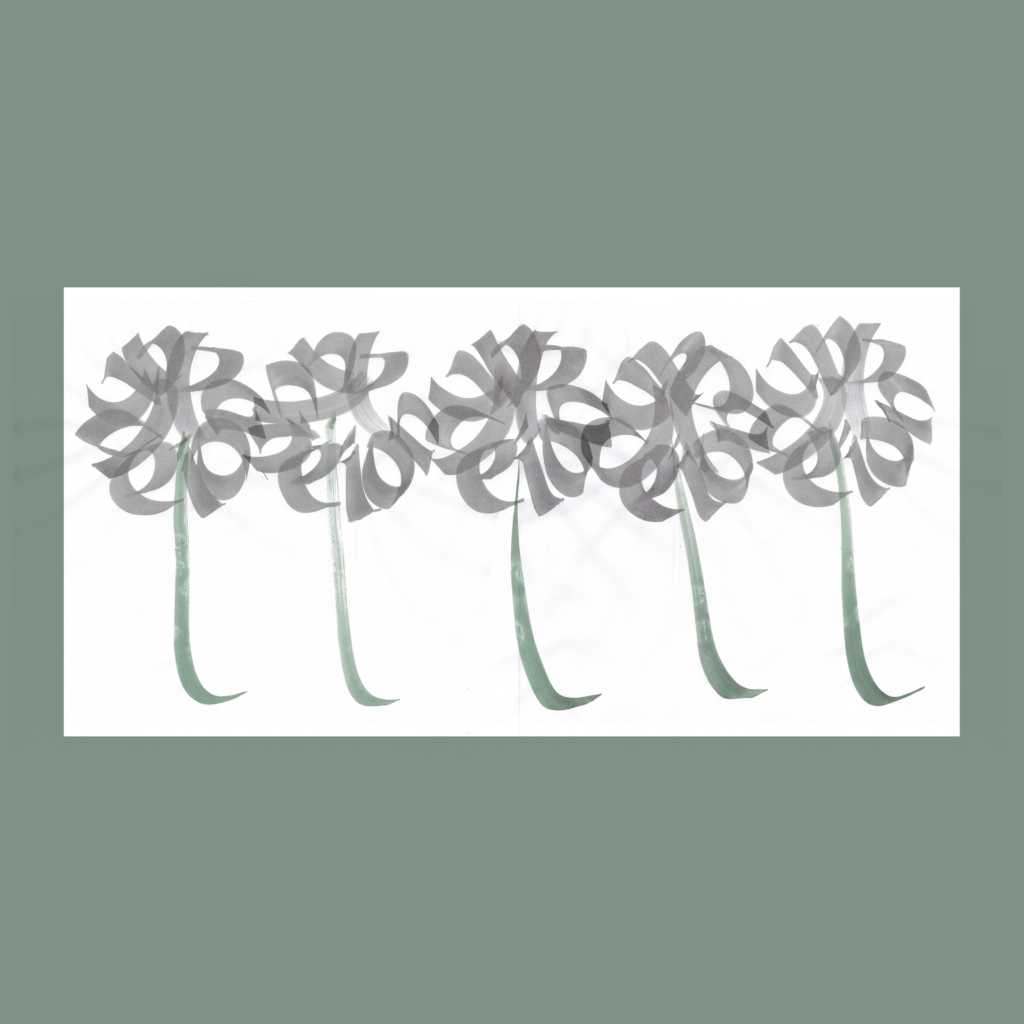
    five
    dandelions
    in
    a
    row

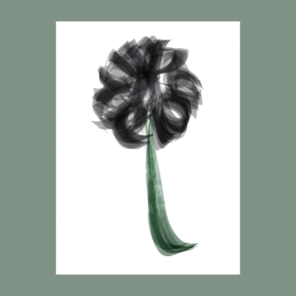
    While working on aequaminitas I was inspired to graph a dandelion. As always, it took a few tries to get the composition right. As my habit, I took a few extra shots for good measure (I’m rarely happy with the results at the table). The morning after, I had a hard time picking the best version so I chose them all (using multiply layers on the opacity function). This turned a single word into a 5WP.

    ,

    PPS

    11/30

    three
    sprawled out
    reading worms

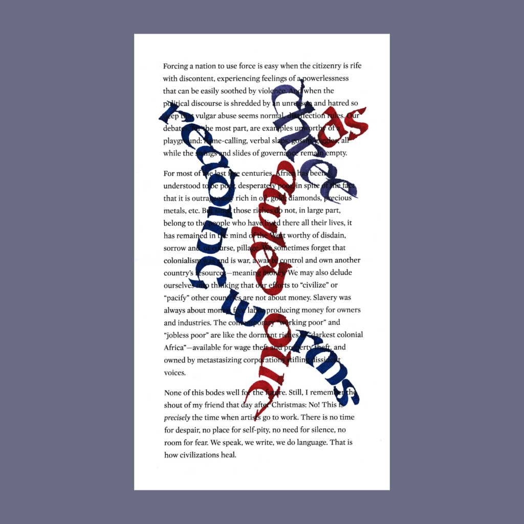
    The kids and I spent the other night reading books, all sprawled out in the bedroom. Mama would have yelled at us if she walked in before I fell asleep. The next morning, I found out that a Substack buddy just reached 333 subscribers, celebrating with this song. The coincidence was too much, I had to celebrate too.

    This first attempt was written on an 8-year old printout of Toni Morrison’s essay No Place for Self-Pity, No Room for Fear.

    ,

    That version was good enough to post in the moment, but I was unsatisfied with the composition and wording. It was originally oriented as a horizontal piece, but given the power of the background words, I pulled it vertical, but it felt off. Plus, I had gotten too cute by choosing “reading” instead of the obvious “book” worm.

    So I went back to the drawing board.

    three
    sprawled out
    book wurms

    .

  • Callivember24, Week 4

    More digital manipulation this week. More subtle than last week, but still not “raw on page”.

    Of course, I prefer to get things right on the paper, but 99.999999% of viewers will only ever see it on their screens. So I don’t feel obligated to physical reality after it’s been translated into 1’s and 0’s.

    Even so, I generally avoid pushing digital limits, unless the piece demands to go hard in the computer. Always listen to the work.

    ,

    11/19

    kiss
    the
    soft
    divine
    pulse

    Given the constraints, the circles weren’t perfectly centered on the page. With a white background, it’s easily fixed in the computer. Then, digital space insisted on a funky paper space. I obliged.

    ,

    11/20

    space
    turns
    letters
    into
    song

    I’m not sure that letting the “p” descend below the white page was a good idea. Experiments can fall flat if the payoff isn’t worth breaking convention.

    ,

    11/21

    art
    becomes
    our
    delicate
    sledgehammer

    I merged the handle from my second attempt with the hammerhead from the first attempt. Interesting that I started the week with three digitally manipulated 5WP’s. Last week, my wife convinced me to stop using the back of old printouts for these pieces. Default white backgrounds simplifying digital play might be an unforeseen consequence this change.

    ,

    11/22

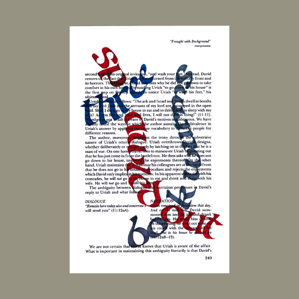
    ain’t gonna find wisdom online

    Sometimes you think the flashier version might work but ultimately upload the simpler one. The good thing with simpler pieces is that it’s easy to try a lot of variations on paper, especially if an early shot is “good enough”. After that you’re playing with house money.

    In the moment, it’s hard to tell which version is “better”, but time sorts things out. Often, the winner is an early attempt (maybe even that first “good enough” shot). If I was a professional with billable hours, this dynamic would be a problem, but amateurs can afford such luxurious whimsies.

    ,

    11/23

    don’t be your worst boss

    I still need to learn control over a ruling pen for deliberate scripts, but I’m now comfortable with being primitive using this tool. Being unpredictable is the point using a ruling pen, but it can’t be totally out of control.

    And yes, the last two versions were from the same scan, I upsized the inner circle to see how it would feel. But my wife is right, it’s cuter with the donut.

    ,

    11/24

    when
    in
    doubt
    add
    textures

    My personal mantra has been “when in doubt add noise” but the prompt “textures” is close enough. For this, I went back to my simple five line 5WP format. With this much texture/noise, no need to get cute with the composition.

    ,

    These compilation posts have become a journal on my social media meanderings, so hello Bluesky!

    I’m really happy with how I’ve trained the Substack algorithm—a wide variety of interesting art, photography, essays, and poetry, and no politics. It’s a vast garden of delights.

    But FOMO is the demon of our age, so I’ve joined the crowd checking out Bluesky. A couple of the folks I met on Post had migrated there, so it is nice to catch up with them.

    But I’m weary of establishing beachheads on yet another platform. At the moment I’m just cross posting the images I upload to on Instagram. Maybe Bluesky will grow into something interesting. Or maybe I’ll stop and my profile will just be a snapshot in time.

    If I had to bet, I’ll most likely keep Substack as my social media home, visit Instagram as a gallery of gorgeous calligraphy and participate in occasionally group challenges, and go dormant on Bluesky.

    But that’s tomorrow’s problem. Time to wrap up November and get going on the holiday postcards.

    Cya next week!

    ,

    PS—One last studio photo of our washroom across the hallway. I suspect that this tract home had an upgrade option for a second lavatory in this counter. Thankfully, the original buyers declined, leaving a big workbench for spreading out out my tools. This sink is also integral to the surface, so no seams. It’s a perfectly clean setup!

    Of course clean is a relative term. My wife generally puts up with my hobbies, maybe because she knows they are always a passing phase. At least this one doesn’t take up a ton of storage space (unlike board games).

    ,

    PPS—The boy said this in October, but I just scanned it yesterday.

    .

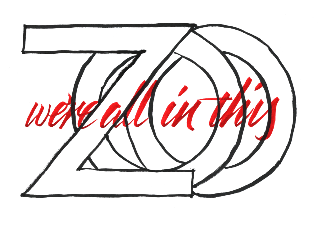
  • AWKWARD!

    A cohort of 31 fiction authors and artists released stories on Substack to celebrate the anniversary of the first airing of the Twilight Zone on 11.24.1968.

    I’m a sucker for internet moments, so here is a little something to celebrate with a 5-word microfiction.

    ,

    he made me dinner.
    awkward!

    This 5WP is based off the Twilight Zone episode “To Serve Man”. As a kid, we didn’t watch much TV, but I saw this episode on Nickelodeon at my cousin’s place. In a pre-streaming world, this was a completely random occurrence. As luck would have it, the only episode that I’ve ever watched turned out to be one of their more famous episodes.

    ,

    Physically, this was the drawn and formatted as a foldy comic. If you’d like to read this book as designed, download my PDF.

    While you’re at it, download instructions to make your own foldy comics by Matt Madden!

    ,

    I initially graphed the piece with a ruling pen on a single page. After scanning it in, I realized that shape and order of words was perfect for a foldy comic. Plus it would be a special way to fete this event.

    ,

    Congratulations for Sean Thomas McDonnell and J. Curtis for coordinating the…

    Enter!

    .
  • Callivember24, Week3

    I was indecisive with several of these.

    <Insert insincere self-deprecating apology for uploading too many versions>

    ,

    11/13

    symmetry
    hobgoblin of small minds

    I first heard the Emerson quote “consistency is the hobgoblin of small minds” at Rogers+Labarthe Architects. We were hung up on the lighting layout in a hallway (a trickier task than it might seem). One of them whipped out this line to keep things moving.

    The top image is more or less how it looks on the page (after darkening the orange). The lower image uses the same ink, but with the contrast pushed hard. This blue is from a wash bottle where I salvage cool colored ink from pens and brushes before rinsing the tools.

    ,

    11/14

    wild style
    takes
    boring
    practice

    I used a grey-ink wash bottle for the liquid to activate the watercolors on the top image. I need to explore this further, but the dirty colors were not the right fit for this word. I should have pushed the saturation harder on the lower image, but I already went heavy on the digital pushing on “symmetry” and “glow up” (last week), so I let it be.

    ,

    11/15

    find your center inside
    chaos

    Super-graphics are tough because they have to be both expressive and “right”. I often use old sheets for test runs. With chaos, it was natural to appropriate such backgrounds for finished pieces. Normally, the background noise makes the smaller words unreadable, but this prompt frees you splash heavy with the opaque ink.

    ,

    11/16

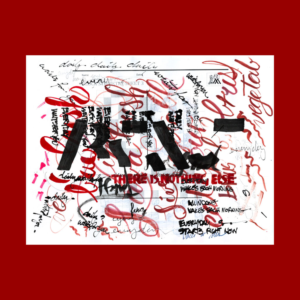
    synchronicity
    everyday
    when we wake

    I miscounted the letters when I decided upon with the clock-face concept. Didn’t realize there were thirteen letters until my second try! Oh well, a compound word is a bit of a cheat too.

    ,

    11/17

    culture
    swings
    via
    any
    tongue

    After taking fifteen shots, you’d think I know how to spell tongue, but I just mistyped it a second ago. This poem was inspired by the prompt “култура”, but I wasn’t about to learn Bulgarian.

    When studying flourishes, I realized that there is quite an art to it. Since I had no idea what I was doing, I went overboard. As a beginner, it wasn’t going to look good, so going heavy at least made it appear possibly intentional. (I posted the middle version for Instagram—Goldilocks would be proud).

    ,

    11/18

    freestyle races
    along ghostly ruts

    I could not envision a good composition, so I finally settled the concept of tire tread marks. That didn’t look good on the paper, but it had promise, and the computer came through. It took time, but this was the fun type of digital manipulation.

    ,

    One Saturday, I went on a streak of truthy remarks on design.

    The hard part of being a professional is knowing when to trust your personal tendencies and knowing when to do exactly the opposite. Actually, the hardest part is just doing the damn work.

    I’m not a great design architect. But I have become more fluid at switching gears when I slam into a wall. Sometimes you need to brute force a problem, but it’s usually more efficient to step laterally and approach the question from a different angle with a fresh technique.

    The creative life is a cycle of expansion and refinement.

    I was given this nugget in grad school before embarking upon on my master’s thesis. There is a tendency to stay in high level to avoid tackling the project. Maybe this applies with my continued emphasis on pushing out new 5WP’s instead of focusing on specific skills.

    When picking between two good versions to publish, bias towards the one that you fear the audience will dislike. (You could say “challenge the audience”…but that’s not properly scary sounding for such a moment).

    I’m a huge fan of default biases, “rules of thumb”. For this, I’m worried about the subtle effect of algorithmic Instagram metrics in shaping my instincts. So whenever what image to post, it’s best go against such subconscious Meta-training (unlike these newsletters, I only post one image per prompt on IG).

    Congrats on the new job! If you think it’s time to change, you were way overdue!

    Fear prudently keeps us from making rash changes, but don’t waste your career staying comfortably miserable.

    Selling writing courses on Substack is that “selling pickaxes to gold miners” phenomena….miners who love to stare at their navels and talk about it endlessly.

    Including me, right now!

    Cya next week!

    ,

    PS—After mentioning my old ink bottles for pre-rinsing tools, here is a photo of the bottles that stay on my work desk (most of my proper ink bottles are stored elsewhere)

    Doing a cycle starting from the front left:

    1. Sheaffer Sepia (with the blue rubber bands). Purchased before college, I use it for trial compositions. The ink is light enough that the paper can be reused for future tests and as a brown, I’m not worried about the ink color getting contaminated. But unlike my wash bottles, this handles as real fountain pen ink.
    2. Speedball Calligraphy. This was a recent purchase to feel how a new bottle of india ink is supposed to act.
    3. Speedball Super Black India. A late college purchase, the ink had gummed up after decades of non-use, Happily, it was revived with a little water.
    4. Sheaffer Red Ink bottle (the original red was finished last year). I use this bottle to wash off tools that used warm colored ink.
    5. Higgins Bottle (with the masking tape). I use this bottle to wash off tools that used cool colored ink.
    6. Higgins White. Bought during college, I’m finally using it. I suspect that white gouache would be more opaque, but gonna use this up first.
    7. Stacking containers of various ink and gouache mixes. It was a cheap purchase from Walmart, but surprisingly airtight. These little mixes haven’t dried out in the past few weeks!
    8. Higgins Engrossing Ink. This bottle was totally gummed up, but revived decently. Not as nice as my old bottle of Speedball India Ink, so I’m using this up first.
    9. Birmingham Magma. I bought big bottle of this awesome ink. Took a little of for an empty Parker bottle.
    10. Higgins Pen Cleaner. I had been using this for Noodler’s Lexington Grey, but now it’s a fresh a pen wash for black ink, so that I can let the other two colored washes bottles stay more brighter with their inks.
    11. Birmingham Salted Sea Breeze.
    12. Birmingham Blossomed Lotus. It’s always nice to have a light blue and a pink on hand. Plus these two are a little too tall to fit the art box that contain the rest of my my inks.
    13. Honorary non-ink mention. The sheet on the light table has a circle on one side and rectangular template on the other side. I have used it for about a quarter of Callivember.

    ,

    PPS—My Substack buddy James Hart just had a new bunny move into their home. He composes real poems with nice calligraphy. Cheers!

    Moki
    harbinger
    of home
    destruction

    .
  • Callivember24, Week 2

    I stole the boy’s watercolor set after reading Modern Calligraphy by Molly Suber Thorpe. I fear that I’ve now exhausted all the easily accessible toys. The hard part will be sticking to the practice long enough to get decent with each of these mediums.
    ,

    11/7

    clarity
    lies on a spectrum

    I discovered scratchiness with this exercise. I realized that I can run the ruling pen multiple times to over the same letter for a frenetic quality and I played with the angle of my Parallel to get the splatters.

    One morning, I also messed with Clarity in a notebook using basic fountain pens. As always, it took multiple tries to get “right”.

    ,

    11/8

    cradle the infinite five words

    After multiple attempts, I gave it one last go on my first initial test sheet. It’s a nice return to my early technique of layering poem drafts for visual texture on the page. I borrowed this method from the great architect Carlo Scarpa and I always wonder why it isn’t used in more art.

    ,

    11/9

    glow up
    more cowbell

    His crayola’s are now mine!

    These images are slightly deceptive. I pushed the saturation and lightness of the scans to achieve the fluorescent effect. I haven’t gone this hard with the digital manipulation before, and I hope it doesn’t become a regular practice. But if it looks right on the screen, then I gotta respect the actual medium of communication.

    ,

    11/10

    breathe
    slowly
    manifest
    supreme
    fluidity

    After testing a few scripts I settled on this composition. It was fine but lacking. On the day of the upload, I saw several folks use the liquidity of ink to add texture to their compositions. My first tests were way overboard, but I salvaged one by rewriting the words. The sweeping brush stroke worked out nicely as well.

    ,

    11/11

    make
    pretty
    on
    a
    leaf

    A simple composition, inspired by a book of flourishes by Arthur Baker, drunk Taoists in the forest, and recent art by Ann Collins.

    ,

    11/12

    wholeness
    is
    not
    just
    collecting

    Over these twO mOnths, I’ve fOund that is that big O’s are sOOOO enticing!

    ,

    These six weeks have really pushed my range, but at the cost of practice. In the few days between Inktober and Callivember, my Copperplate progressed quickly but stalled out once I started producing daily pieces again. It’s time to tackle one skill at a time.

    Practice is a balancing act between expanding the field and focusing intently. But more important than the specific, it’s most important to keep working! With infinite games, you always winning if you’re still playing.

    Cya next week!

    ,

    PS—This came on an early morning commute as I watched the sun rise above a crescent moon. Pair it with a fortuitous drawing and here you go (after several other attempts).

    10/31—Inktober52, week 37

    chase the golden crescent sun

    .

  • Callivember24, Week 1

    We’re now into #callivember! Things are slightly less stressful because I’ve learned how to handle these daily challenges, but there’s no super-easy button for publishing once a day (thoughts and prayers for newspaper cartoonists!).

    ,

    11/1

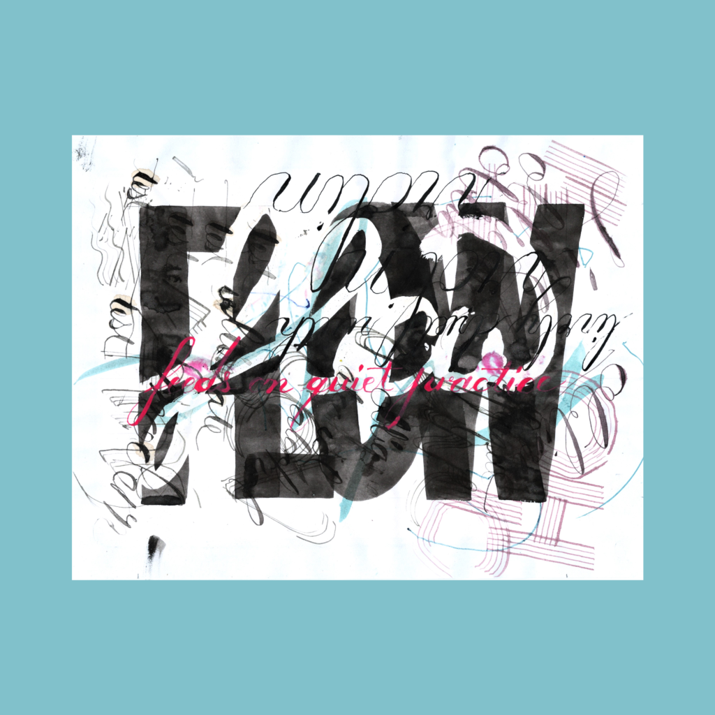
    flow
    feeds on quiet practice

    It’s wild when an sketch plays out like the concept. Of course it’s not that easy. This took multiple attempts (beyond these examples) and chewed up half a day. Still super happy with how it played out, worth the brush that was ruined in applying the mastic.

    ,

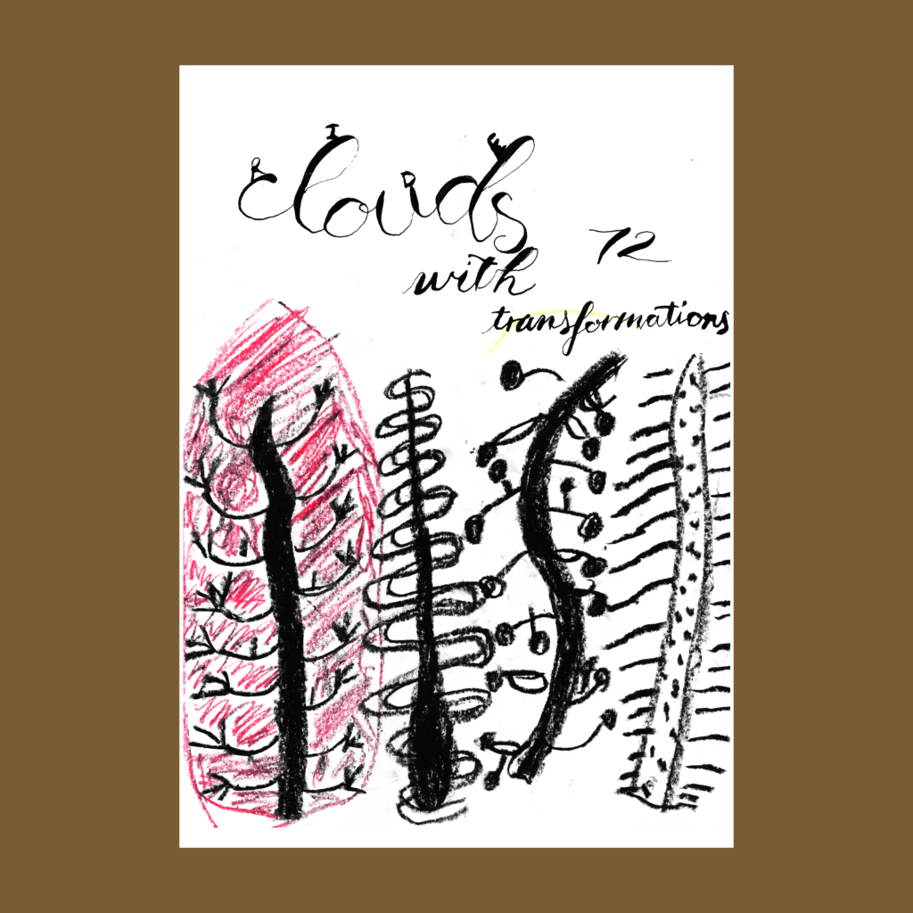
    in one transformation the universe

    Sometimes it just falls into place. I started with a totally different concept that quickly slipped into this composition. I didn’t even have to tweak the 5WP. Magic happens on the desk.

    ,

    11/3

    golden ratio
    my big fart

    Like many, I am enchanted by the mathematical and geometric properties of the golden ratio. However, I’ve always been skeptical about its mystical power in design.

    ,

    11/4

    expressive
    words depend upon contrast

    I went counter on this word too.

    ,

    11/5

    each
    beat
    the
    next
    rebirth

    My original concept was the upper version with alternating lines. It came out fine but I often take additional shots to see if I can execute better. As I started the second word on the next one, I made a mistake with the line spacing. Rolled with it and changed the composition.

    ,

    11/6

    geometric
    journey to delights uncharted

    I used ruling pen again for “real” drafting (with the corner of the Parallel for the flourishes). I don’t think either set of flourishes came out great but didn’t have the energy to set up another sheet. On intensive pieces like this, I make progress prints to practice the final touches, but it’s never the same on the real, final gamble.

    As aggravating as it can be, such moments are a thrilling part of calligraphy. This art has room to grind (see all the messy compositions), but it also includes the adrenaline rush of a performance, as the ink kisses the paper.

    ,

    It’s been fun to follow other word artists on Callivember, all wrestling with the same prompt every day. This is totally worth risk of being on Instagram. Digital platforms are power tools. They can foster powerful connections and will totally mess you up when used carelessly.

    I don’t like being competitive, but such sentiments are unavoidable with numbers in social media. The most fashionable gets all the attention, and the algorithm nudges the rest of us towards envy. Fortunately, the Callivember cohort is much smaller than Inktober. I’m nowhere near the upper tier but am now comfortably in the middle class. Shrink the field and they have less fodder to feed my insecurities!

    Cya next week!

    ,

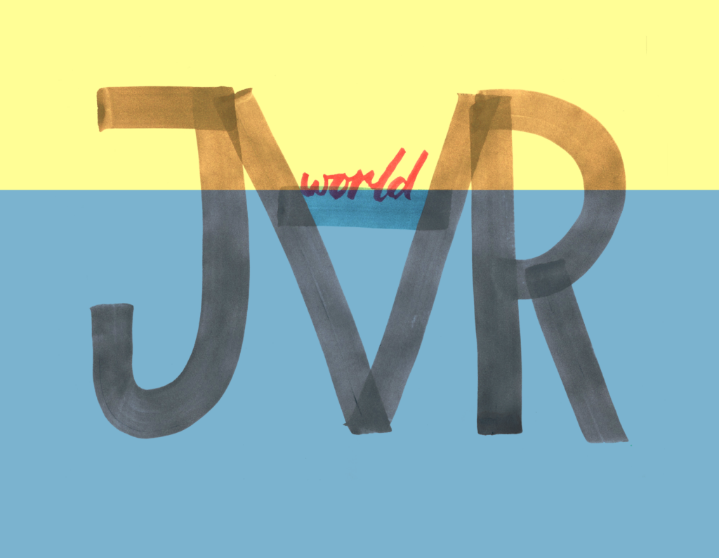
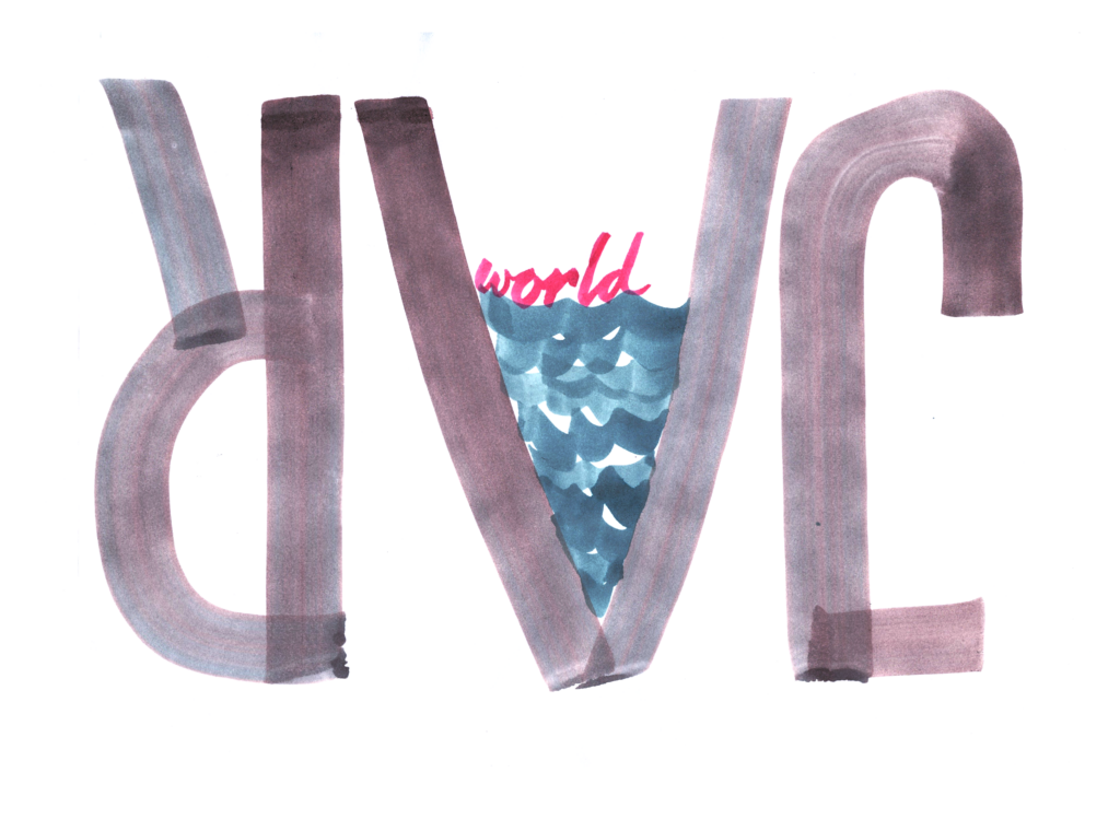
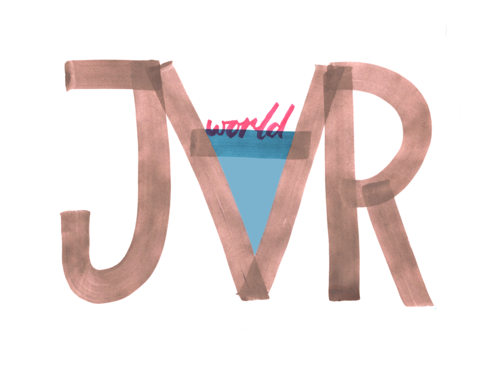
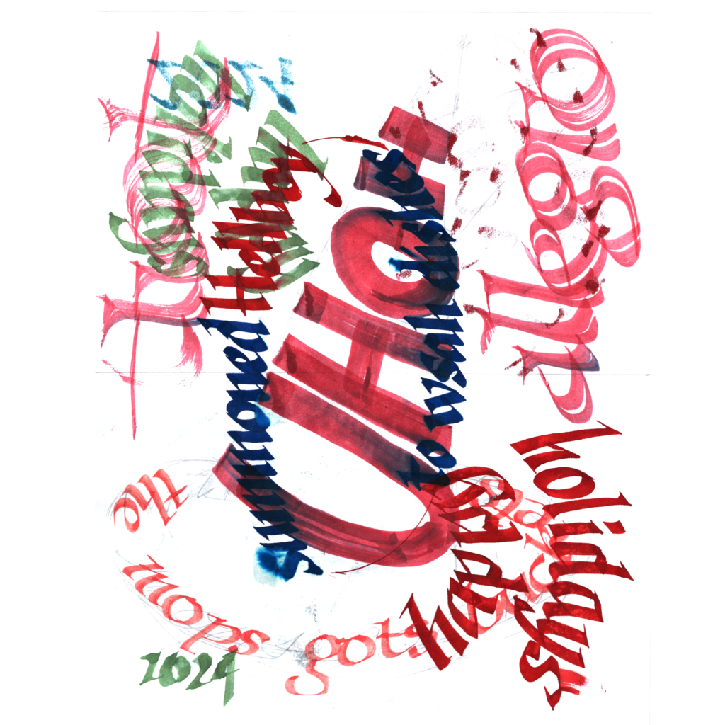
    PS: An airport manager gave us tickets to HallOVeen at Opportunity Village. We drew up this thank you card. It’s fun to get this calligraphy into the wild.

    .

  • On elections and making art

    Bad result, go make art!

    I get why this statement is so obnoxious. Shit happens and just advise folks to move on? Is this the content creator’s version of hustle culture? How do you say #privilege with anything more trite?

    Let me try to defend the sentiment with three tangents.

    1. What else should we do? Making art is unequivocally better than doom-scrolling (or gloat-trolling). This world hasn’t actually changed today—a guy just won a four-year lease on a building at the edge of a continent. You’re not that dude. If you should’ve been making art on Monday then you should make art on Wednesday too.
    2. In a world of competing truths, I hope you believe there is something special with your truth. Make art that lives in this truth and let us partake through your art.
    3. Most importantly, making art shifts your world. It might not be a direct path to enlightenment like reading Spinoza, but if you aren’t meditating under a waterfall, then mashing marks on paper is a fine way to exploring the truth.

    By all means, be human. Feel the dread (or elation). Curse the gods. Then hug the kids and guinea pig. Shit, shower, and shave. And get to work. We need you to make it.

    ,

    11/8—Inktober 52, week 45

    polar
    spinning
    round
    and
    round

    .

  • Inktober24, Week 5

    This week started chill because I finished Inktober the previous Sunday. Without pressure to produce, I practiced Copperplate script. But on Wednesday, I found out about #Callivember. Practice on pause, back on challenge!

    ,

    10/26

    camera
    frozen wisps
    amber waves

    The lower 5WP with the ruling pen (used as a drafting tool!) was so different from previous pieces that I uploaded it to IG. But I’m also fond of the upper drawing’s nod to the lens aperture. It’s rare when one concept falls into place, much less two!

    ,

    10/27

    five words for the road

    The “driving scene on Peppa Pig” concept landed quickly, but it took a few attempts to get right. Like architecture, each decision leads to more choices. The small details and the big concept are all interconnected. And then execution. Everything can be refined. More! More! More! Then you run out of time.

    ,

    10/28

    jumbo jet
    crossing Orion’s belt

    After omitting 75% of “road”, I took the next step and dropped the theme word altogether. I posted the jumbo-er “JET” on IG, but the lower version feels better composed. Maybe I need to try an extreme crop on the top version.

    Before, I might soothe myself by planning to return to the these files. But time is much more expensive after kids, and I’d rather take a shot at a new composition. Oh well.

    In architecture you also learn to live with the mantra “on to the next one”.

    ,

    10/29

    lost
    in
    circles
    missing
    navigator

    I planned on a series of random overlapping circles, but concentric rings were just too friggin’ awesome. Take the win and run.

    This piece also crystalized a nascent realization that readability is only one criteria among many for calligraphy.

    ,

    10/30

    a duet between
    two violins

    I really liked the font on the top drawing, but the lower one felt properly confrontational, thus getting the IG nod. The wording on this poem changed quite a bit as I worked on the composition for the visual pun. So I’m annoyed that I chickened out at the last letter and didn’t re-word it all the way to “duel”.

    ,

    10/31

    landmark
    thirty-one
    days of glyphs

    Apologies for indulging in three versions of the the same image. The top two backgrounds were drawn by the boy last week while messing around on my desk. The bottom one was from Easter 2023, maybe the 2022.

    And yes, this was inspired by Baskin Robbin’s old logo, even though I’ve never been there. They should have stuck to this classic 1991 BR logo. I understand why they updated away the original overtly western vibe, but the latest versions muddy the identity without injecting any new energy to the brand.

    ,

    Inktober52, Week 39

    glove stuffed with seven fingers

    Before finding out about Callivember, I started to work on the backlog of old prompts from “Inktober52”, a weekly challenge to encourage folks to keep drawing outside of October. This one timed nicely as a slightly horrific 5 word flash fiction for Halloween.

    ,

    This closing section should have been reflections from completing #Inktober. Instead, I spent the weekend getting ahead on #Callivember to minimize the pressure during the workweek.

    But the first month’s experience has been helpful. I’m tired, but now that I have a good rhythm, so I’m less stressed than two weeks ago. I doubt I’ll embark on a full 2-month challenge next year, but I feel comfortable with this year’s choice to keep going.

    I’ve been lucky that fun ideas keep showing up with each prompt. The poem kickstarts the brain. Then the hand inserts feedback as ink hits the paper. And viola! something shows up, one or four hours later. Hopefully, my skill will increase next year so that I won’t have as many failed sheets for each word.

    But hey, it should be about the process! So hopefully y’all enjoy the images, but selfishly, I’m #winning cause get to wander this journey.

    Cya next week!

    ,

    PS. This is my first practice page of the basic strokes for Copperplate over the week. It was nice to focus on not-producing for a few days.

    ,

    PPS—We finally made Jack-o’-lanterns, lit with cell phones.

    11/3 — Pikachu-tree and Umbrion-ghost

    .