I was less intense this week. It might show in the pieces, but I’m happy with the work. One big change is that I’m now working ahead, which takes a lot the pressure off the process. Next year, I’ll start working on the prompts as soon as they are announced.
,
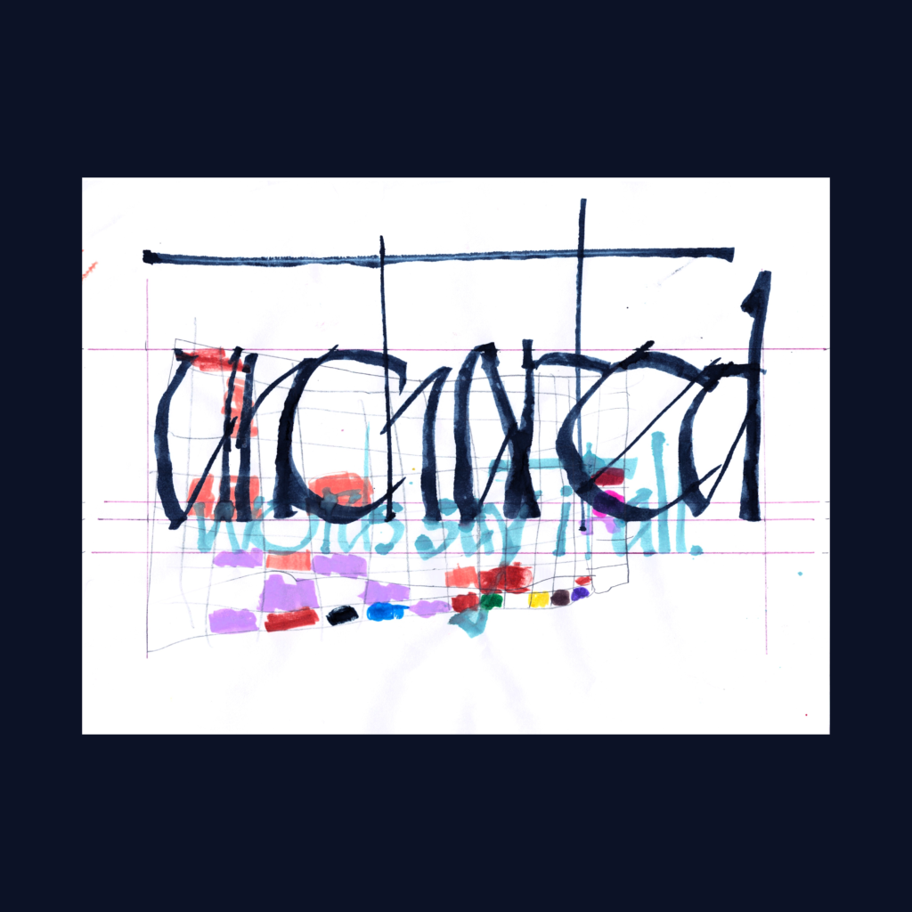
uncharted
words say it all.
I wanted to write this one with the ruling pen. So I did. It’s going to take a lot of practice to get this working well. I suspect that basing the strokes on an established hand (in this case Chancery Cursive) might be the best way to get something that works consistently.
,
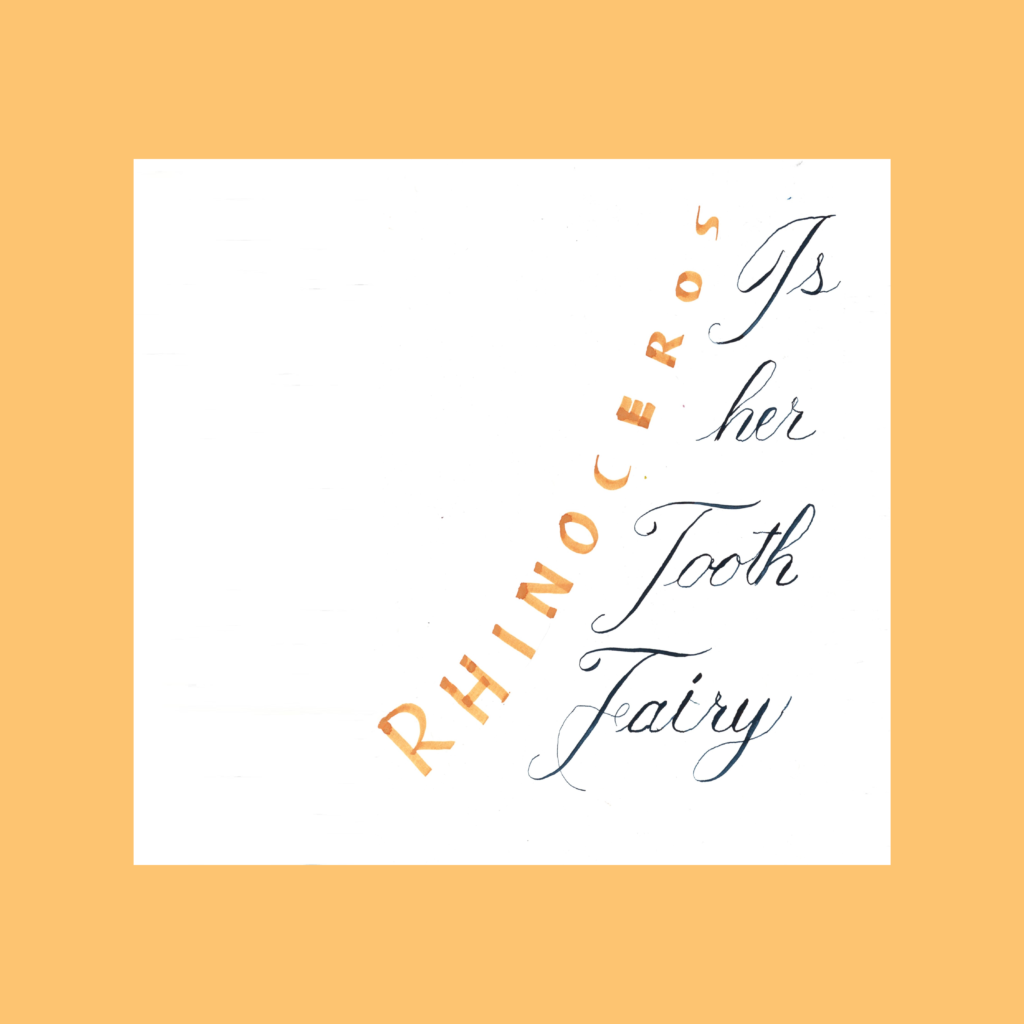
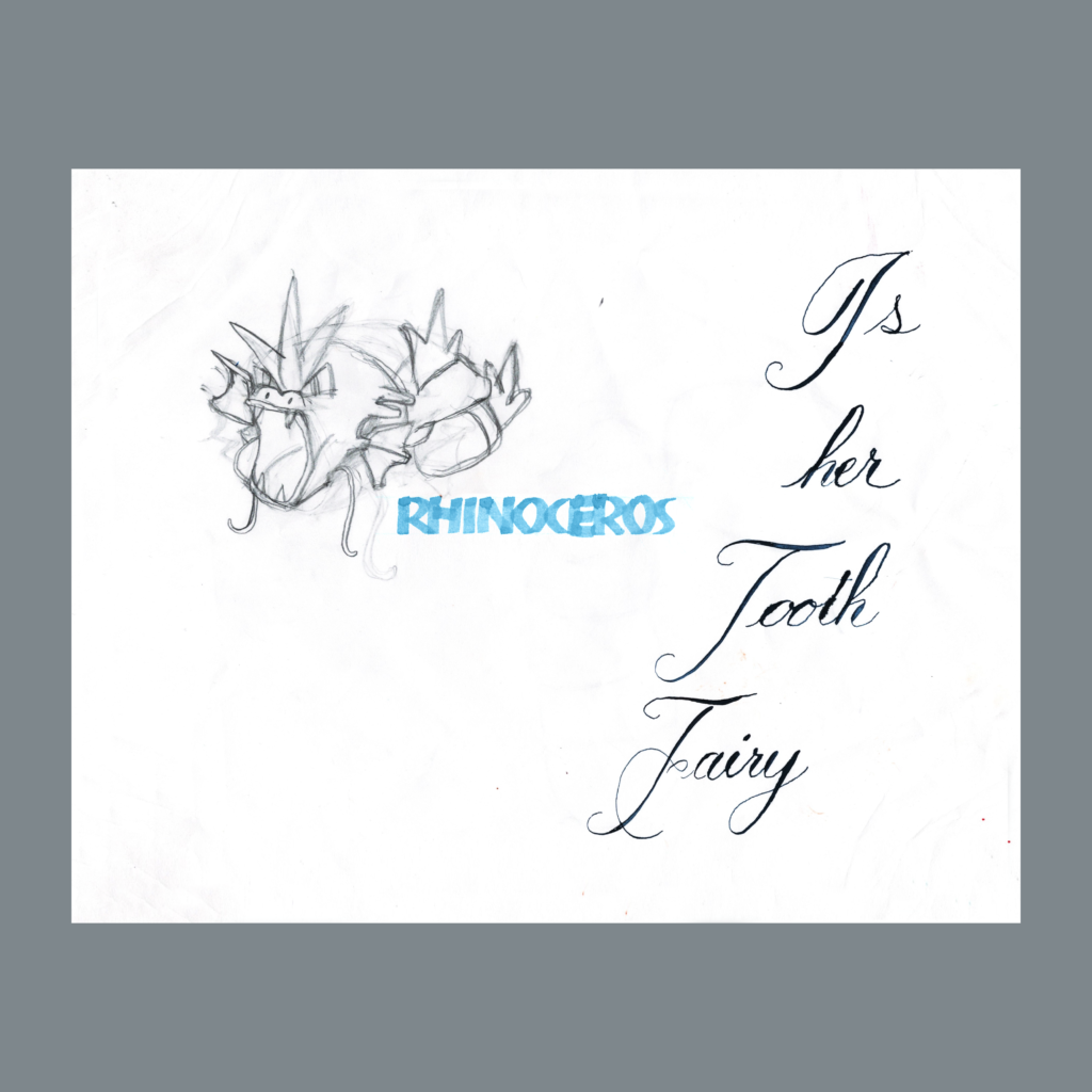
rhinoceros
is
her
tooth
fairy
Like “uncharted”, I forced Copperplate into this composition. I hoped that a blocky Rhino would contrast nicely against the cursive. This was my first time playing with Copperplate and I’m clearly not ready for it. Fortunately the girl traced a Gyarados last year to partially salvage the composition.
After Inktober, I have at least four initiatives to pursue:
- Straight Brush
- Ruling Pen
- Copperplate script
- Gothic Script
,
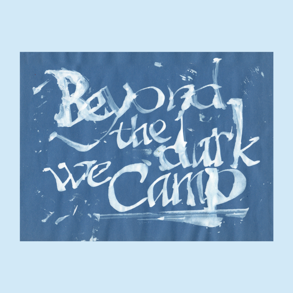
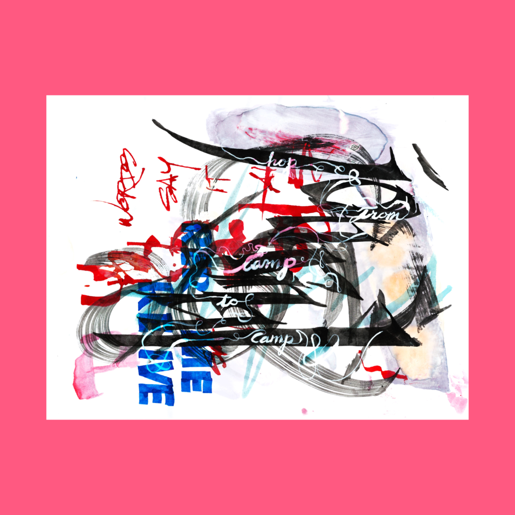
hop
from
camp
to
camp
I own inks that go all the way back to undergrad. Some of it ink has coagulated but is usable after mixing it up. It’s not as good as brand new ink (I bought a new bottle of india ink to verify) but raw ink works for most of my compositions.
I vaguely remember buying this white Higgins ink at Berkeley, being disappointed in its opacity, and setting it aside. I’ve used it more this week than during the quarter century that preceded it.
That $4 bottle of ink would be worth $47 if I invested it in the SP500 back in 1997, but what’s the fun in that?
,
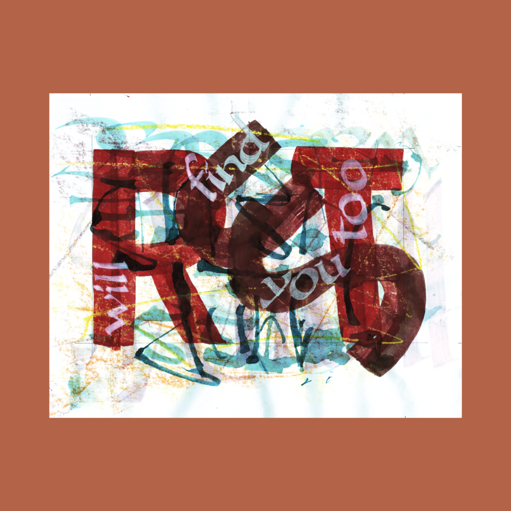
rust
will
find
you
too
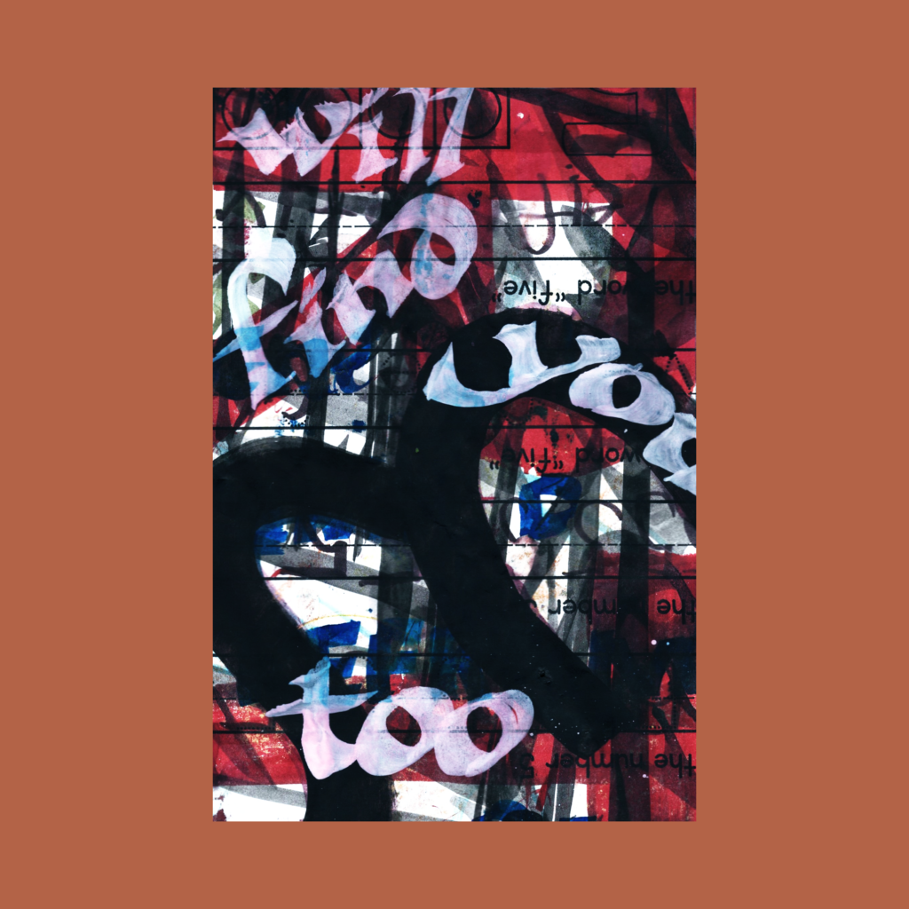
I’m in the video game phase of this hobby, unlocking new toys and levels every day. The white ink from “camp“ and the “rhinoceros” copperplate became the basis of today’s composition. On the computer I also started messing with extreme crops.
,
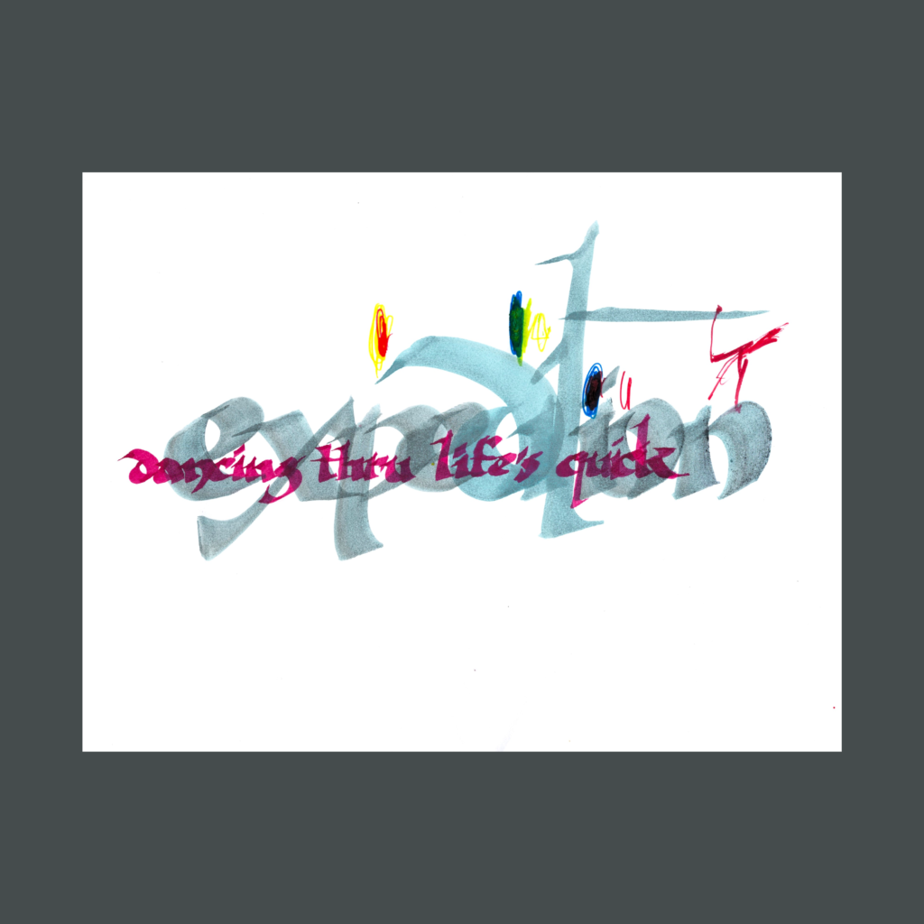
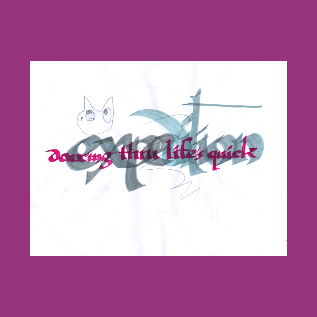
dancing thru life’s quick
expedition
I expected this to be a tough composition, but I quickly landed on a simple through-line (following the word in poem). I got lucky with a couple kids’ scribbles that play well with this arrangement.
,
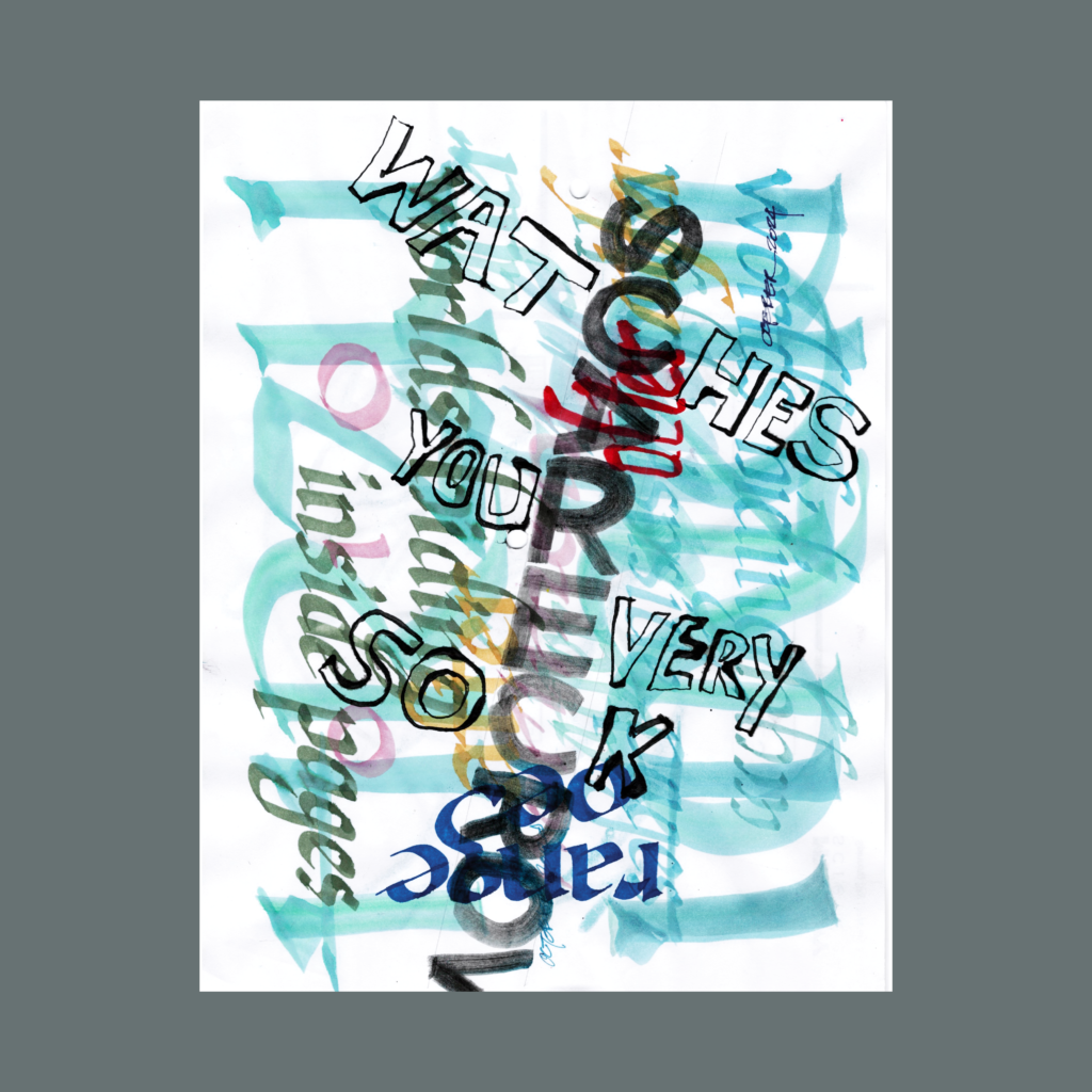
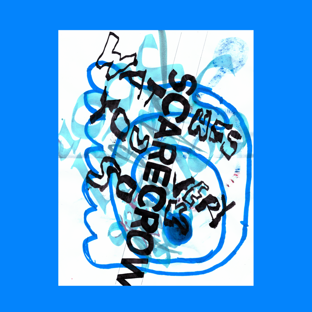
scarecrow
watches
your
every
sock
I was inspired by Randall Slaughter to incorporate raw open lettering. Making those letters feel right is harder than it seems. Last week, I would have grinded out another ten variations to get it just right, but I don’t got it in me.
,
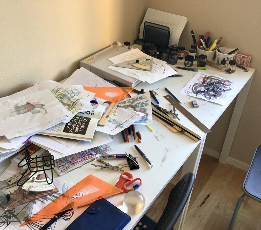
After last week’s post, my dad asked for a photo of the tools.
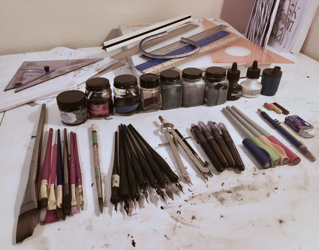
- Flat brushes (1″ down to 4mm) with a pointed brush
- Dip pens with a variety of nibs including calligraphy, flexible, and broad edge
- Pilot Parallel Pens (four 6.0mm, 3.8mm, and 1.5mm)
- Leadholder, pencil, crayons, and eraser
- A big collection of fountain pen inks (many more than in this photo), a new bottle of india ink, ancient inks, and a couple bottles of pen washes (for testing compositions)
- Pages of templates, though I now use drafting tools for locking in layouts
- Triangles, scales, rulers, and a compass
- Light table
- A practice notebook for quick 5WP’s to unwind after the compositions. (I use previously failed sheets for testing compositions and exploring design ideas)
- Not shown—Lots of books, by Arthur Baker, David Harris, Alan Furber, and the Speedball Textbook.
However, that tool photo is deceptive. Normally it looks like this.
Have a Fun Halloween. Cya next week!
,
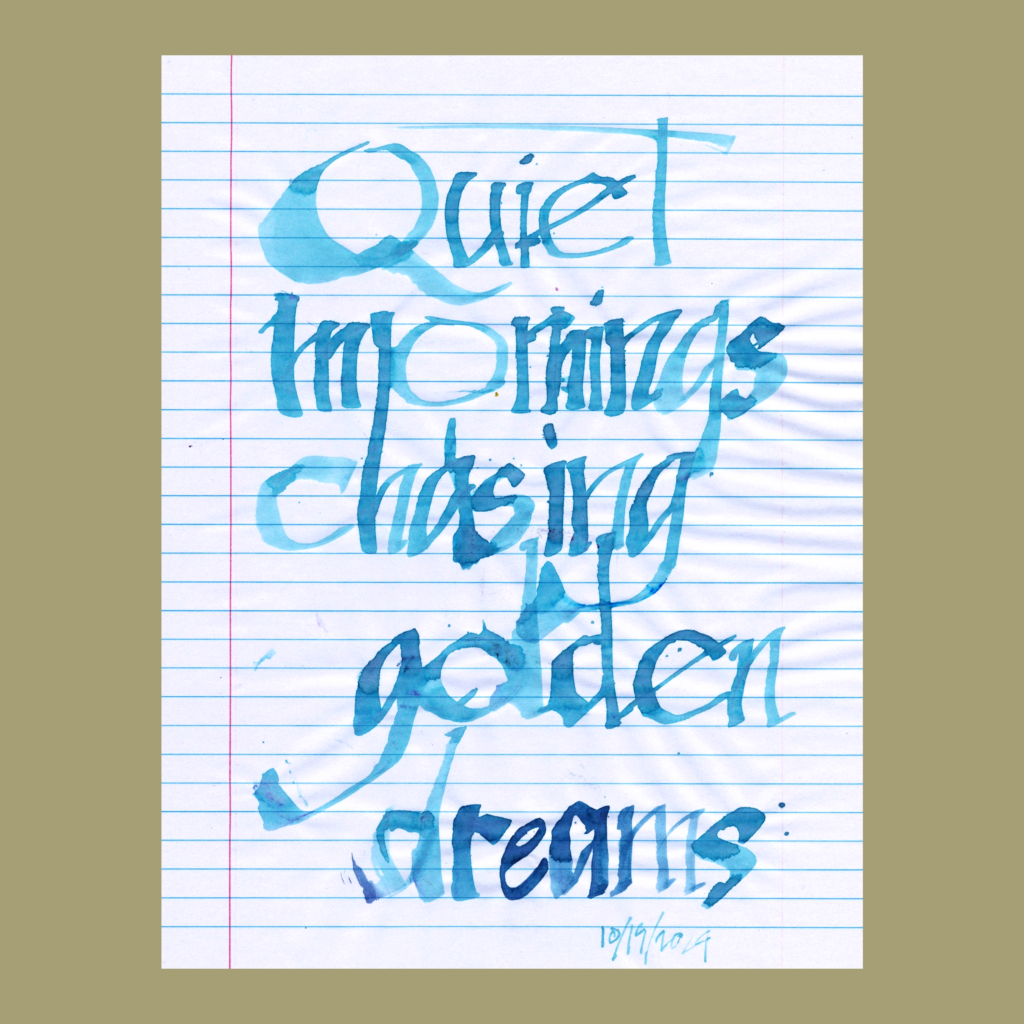
After finishing “uncharted” I cut loose with the ruling pen. This scan doesn’t do justice to the magic on the page that materialized as I did my usual bottom up scribing.
.